Welcome to FlexColorScheme
Use FlexColorScheme to make beautiful Flutter Material Design themes. Apply optional surface blends and use Material-3 color system seeded color schemes, with more customization features than Flutter offers. The returned themes are standard ThemeData objects, but very sophisticated ones. Choose from numerous pre-made designs or make your own. You can also use component sub theming, that is quick to configure.
FlexColorScheme is at its core an advanced ThemeData factory. It makes customization of ThemeData simpler. It does not expose everything you can do with ThemeData via its own APIs. Its focus is on things that are complex and tedious to do with ThemeData. You can further tune the produced ThemeData by using copyWith and ThemeData's own APIs.
The Themes Playground is a visual web configuration tool for the FlexColorScheme API. It allows you to play with different styles interactively, and copy the FlexColorScheme API setup code for the theme you created. The Playground does not cover all APIs offered by FlexColorScheme, but most of them, certainly the most commonly used ones.
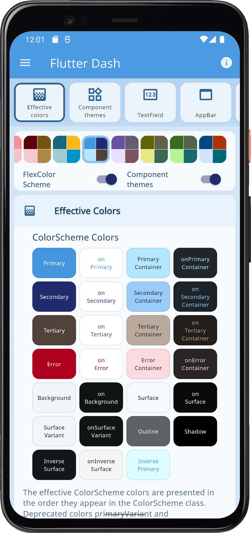 | 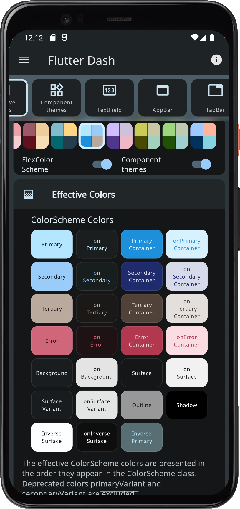 |  |  |
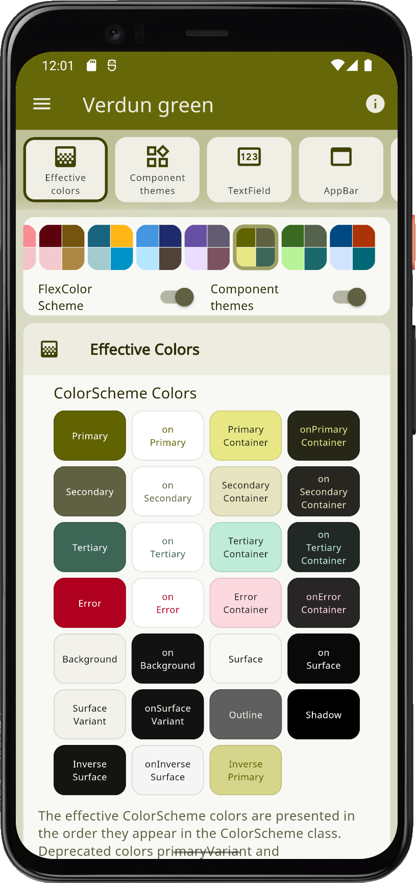
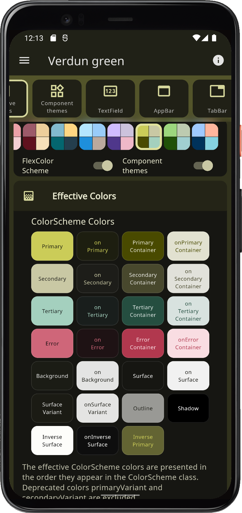
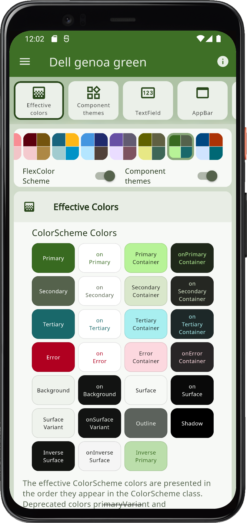
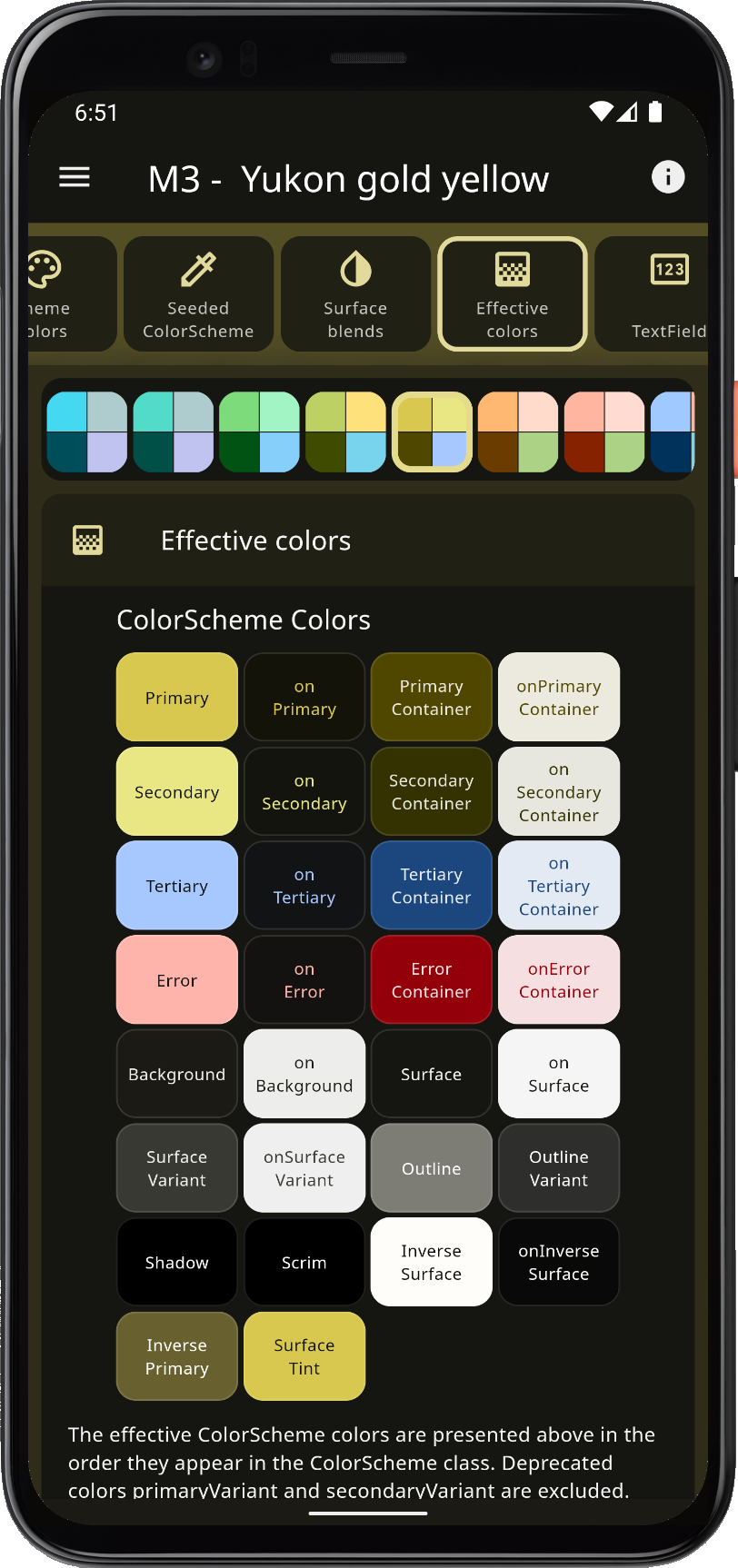
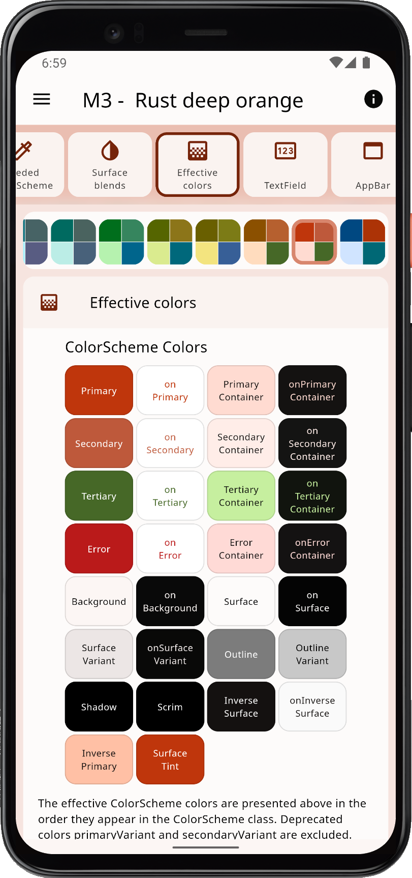
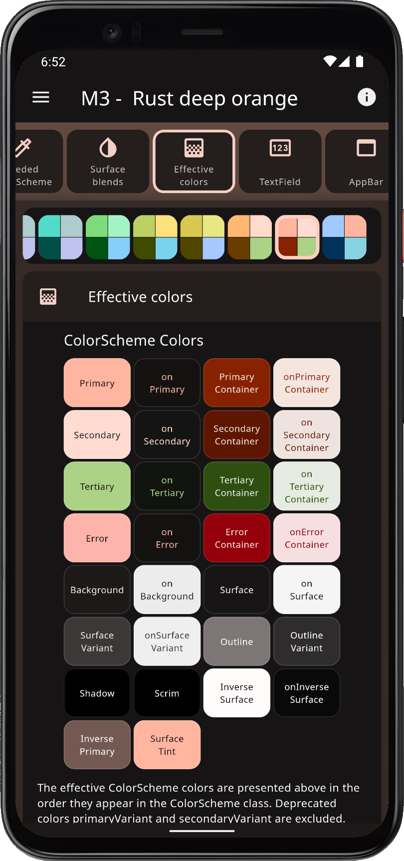
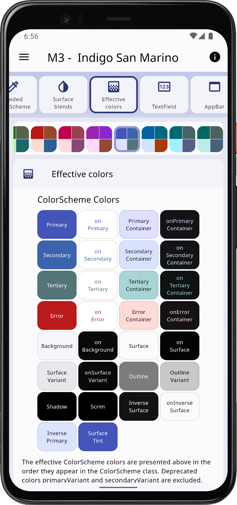
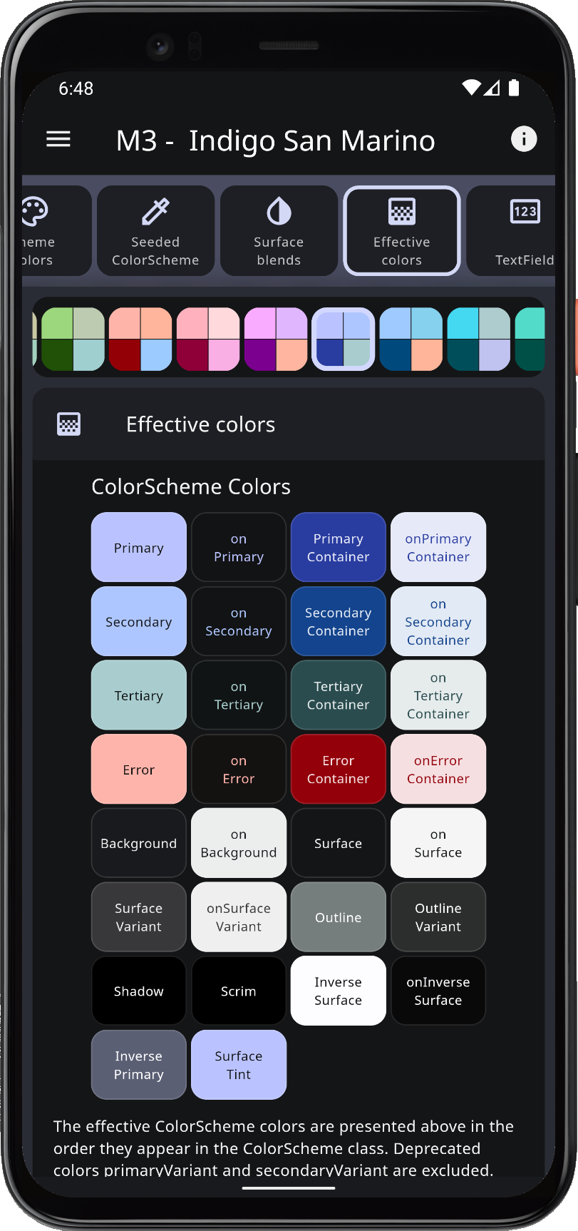
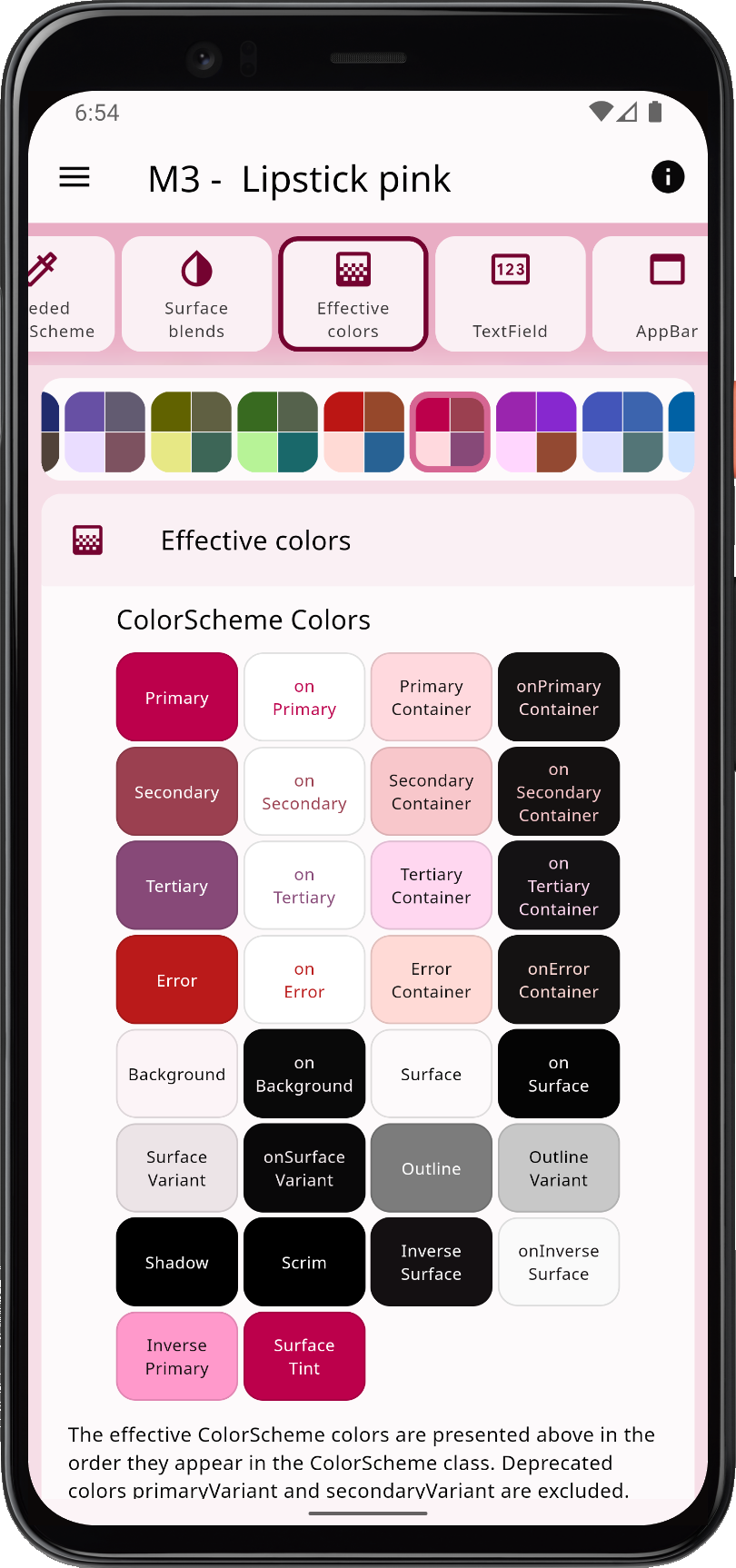
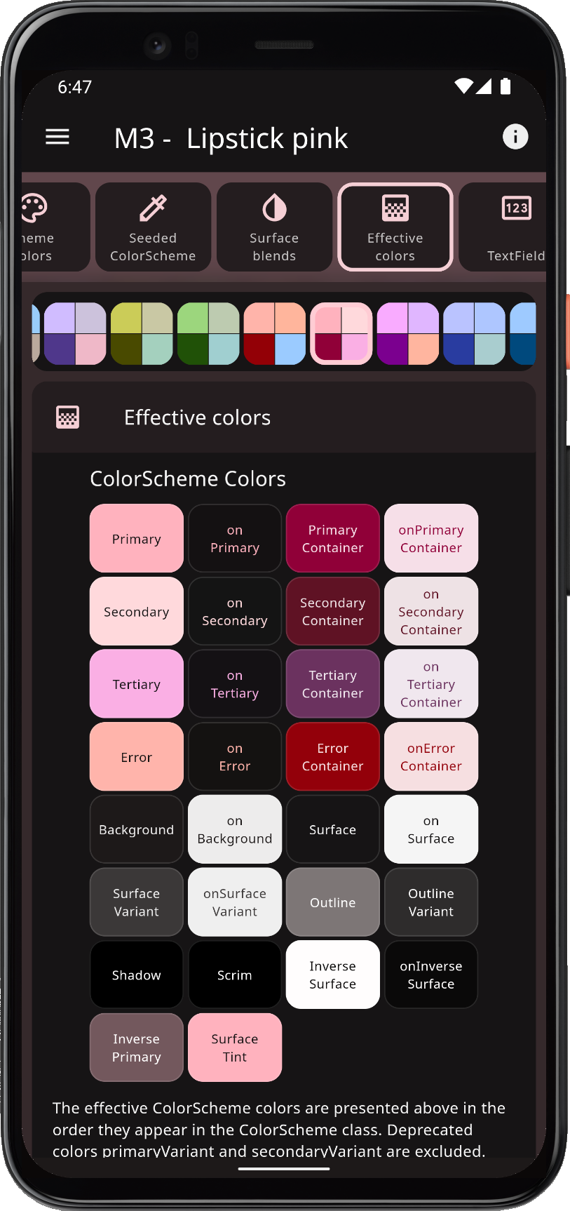
When you theme a Flutter application correctly, all built-in widgets use the colors of the ColorScheme in your theme. At least in theory, and it is almost so if you defined your ThemeData in Material-3 mode, or by using the ThemeData.from factory, but it still misses a few details.
FlexColorScheme ensures that all Flutter SDK UI components get themed completely by its color schemes and custom colors you provide, regardless of if you used M2 or M3 mode. It applies effective ColorScheme colors to all color properties in ThemeData. This ensures that all the direct colors properties in ThemeData match your ColorScheme. There are no surprises in ThemeData that do not match your ColorScheme.
 |  |  |  |
You can opt in on using opinionated component sub-themes. By doing so, you can, for example, adjust the border radius on all UI widgets with a single property value. Flutter's Material UI widgets now default to the Material-3 design when you use vanilla ThemeData.
When you opt in on using the component sub-themes, border radius on widgets defaults to the Material-3 rounded corner design regardless of if you use M2 or M3 mode. In M3 design the radius varies by widget type, as specified by the Material 3 guide, in M2 it was 4dp on most widgets. One could say that opting in on using FlexColorScheme component sub-themes in Material-2 mode, is a way of getting a Material-2 design of Material-3. You can keep the M3 defaults or set the shared global widget radius to a value you prefer. You can also easily set the themed border radius per widget, and override the Material-3 default or the global radius value you defined.
Material-3 Mode#
You can also opt in on using Material-3 design. The Material-3 mode component sub-theming is far less opinionated than it is in Material-2 mode, using mostly Material-3 defaults. It offers many quick settings that you can use to customize Material-3's quite opinionated default style, to fit your custom design goals.
In Flutter 3.7 and later, using Material-3 design is ready for production use. Some minor issues still exist, please refer to the FlexColorScheme docs known issues chapter for more information on status of known theming issues in Flutter.
In Flutter 3.16 and later, Material-3 is the default mode when using its various ThemeData() factories. FlexColorScheme still defaults to using Material-2 mode, but you can opt in on using Material-3 mode by setting useMaterial3: true, when you create your FlexColorScheme. The Themes Playground uses Material-3 mode by default, by setting useMaterial3: true in the generated code. Next major version (version 8) of FlexColorScheme API will default to Material-3 mode as well. This will be a breaking change.
 |  |  |  |
FlexColorScheme has many advanced coloring features, like using surface alpha blends. It also fully supports Material 3 based color schemes, including seed generated ColorSchemes. It offers different configuration options that you can use when you generate your ColorScheme from key colors. You can use this to make more saturated seed generated themes and themes with higher contrast. Advanced seeded ColorScheme features like these are currently not available in Flutter directly. This includes using multiple key colors as seed colors, custom minimum chroma levels and customized tone mapping to ColorScheme colors.
In Material-3 mode theming you can disable its surface elevation tint and even bring back elevation shadows where they were removed in M3. You can choose to do this adaptively on only selected platforms, like iOS and macOS, where surface tint elevation may seem foreign, while still keeping the M3 tinted elevation styles when the app is used on Android.
 |  |  |  |
With FlexColorScheme component themes, you use simple flat property values. No need for verbose Flutter SDK component sub-themes, with ShapeBorder definitions on multiple widget themes to change their border radius. The component theming provides a large number of easy-to-configure options via simple flat properties. In many cases you can avoid the both complicated and confusing MaterialState theming properties.