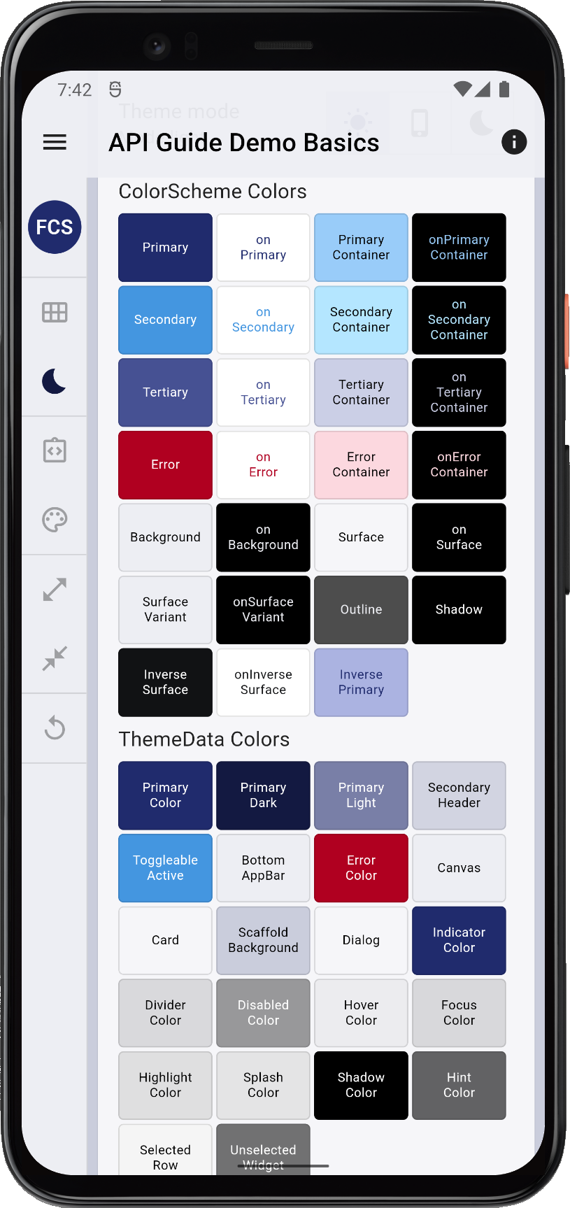
 ](https://raw.githubusercontent.com/rydmike/flex_color_scheme_docs/master/docs/images/fcs-v5-api-01-basics.png)
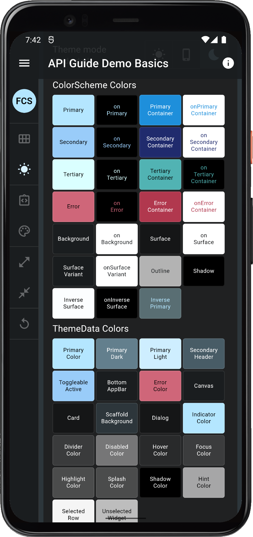 ](https://raw.githubusercontent.com/rydmike/flex_color_scheme_docs/master/docs/images/fcs-v5-api-02-basics.png)
 ](https://raw.githubusercontent.com/rydmike/flex_color_scheme_docs/master/docs/images/fcs-v5-api-03-basics.png)
 ](https://raw.githubusercontent.com/rydmike/flex_color_scheme_docs/master/docs/images/fcs-v5-api-04-basics.png)
 ](https://raw.githubusercontent.com/rydmike/flex_color_scheme_docs/master/docs/images/fcs-v5-api-05-key.png)
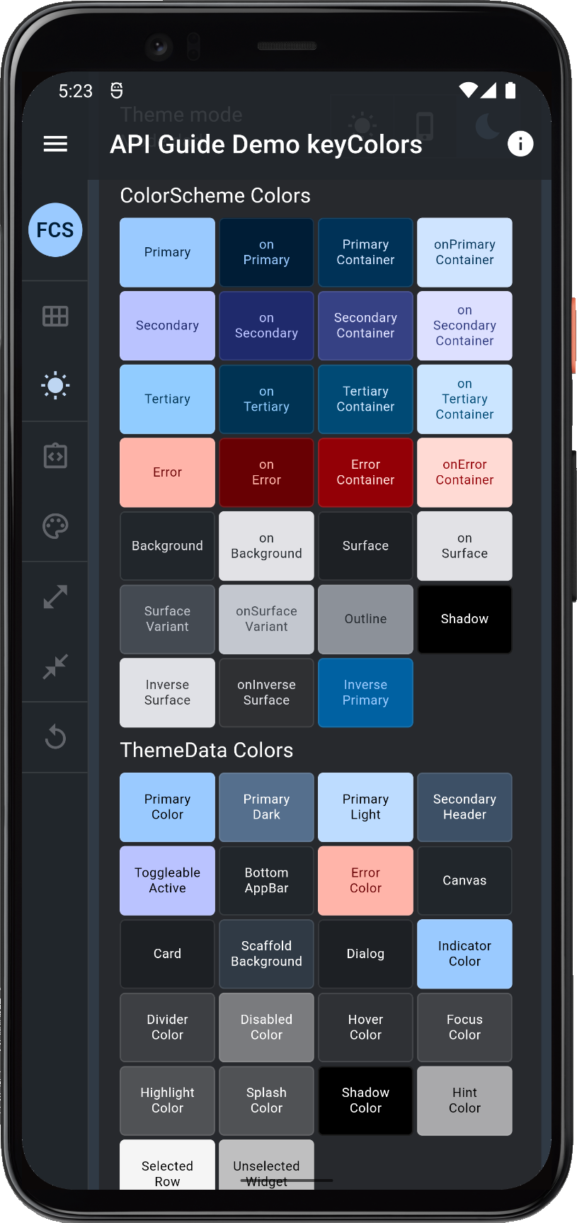 ](https://raw.githubusercontent.com/rydmike/flex_color_scheme_docs/master/docs/images/fcs-v5-api-06-key.png)
 ](https://raw.githubusercontent.com/rydmike/flex_color_scheme_docs/master/docs/images/fcs-v5-api-07-key.png)
 ](https://raw.githubusercontent.com/rydmike/flex_color_scheme_docs/master/docs/images/fcs-v5-api-08-key.png)
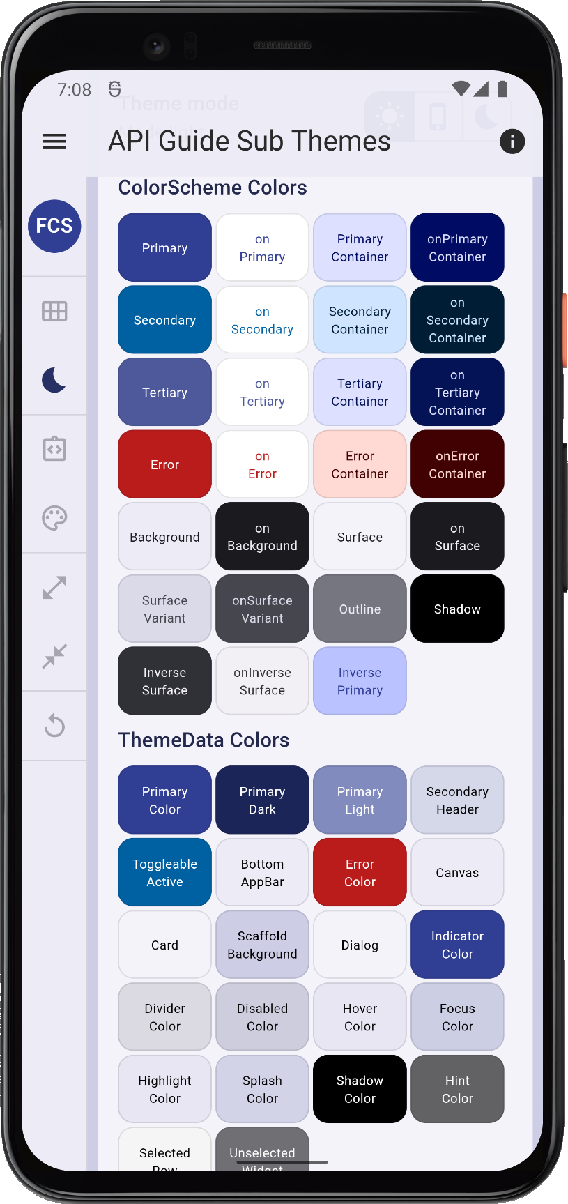 ](https://raw.githubusercontent.com/rydmike/flex_color_scheme_docs/master/docs/images/fcs-v5-api-09-sub.png)
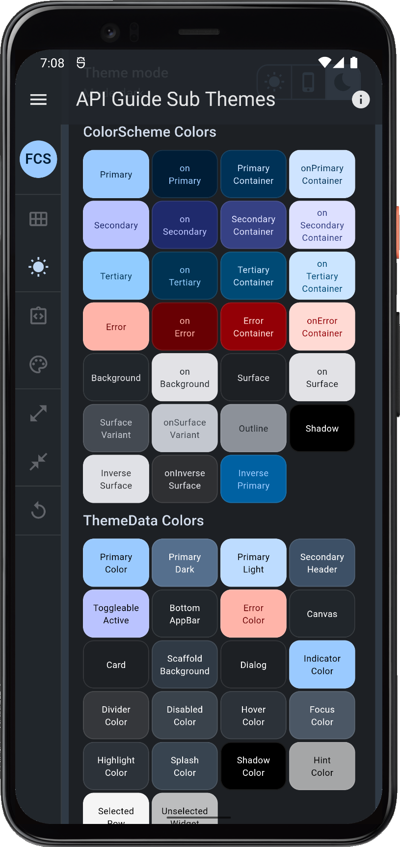 ](https://raw.githubusercontent.com/rydmike/flex_color_scheme_docs/master/docs/images/fcs-v5-api-10-sub.png)
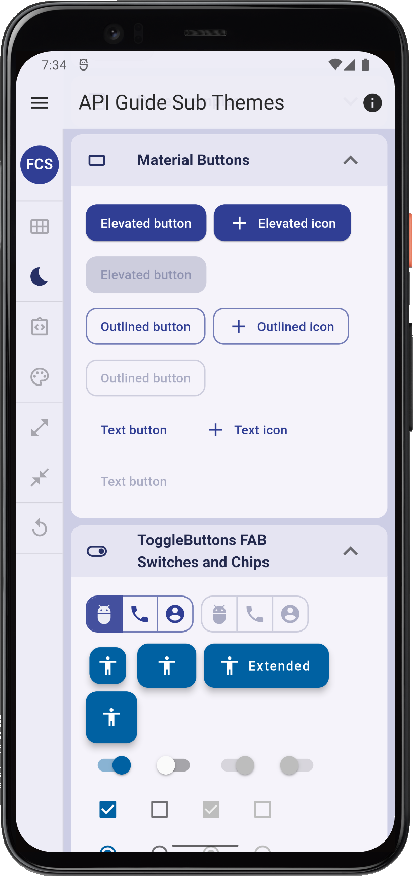 ](https://raw.githubusercontent.com/rydmike/flex_color_scheme_docs/master/docs/images/fcs-v5-api-11-sub.png)
 ](https://raw.githubusercontent.com/rydmike/flex_color_scheme_docs/master/docs/images/fcs-v5-api-12-sub.png)