 ](https://rydmike.com/assets_fcsv4/fcs_phone_ex5ad.png)
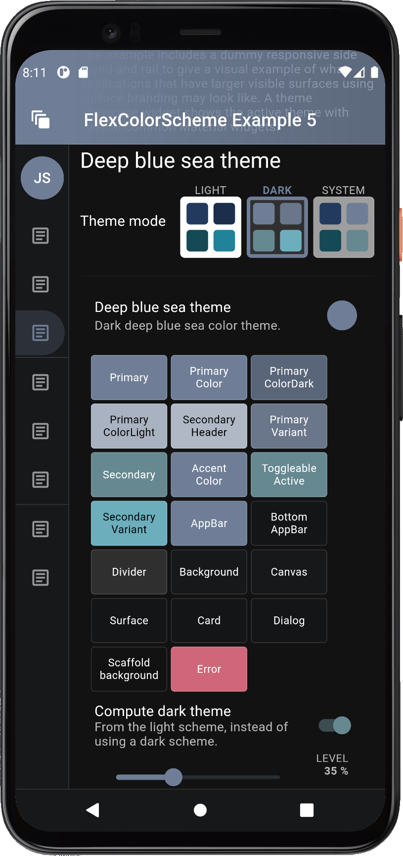 ](https://rydmike.com/assets_fcsv4/fcs_phone_ex5ad-to-black.png)
 Using the switch is simple, give it the currently selected and active theme mode, the current `FlexSchemeData` scheme, so it can color its buttons correctly. Then use the `onThemeModeChanged` callback for changes to its mode, and change the `themeMode` property in the `MaterialApp` accordingly, to actually change the used theme mode.
```dart
FlexThemeModeSwitch(
themeMode: themeMode,
onThemeModeChanged: onThemeModeChanged,
flexSchemeData: flexSchemeData,
),
```
Using the `FlexThemeModeSwitch` 3-way theme mode switch is optional and not required to use `FlexColorScheme` based themes. It is just a custom theme mode switch design and was included as a bonus feature in the `FlexColorScheme` package. It was added based on a request after it had been observed in the wild in the old **Flexfold** demo app.
In the **Flexfold** demo app, the switch was originally a fairly fixed design. This `FlexThemeModeSwitch` has many properties that allow you to customize it extensively. You can find its [API reference here](https://pub.dev/documentation/flex_color_scheme/latest/flex_color_scheme/FlexThemeModeSwitch-class.html) and its companion, the `FlexThemeModeOptionButton` [API reference here](https://pub.dev/documentation/flex_color_scheme/latest/flex_color_scheme/FlexThemeModeOptionButton-class.html). With the API you can customize the look of the `FlexThemeModeSwitch`, here are some examples:
Using the switch is simple, give it the currently selected and active theme mode, the current `FlexSchemeData` scheme, so it can color its buttons correctly. Then use the `onThemeModeChanged` callback for changes to its mode, and change the `themeMode` property in the `MaterialApp` accordingly, to actually change the used theme mode.
```dart
FlexThemeModeSwitch(
themeMode: themeMode,
onThemeModeChanged: onThemeModeChanged,
flexSchemeData: flexSchemeData,
),
```
Using the `FlexThemeModeSwitch` 3-way theme mode switch is optional and not required to use `FlexColorScheme` based themes. It is just a custom theme mode switch design and was included as a bonus feature in the `FlexColorScheme` package. It was added based on a request after it had been observed in the wild in the old **Flexfold** demo app.
In the **Flexfold** demo app, the switch was originally a fairly fixed design. This `FlexThemeModeSwitch` has many properties that allow you to customize it extensively. You can find its [API reference here](https://pub.dev/documentation/flex_color_scheme/latest/flex_color_scheme/FlexThemeModeSwitch-class.html) and its companion, the `FlexThemeModeOptionButton` [API reference here](https://pub.dev/documentation/flex_color_scheme/latest/flex_color_scheme/FlexThemeModeOptionButton-class.html). With the API you can customize the look of the `FlexThemeModeSwitch`, here are some examples:
 The `FlexThemeModeOptionButton` is typically used by the `FlexThemeModeSwitch`, but it can also be used as a part of other theme related indicator widgets. Like the scrolling horizontal list used in example 5, where it is used as a theme indicator and selector in a horizontal scrolling list.
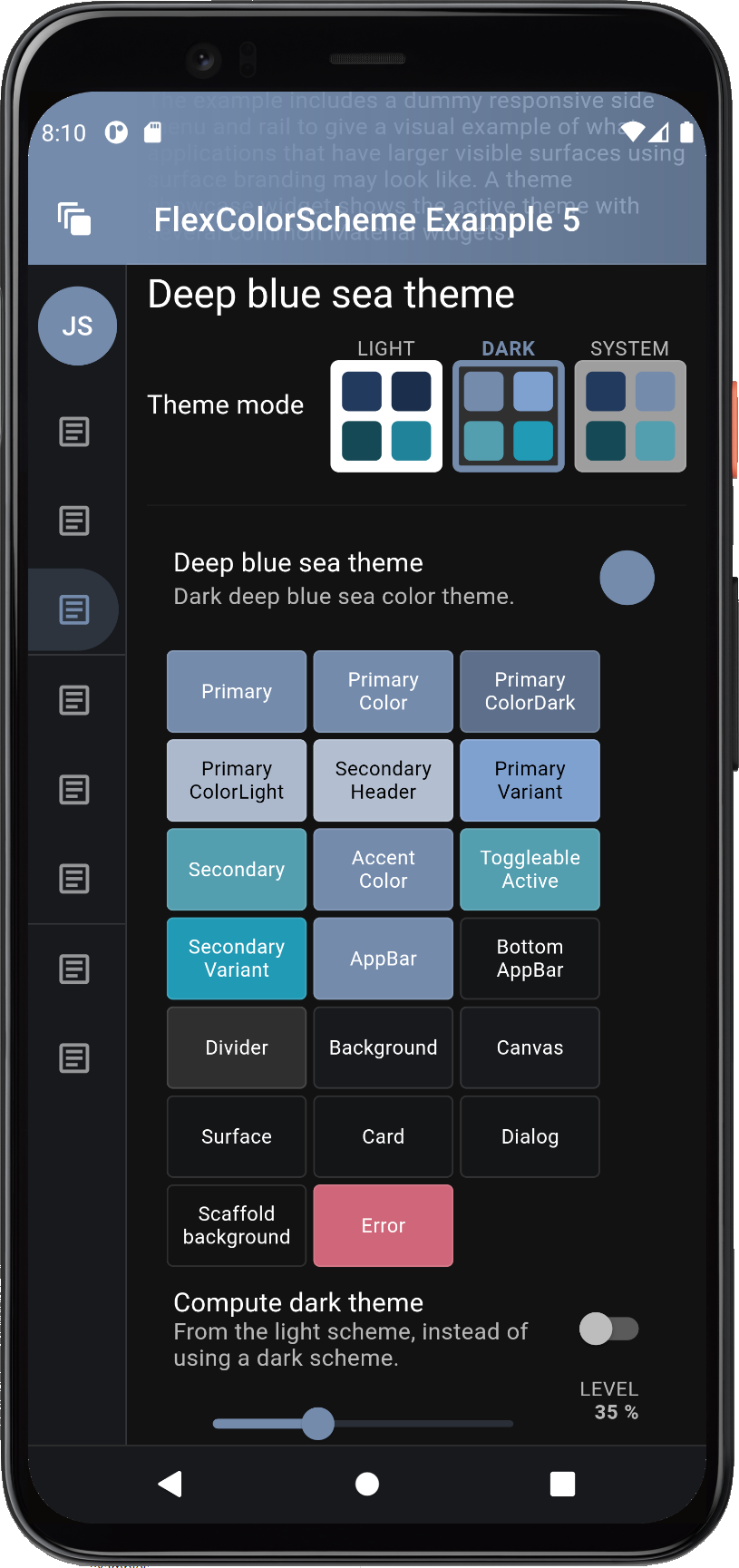
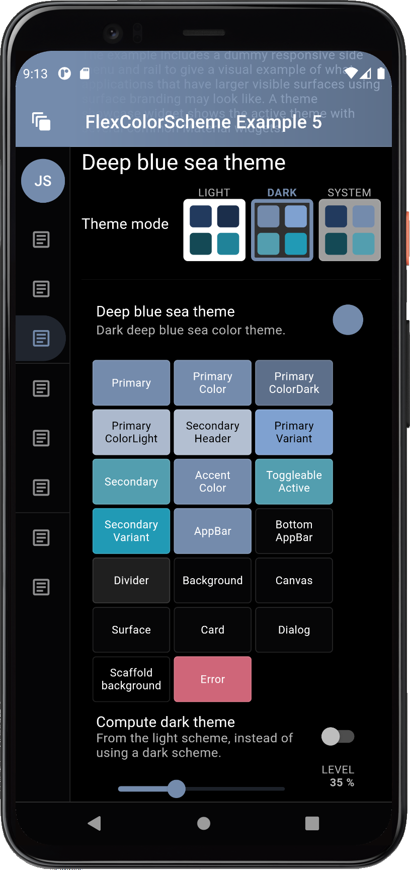
 ## Computed Dark Theme
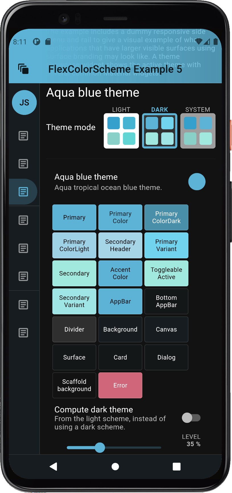
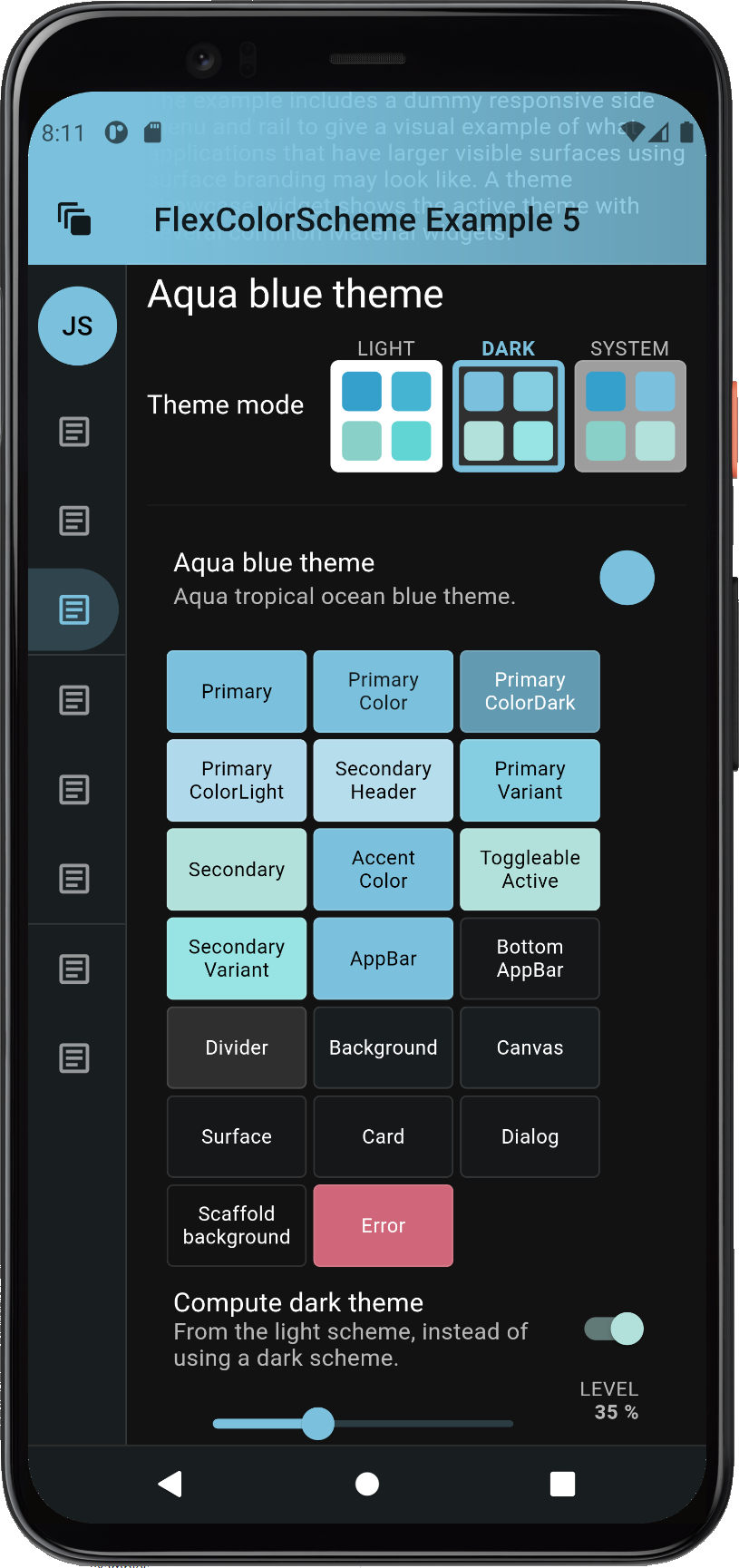
Example 5 allows us to toggle the dark mode, from using its hand-tuned predefined dark scheme colors, to the dark scheme colors computed from the light scheme colors. Let's use it to compare some examples.
When using the **Deep blue sea** scheme, the computed dark theme colors are a bit more dull and muted in this example. The computed dark scheme is on the right.
## Computed Dark Theme
Example 5 allows us to toggle the dark mode, from using its hand-tuned predefined dark scheme colors, to the dark scheme colors computed from the light scheme colors. Let's use it to compare some examples.
When using the **Deep blue sea** scheme, the computed dark theme colors are a bit more dull and muted in this example. The computed dark scheme is on the right.
| [](https://rydmike.com/assets_fcsv4/fcs_phone_ex5ad.png) |
[](https://rydmike.com/assets_fcsv4/fcs_phone_ex5ad-to-black.png) |
|
| _Designed dark **Deep blue see** theme (left) versus computed dark theme (right) from its light theme._ | ||
[ ](https://rydmike.com/assets_fcsv4/fcs_phone_ex5a2d.png) ](https://rydmike.com/assets_fcsv4/fcs_phone_ex5a2d.png) |
[ ](https://rydmike.com/assets_fcsv4/fcs_phone_ex5a2d-to-black.png) ](https://rydmike.com/assets_fcsv4/fcs_phone_ex5a2d-to-black.png) |
|
| _Designed dark **Aqua blue** theme (left) versus computed dark theme (right) from its light theme._ | ||
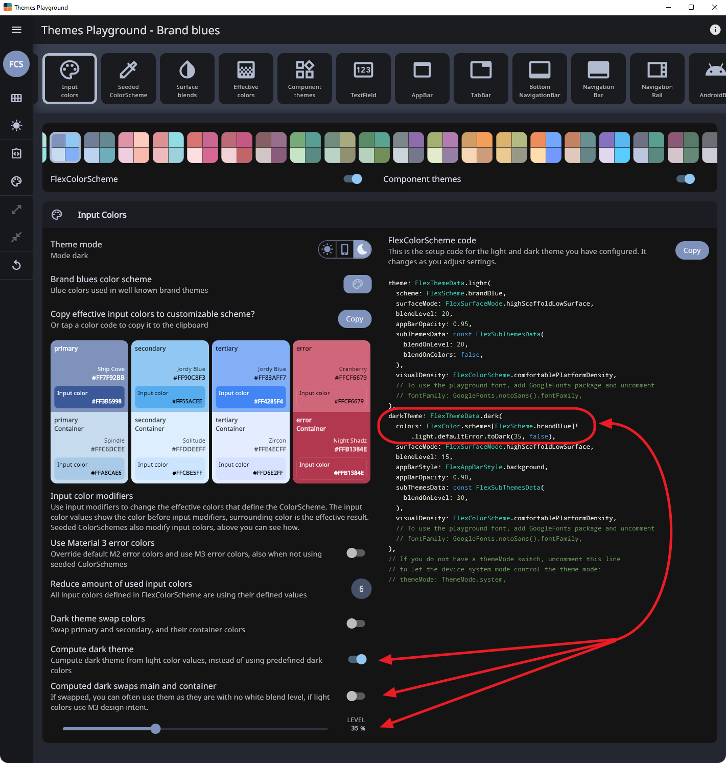
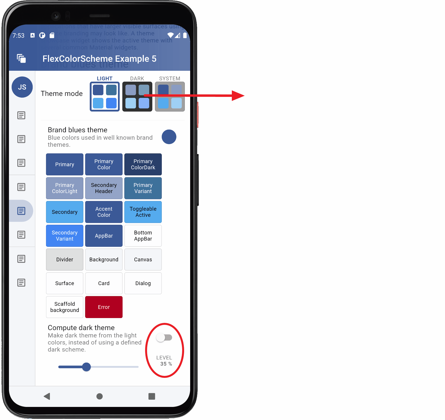 So that you can find the same setup in the new version 5 of the **Themes Playground**, here is an image of it when using the same `brandBlue` scheme and computing the dark theme from light one at level 35%. You can see the code in the image too. The key part is this:
```dart
darkTheme: FlexThemeData.dark(
colors: FlexColor.schemes[FlexScheme.brandBlue]!
.light.defaultError.toDark(35, false),
```
[
So that you can find the same setup in the new version 5 of the **Themes Playground**, here is an image of it when using the same `brandBlue` scheme and computing the dark theme from light one at level 35%. You can see the code in the image too. The key part is this:
```dart
darkTheme: FlexThemeData.dark(
colors: FlexColor.schemes[FlexScheme.brandBlue]!
.light.defaultError.toDark(35, false),
```
[ ](https://raw.githubusercontent.com/rydmike/flex_color_scheme_docs/master/docs/images/fcs-v5-deep-01-toDark.png)
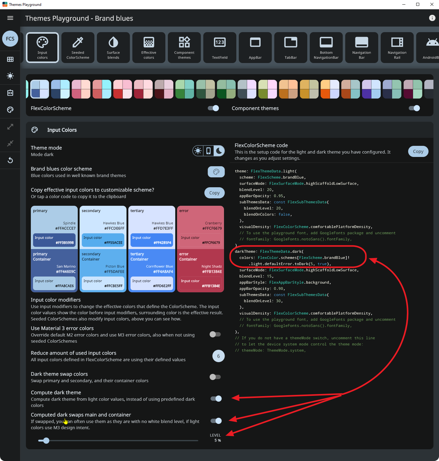
In FlexColorScheme V5 that has container colors for each main color in the `ColorScheme`, a new way to produce the computed dark mode colors was added. If you for your dark mode, swap main and container colors, the colors will usually work well as they are in dark mode, at least if you followed the design principle for the main color and its container color in light theme mode.
You can then pass 'true' to the toDark method, indicating you have a "true" M3 light theme mode ColorScheme design. The `toDark` computation will swap the colors from the light mode colors and use it as a starting point for the dark theme mode. This also produces a more design correct dark mode, with respect to the shade tones used on the main color and its container color. You may not even need to add any white blend level to desaturate the colors. Below, we use 5% to demonstrate that you can.
```dart
darkTheme: FlexThemeData.dark(
colors: FlexColor.schemes[FlexScheme.brandBlue]!
.light.defaultError.toDark(5, true),
```
[
](https://raw.githubusercontent.com/rydmike/flex_color_scheme_docs/master/docs/images/fcs-v5-deep-01-toDark.png)
In FlexColorScheme V5 that has container colors for each main color in the `ColorScheme`, a new way to produce the computed dark mode colors was added. If you for your dark mode, swap main and container colors, the colors will usually work well as they are in dark mode, at least if you followed the design principle for the main color and its container color in light theme mode.
You can then pass 'true' to the toDark method, indicating you have a "true" M3 light theme mode ColorScheme design. The `toDark` computation will swap the colors from the light mode colors and use it as a starting point for the dark theme mode. This also produces a more design correct dark mode, with respect to the shade tones used on the main color and its container color. You may not even need to add any white blend level to desaturate the colors. Below, we use 5% to demonstrate that you can.
```dart
darkTheme: FlexThemeData.dark(
colors: FlexColor.schemes[FlexScheme.brandBlue]!
.light.defaultError.toDark(5, true),
```
[ ](https://raw.githubusercontent.com/rydmike/flex_color_scheme_docs/master/docs/images/fcs-v5-deep-02-toDark.png)
If your light theme mode colors follow the M3 design intent, then always use the `toDark(level, true)` API. If you on the other have colors that are designed with older M2 design intent, then using `toDark(level)` as before, which defaults to `toDark(level, false)` is usually a better choice.
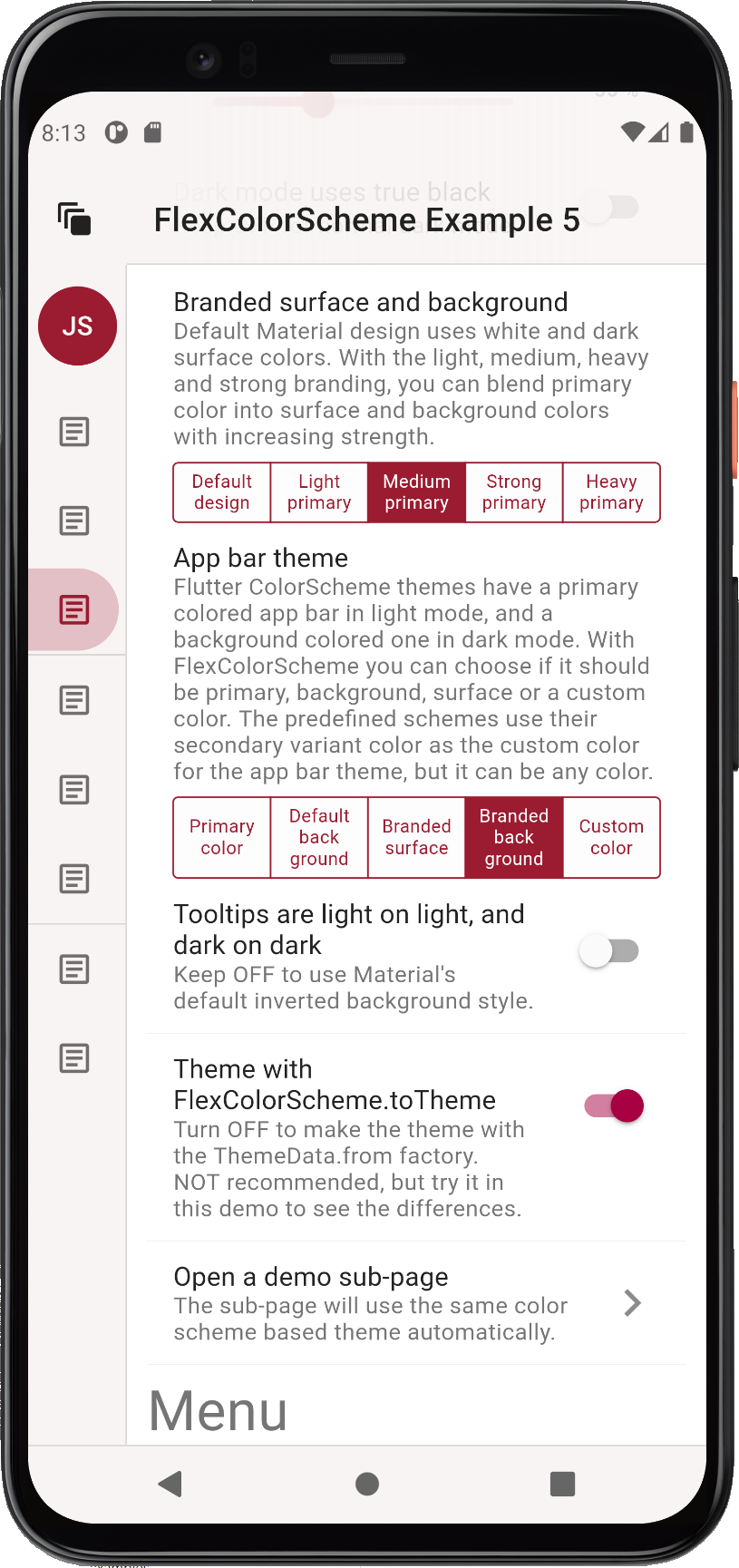
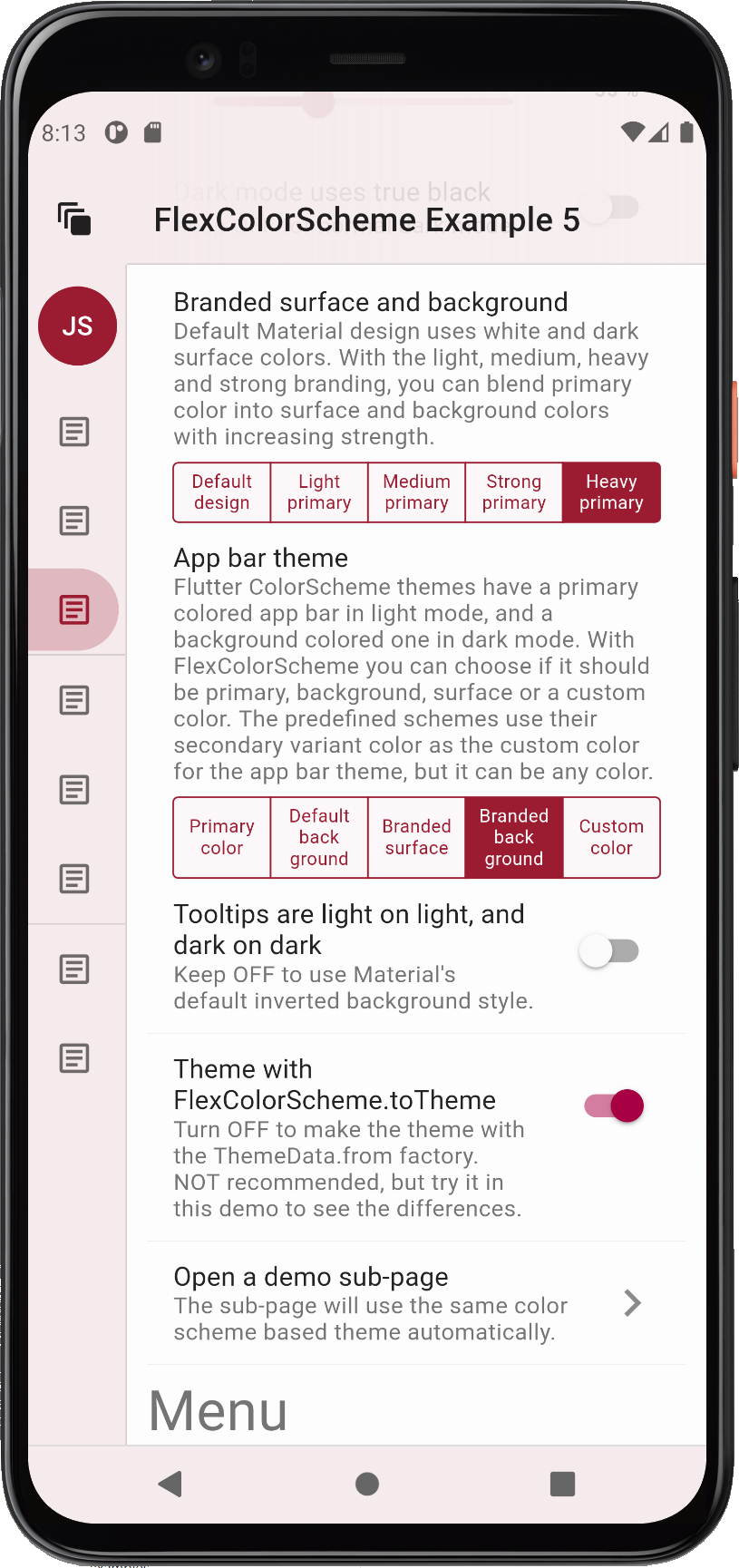
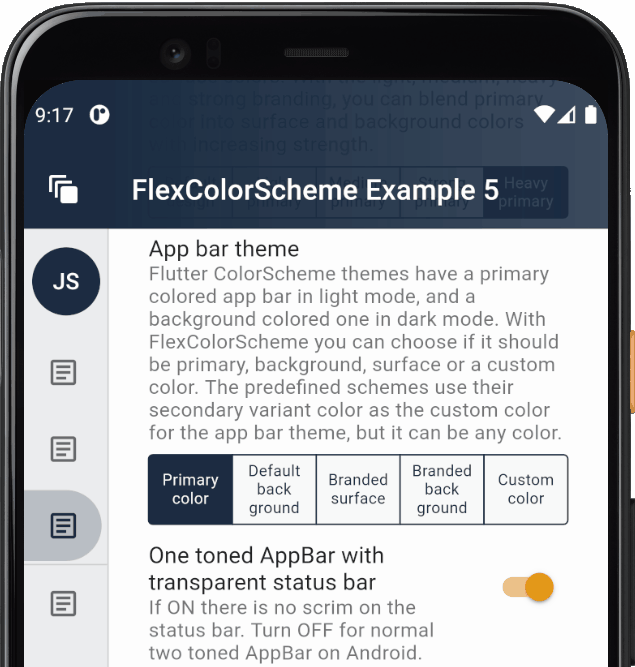
## Convenient AppBar Theming
Let's study what `FlexColorScheme` can do with the `AppBarTheme` and how you can match it to your surface blending if you like.
You can easily toggle both dark and light mode AppBars to use differently themed backgrounds. By default, Material design uses AppBars with `ColorScheme.primary` color for light theme mode, and the dark background color in dark theme mode. Without using a separately defined sub `AppBarTheme`, **FlexColorScheme** AppBars can use different themed backgrounds based on an enum value.
The themed `AppBar` background can use scheme primary color, default Material plain white/dark background color, primary branded surface, primary branded background color, or a custom AppBar color.
The `FlexColorScheme` scheme's `appBarColor` is a separate scheme color that does not exist in Flutter's standard `ColorScheme`, so it does not have to be any of the colors available in a `ColorScheme`.
The predefined schemes use the color defined in a `ColorScheme` scheme's `tertiary` color, as their value for the custom `appBarColor`. When you make your own schemes, you can do the same or use a totally none `ColorScheme` related color as the AppBar's custom color option. This color then becomes one of the FlexColorScheme's easy selectable AppBar theme color options, via the `appBarStyle` property and the `FlexAppBarStyle` enum, in this case via the `custom` choice.
Below, you can see some different primary color blend level using background colors used as the themed AppBar background color.
](https://raw.githubusercontent.com/rydmike/flex_color_scheme_docs/master/docs/images/fcs-v5-deep-02-toDark.png)
If your light theme mode colors follow the M3 design intent, then always use the `toDark(level, true)` API. If you on the other have colors that are designed with older M2 design intent, then using `toDark(level)` as before, which defaults to `toDark(level, false)` is usually a better choice.
## Convenient AppBar Theming
Let's study what `FlexColorScheme` can do with the `AppBarTheme` and how you can match it to your surface blending if you like.
You can easily toggle both dark and light mode AppBars to use differently themed backgrounds. By default, Material design uses AppBars with `ColorScheme.primary` color for light theme mode, and the dark background color in dark theme mode. Without using a separately defined sub `AppBarTheme`, **FlexColorScheme** AppBars can use different themed backgrounds based on an enum value.
The themed `AppBar` background can use scheme primary color, default Material plain white/dark background color, primary branded surface, primary branded background color, or a custom AppBar color.
The `FlexColorScheme` scheme's `appBarColor` is a separate scheme color that does not exist in Flutter's standard `ColorScheme`, so it does not have to be any of the colors available in a `ColorScheme`.
The predefined schemes use the color defined in a `ColorScheme` scheme's `tertiary` color, as their value for the custom `appBarColor`. When you make your own schemes, you can do the same or use a totally none `ColorScheme` related color as the AppBar's custom color option. This color then becomes one of the FlexColorScheme's easy selectable AppBar theme color options, via the `appBarStyle` property and the `FlexAppBarStyle` enum, in this case via the `custom` choice.
Below, you can see some different primary color blend level using background colors used as the themed AppBar background color.
[ ](https://rydmike.com/assets_fcsv4/fcs_phone_ex5dl.png) ](https://rydmike.com/assets_fcsv4/fcs_phone_ex5dl.png) |
[ ](https://rydmike.com/assets_fcsv4/fcs_phone_ex5el.png) ](https://rydmike.com/assets_fcsv4/fcs_phone_ex5el.png) |
[ ](https://rydmike.com/assets_fcsv4/fcs_phone_ex5fl.png) ](https://rydmike.com/assets_fcsv4/fcs_phone_ex5fl.png) |
[ ](https://rydmike.com/assets_fcsv4/fcs_phone_ex5gl.png) ](https://rydmike.com/assets_fcsv4/fcs_phone_ex5gl.png) |
|||
| _Using background colored AppBar theme, that includes the primary color blend at different levels in the background_ | ||||||
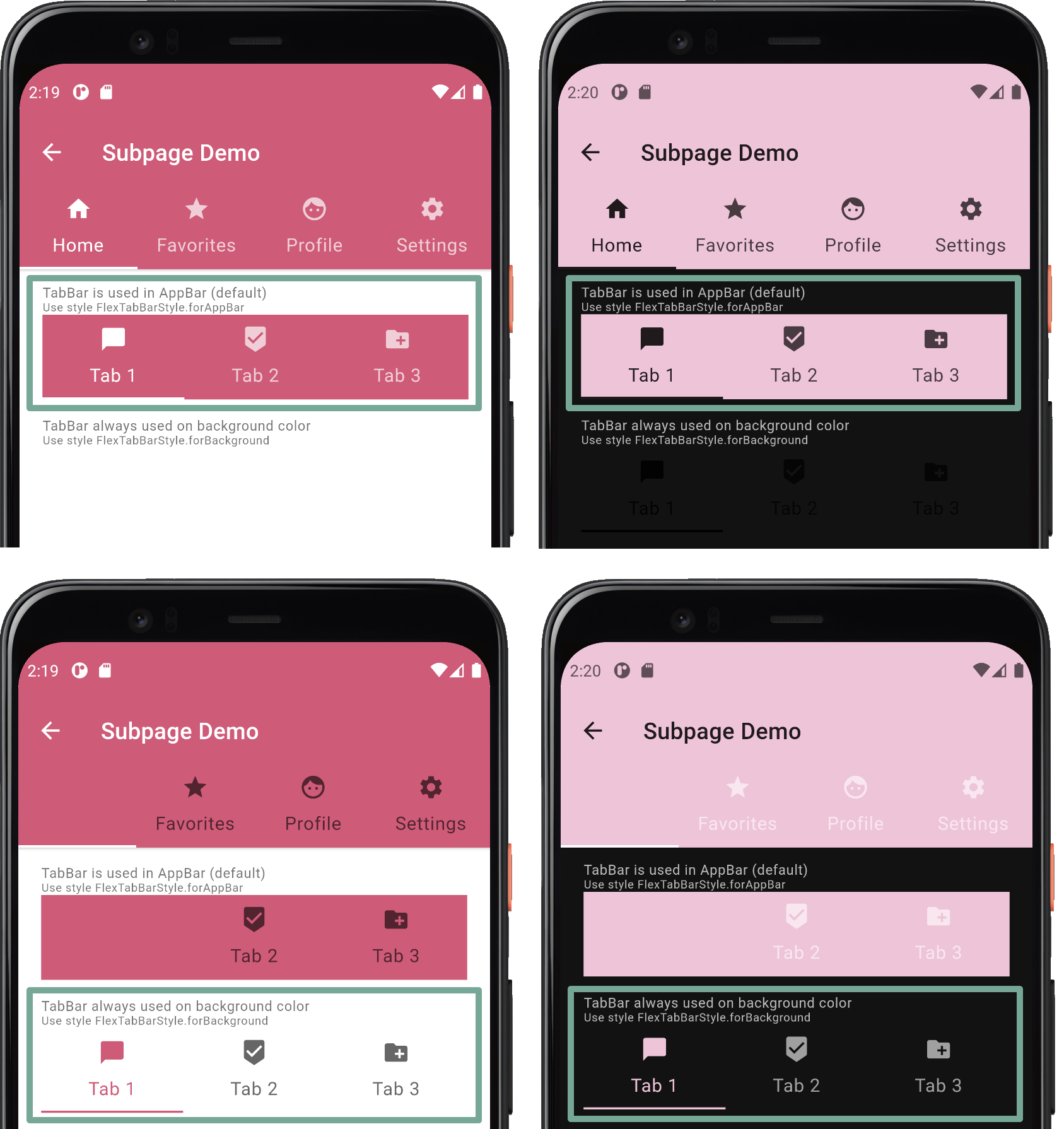 ](https://rydmike.com/assets_fcsv4/TabBar-on-primary.png)
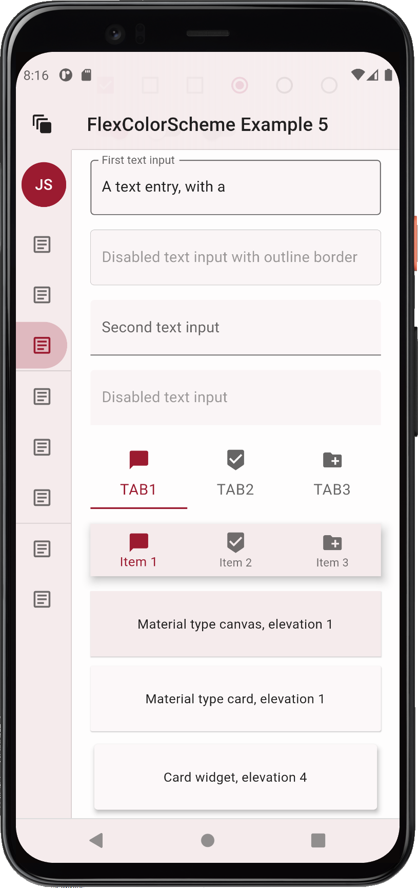
If you plan to use only surface or background (also the branded ones) colored AppBars, you can see that both TabBar styles, and their resulting themes, work for both situations. The difference is minor, and it is a matter of opinion which one is preferable. Both style options can be used if you restrict your AppBar color to background and surface colors, or their primary branded variants. In such a use case, you can use just one of the built-in style options, even when you use TabBars in the AppBar and on other surfaces.
[
](https://rydmike.com/assets_fcsv4/TabBar-on-primary.png)
If you plan to use only surface or background (also the branded ones) colored AppBars, you can see that both TabBar styles, and their resulting themes, work for both situations. The difference is minor, and it is a matter of opinion which one is preferable. Both style options can be used if you restrict your AppBar color to background and surface colors, or their primary branded variants. In such a use case, you can use just one of the built-in style options, even when you use TabBars in the AppBar and on other surfaces.
[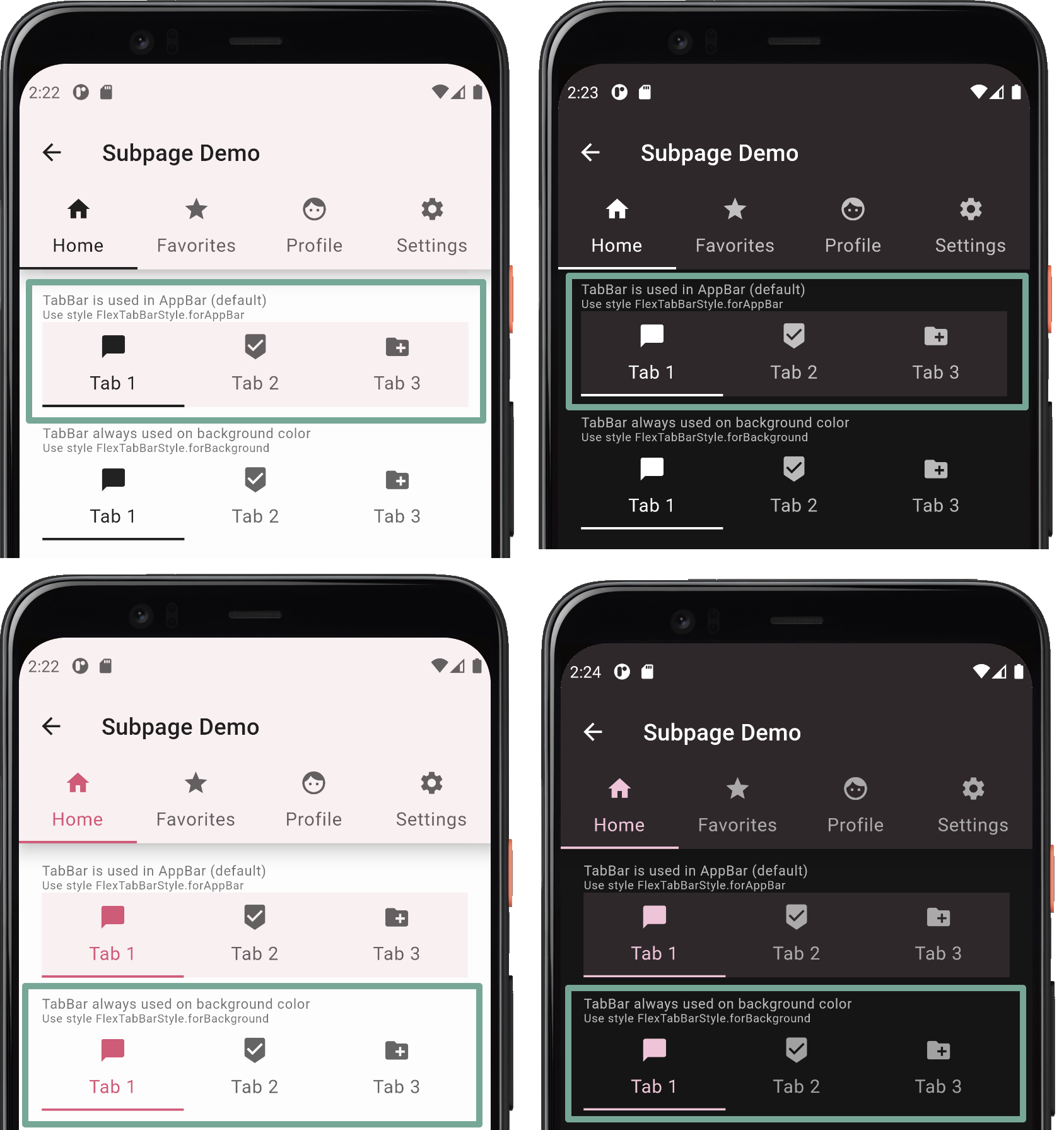 ](https://rydmike.com/assets_fcsv4/TabBar-on-surface.png)
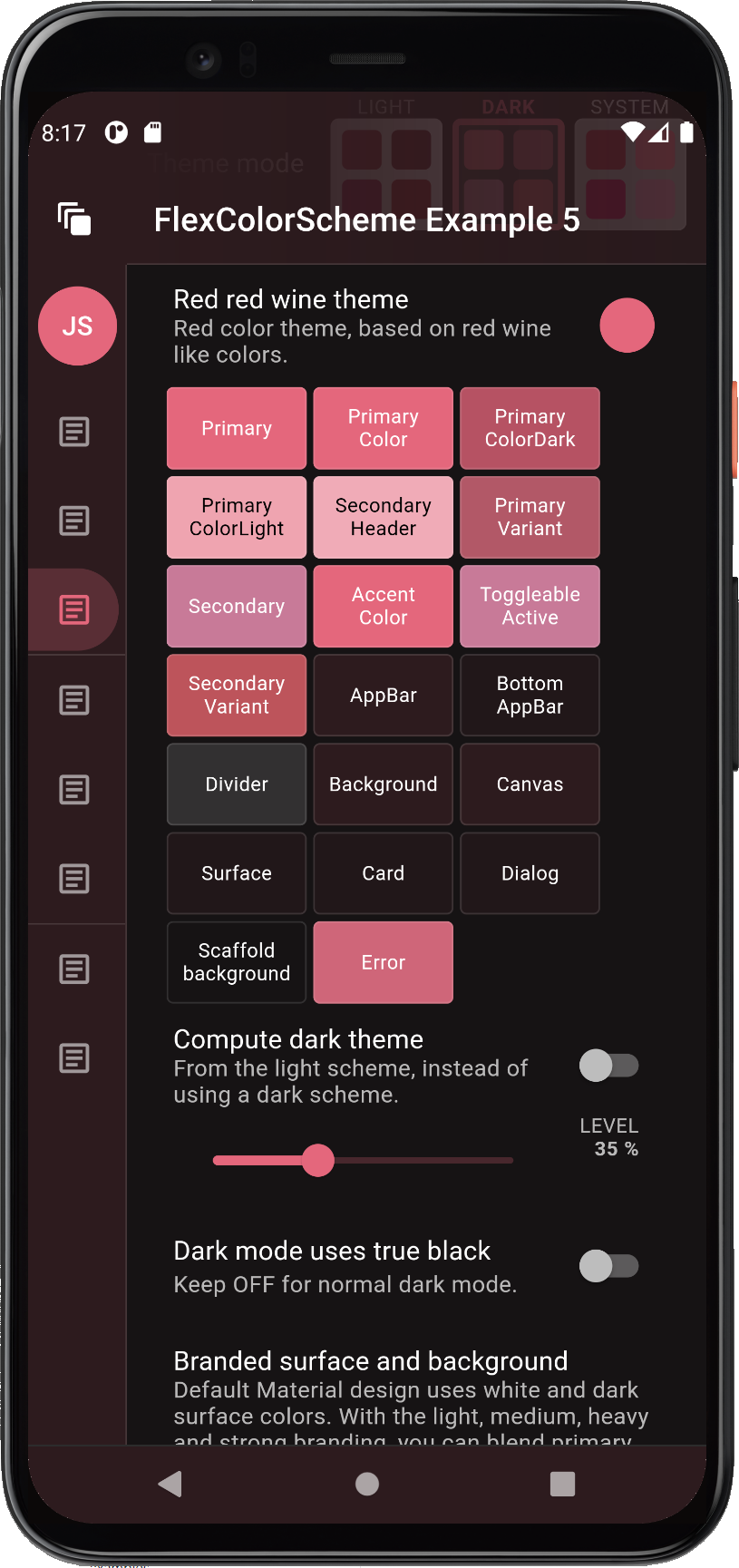
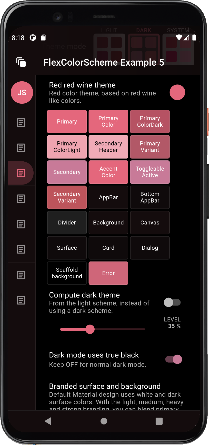
## True Black
Dark-mode is cool and with `FlexColorScheme` you can go even darker. Go **true black** with the flick of a switch. When using the true black option for dark-mode, surface, background and scaffold background are set to fully black. This can save power on OLED screens as the pixels are turned off, but it can also cause scrolling artefact issues when pixels turn fully on and off rapidly as you scroll. You can read about this and see an example of it in the [Material design guide](https://material.io/design/color/dark-theme.html#ui-application) as well. Scroll back up one heading from the link to get to the mention of it.
If you use surface blends with true black mode enabled, you will notice that the surface blends have a lower impact, only at higher blend levels does it have a visible effect. This is by design to keep most surfaces totally or very close to black when true black is combined with surface blends. If you really want complete black for all surfaces and backgrounds, then avoid combining the true black mode with blended surfaces. On the other hand, it still makes a much darker theme than the normal dark theme, which can look nice. It may also eliminate the scrolling issue, since all background colored pixels are not fully off in the true black modes when you use higher blend levels.
Here is an example of a branded dark theme with true black OFF (default) and true black ON, when using high surface blend level with the **Red red wine** color scheme.
](https://rydmike.com/assets_fcsv4/TabBar-on-surface.png)
## True Black
Dark-mode is cool and with `FlexColorScheme` you can go even darker. Go **true black** with the flick of a switch. When using the true black option for dark-mode, surface, background and scaffold background are set to fully black. This can save power on OLED screens as the pixels are turned off, but it can also cause scrolling artefact issues when pixels turn fully on and off rapidly as you scroll. You can read about this and see an example of it in the [Material design guide](https://material.io/design/color/dark-theme.html#ui-application) as well. Scroll back up one heading from the link to get to the mention of it.
If you use surface blends with true black mode enabled, you will notice that the surface blends have a lower impact, only at higher blend levels does it have a visible effect. This is by design to keep most surfaces totally or very close to black when true black is combined with surface blends. If you really want complete black for all surfaces and backgrounds, then avoid combining the true black mode with blended surfaces. On the other hand, it still makes a much darker theme than the normal dark theme, which can look nice. It may also eliminate the scrolling issue, since all background colored pixels are not fully off in the true black modes when you use higher blend levels.
Here is an example of a branded dark theme with true black OFF (default) and true black ON, when using high surface blend level with the **Red red wine** color scheme.
[ ](https://rydmike.com/assets_fcsv4/fcs_phone_ex5cd.png) ](https://rydmike.com/assets_fcsv4/fcs_phone_ex5cd.png) |
[ ](https://rydmike.com/assets_fcsv4/fcs_phone_ex5bd.png) ](https://rydmike.com/assets_fcsv4/fcs_phone_ex5bd.png) |
|
| _Comparing true black OFF (left) and ON (right), with the **Red red wine** scheme._ | ||
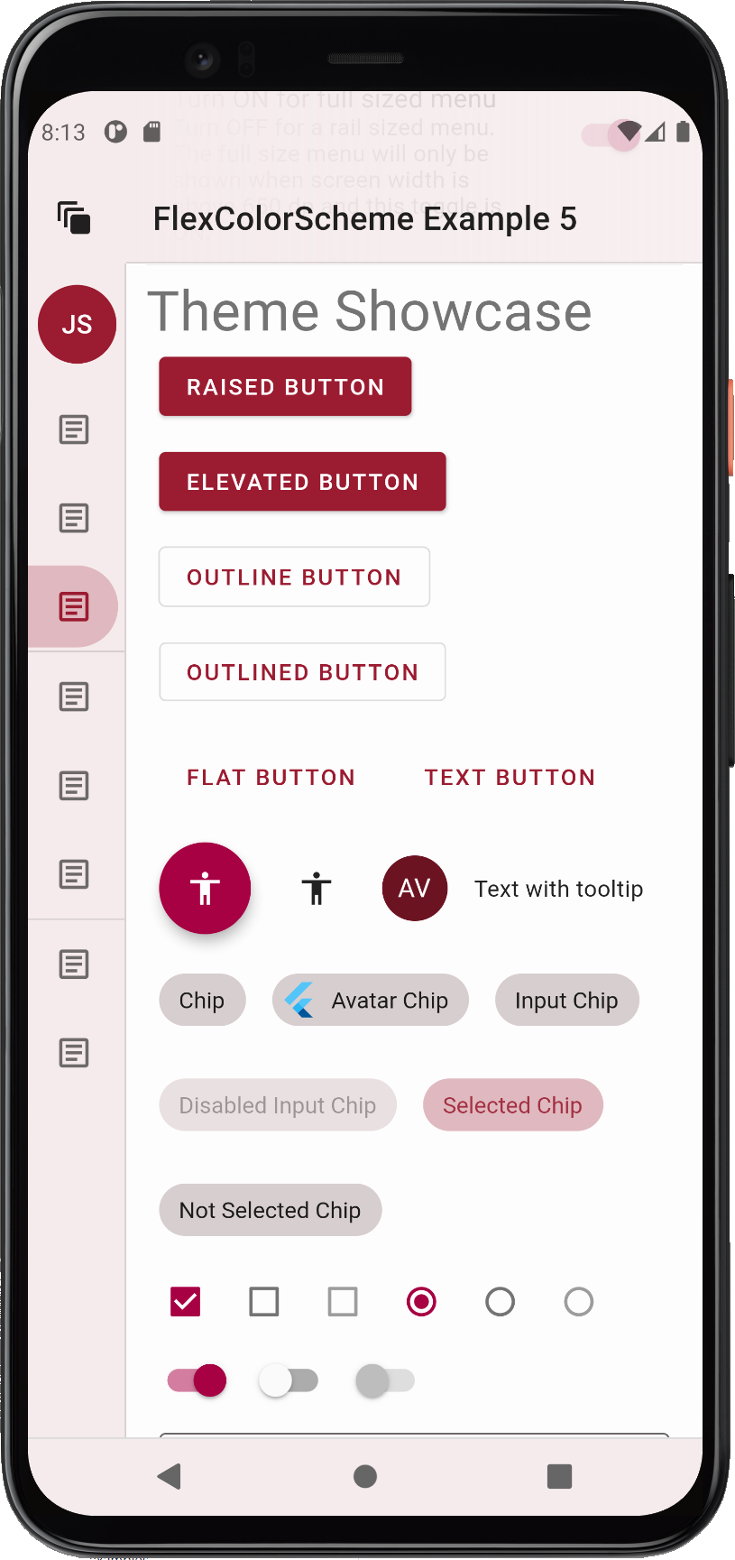
| [](https://rydmike.com/assets_fcsv4/fcs_phone_ex5ad.png) |
[ ](https://rydmike.com/assets_fcsv4/fcs_phone_ex5ad-true-black.png) ](https://rydmike.com/assets_fcsv4/fcs_phone_ex5ad-true-black.png) |
|
| _Comparing true black OFF (left) and ON (right), with the **Deep blue sea** scheme._ | ||
[ ](https://rydmike.com/assets_fcsv4/FlexSchemeAppBar.gif) ](https://rydmike.com/assets_fcsv4/FlexSchemeAppBar.gif) |
[ ](https://rydmike.com/assets_fcsv4/FlexSchemeNavBar.gif) ](https://rydmike.com/assets_fcsv4/FlexSchemeNavBar.gif) |
|
| _Changing Android system status bar and navigation bar._ | ||
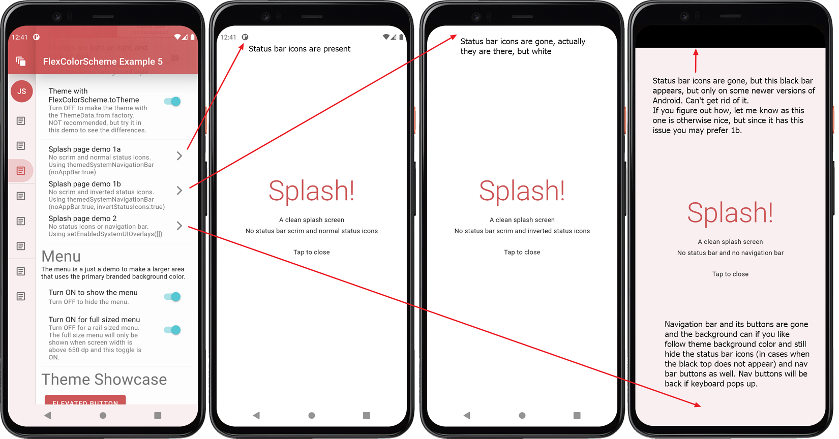 ](https://rydmike.com/assets_fcsv4/FlexColorScheme-Splash-half-Size.png)
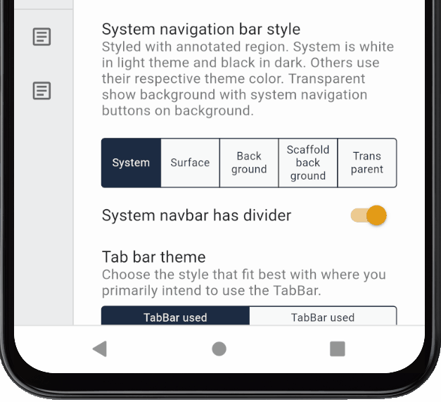
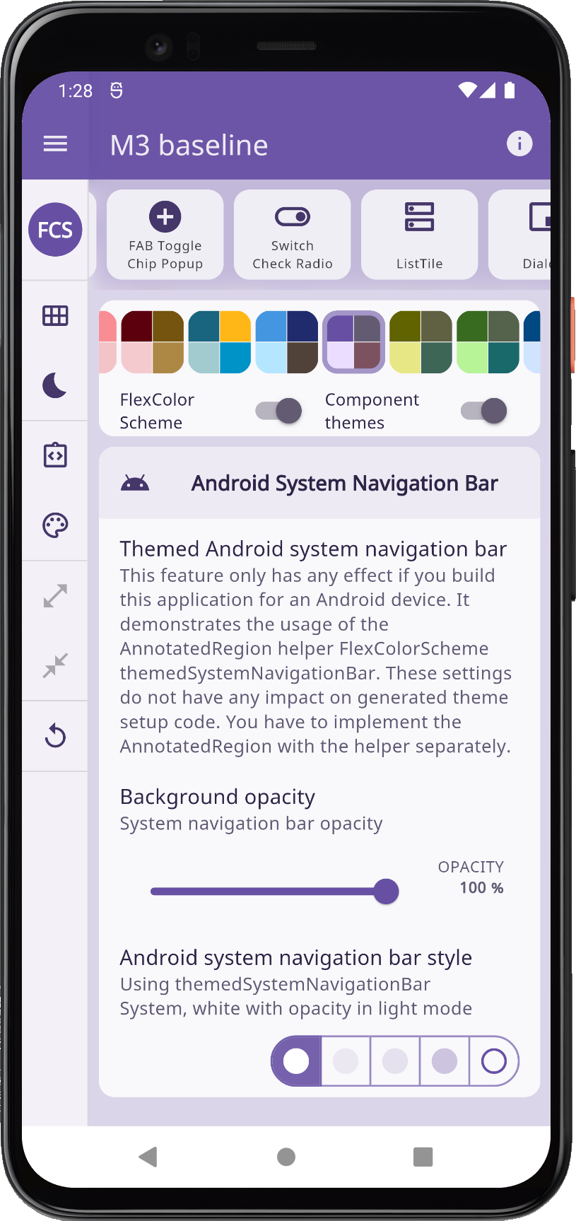
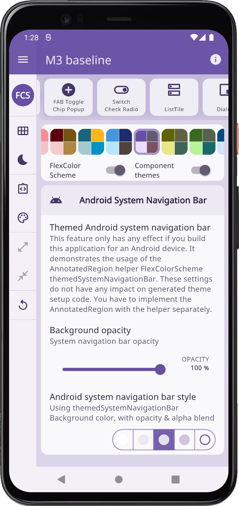
### Transparent System Navigation Bar
FlexColorScheme V4 added full support for transparent system navigation bar for **Android SDK** >= 29 (Android 10). The support is added via the [opacity](https://pub.dev/documentation/flex_color_scheme/latest/flex_color_scheme/FlexColorScheme/themedSystemNavigationBar.html) property in `FlexColorScheme.themedSystemNavigationBar`. Use and support for the opacity value on the system navigation bar is supported starting from Flutter 2.5. This [PR 28616](https://github.com/flutter/engine/pull/28616) amends it a bit and limits its functionality to Android SDK >= 29.
Examples 1 to 4 do not use the transparent or themed system navigation bar feature, but example 5, the **Themes Playground**, the **Copy Playground** and the default example, the **Hot Reload Playground** apps do. If you build them on an Android device, you can see it working if you use a device with the appropriate Android API level that supports it.
If you build example 5, the **Themes Playground** on an Android device, you can test it with the playground. With it, you can modify the settings interactively, just as theme settings in the Playground app. Set it to a themed background color to try it with colors from active theme, use partially, and even a fully transparent Android system navigation. You can adjust the settings using the "Android System Navigation Bar" panel. These settings are not a part of the theme setup that can be copied, since the required setup is not in ThemeData. You will have to add support for this manually in your app, by adding it to your widget tree.
](https://rydmike.com/assets_fcsv4/FlexColorScheme-Splash-half-Size.png)
### Transparent System Navigation Bar
FlexColorScheme V4 added full support for transparent system navigation bar for **Android SDK** >= 29 (Android 10). The support is added via the [opacity](https://pub.dev/documentation/flex_color_scheme/latest/flex_color_scheme/FlexColorScheme/themedSystemNavigationBar.html) property in `FlexColorScheme.themedSystemNavigationBar`. Use and support for the opacity value on the system navigation bar is supported starting from Flutter 2.5. This [PR 28616](https://github.com/flutter/engine/pull/28616) amends it a bit and limits its functionality to Android SDK >= 29.
Examples 1 to 4 do not use the transparent or themed system navigation bar feature, but example 5, the **Themes Playground**, the **Copy Playground** and the default example, the **Hot Reload Playground** apps do. If you build them on an Android device, you can see it working if you use a device with the appropriate Android API level that supports it.
If you build example 5, the **Themes Playground** on an Android device, you can test it with the playground. With it, you can modify the settings interactively, just as theme settings in the Playground app. Set it to a themed background color to try it with colors from active theme, use partially, and even a fully transparent Android system navigation. You can adjust the settings using the "Android System Navigation Bar" panel. These settings are not a part of the theme setup that can be copied, since the required setup is not in ThemeData. You will have to add support for this manually in your app, by adding it to your widget tree.
[ ](https://raw.githubusercontent.com/rydmike/flex_color_scheme_docs/master/docs/images/fcs-v5-tut5-13.png) ](https://raw.githubusercontent.com/rydmike/flex_color_scheme_docs/master/docs/images/fcs-v5-tut5-13.png) |
[ ](https://raw.githubusercontent.com/rydmike/flex_color_scheme_docs/master/docs/images/fcs-v5-tut5-15.png) ](https://raw.githubusercontent.com/rydmike/flex_color_scheme_docs/master/docs/images/fcs-v5-tut5-15.png) |
[ ](https://raw.githubusercontent.com/rydmike/flex_color_scheme_docs/master/docs/images/fcs-v5-tut5-19.png) ](https://raw.githubusercontent.com/rydmike/flex_color_scheme_docs/master/docs/images/fcs-v5-tut5-19.png) |
[ ](https://raw.githubusercontent.com/rydmike/flex_color_scheme_docs/master/docs/images/fcs-v5-tut5-23.png) ](https://raw.githubusercontent.com/rydmike/flex_color_scheme_docs/master/docs/images/fcs-v5-tut5-23.png) |
|||
| _Android System Navigation Bar: Light theme mode white, primary blended ColoScheme.background themed, partially transparent, and fully transparent_ | ||||||