Installing and Using
The Flutter FlexColorScheme package is published in pub.dev and has its open source code in the GitHub flex_color_scheme repository. To use it in your Flutter project, add the flex_color_scheme package to pubspec.yaml:
dart pub add flex_color_scheme or flutter pub add flex_color_scheme
Import the package to use it:
import 'package:flex_color_scheme/flex_color_scheme.dart';
You can now start using FlexColorScheme based color schemes and theming in your application. A quick way to do so is to try one of the 52 built-in themes. They have enum values that you can use to select which one to use as the theme of your application.
The package default example offers a heavily commented code guide on how to use almost every property in FlexColorScheme. The Examples chapter shows you how to try it and the other five tutorial examples.
FlexColorScheme Counter App
Let's first setup FlexColorScheme in the default Flutter counter app. Create a new Flutter project, giving you the default counter app. Add the FlexColorScheme import, after that we change one line of code, and add two lines to enable it in the default counter app.
Here we use the Oh Mandy red color scheme, it is represented by enum value FlexScheme.mandyRed. Set the MaterialApp.themeMode to ThemeMode.system so that the device can control if the app uses its light or dark theme mode. You can then toggle the application's theme mode by changing system theme mode on the used device.
Assign FlexThemeData.light to the app's theme property, which is the application's light theme definition property, and FlexThemeData.dark to darkTheme.
For both FlexThemeData dark and light we set the scheme property to FlexScheme.mandyRed to use the same Oh Mandy red predefined scheme colors in both theme modes. We then get matching light and dark themes based on the built-in scheme's color definitions.
The three line modified MaterialApp, of the Flutter default counter app becomes:
class MyApp extends StatelessWidget {
  const MyApp({Key? key}) : super(key: key);
  @override
  Widget build(BuildContext context) {
    return MaterialApp(
      title: 'Flutter Demo',
      // The Mandy red, light theme.
      theme: FlexThemeData.light(scheme: FlexScheme.mandyRed),
      // The Mandy red, dark theme.
      darkTheme: FlexThemeData.dark(scheme: FlexScheme.mandyRed),
      // Use dark or light theme based on system setting.
      themeMode: ThemeMode.system,
      home: const MyHomePage(title: 'Flutter Demo Home Page'),
    );
  }
}
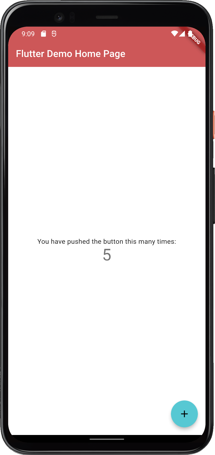
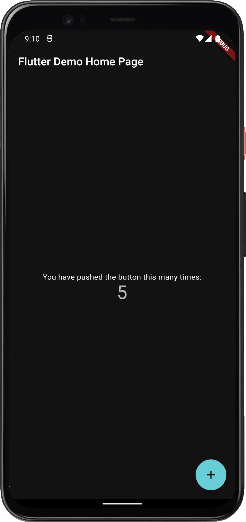
This gives us a counter application that looks like this:
 |  |
| FlexColorScheme applied on the standard Flutter counter template | |
Not as exciting as the images shown on the introduction page. That is because the basic counter app uses very few features and widgets, so it does not present the results very well.
The included examples contain mockup user interface to better demonstrate the results. The used UI demonstration code in the examples is not relevant to using FlexColorScheme, it is only there to present the results.
