3. Four Themes
The third tutorial example shows how we can use three built-in color schemes, add a custom scheme, using the same colors as in example 2. We then use these four color schemes as selectable FlexColorScheme based theme options. The example also uses surface colors with primary color blends.
Additionally, we can activate an option that uses the selected scheme's colors as input to generate a ColorScheme computed by the Material-3 based ColorScheme generation algorithms. We can also turn the opinionated component widget themes ON or OFF.
Only code highlights might be shown below. The complete code of this example can be found here.
ThemeServicePrefs
The main start function of the app is very similar to example 2, but in this case we use another ThemeService implementation, the ThemeServicePrefs version, that will locally persist the theme selection options we make.
The ThemeServicePrefs persistence is based on the popular package SharedPreferences.
We again use the ThemeController, which glues our theme settings to Flutter Widgets. The controller uses an abstract ThemeService interface to get and save the settings. There are 3 concrete implementations available that we can use in these examples.
- ThemeService, abstract interface base class.
- ThemeServiceMem, settings in volatile memory.
- ThemeServicePrefs, persist settings locally using SharedPreferences.
- ThemeServiceHive, persist settings locally using Hive.
In this example we use the ThemeServicePrefs option. These examples are all built using the same example app. If we use SharedPreferences in more than one of them, they would all use the same storage container and share the settings when you build them locally. By using Hive for most examples, we can change the storage container name, for each example. In these demos, the SharedPreferences service is only used in this example. You can swap in the Hive-based one here as well, or SharedPreferences on the other ones too.
These tutorials are not about how to define the used Flutter skeleton style controller, or how to make the abstract service with three different implementations. Still, they do demonstrate with these examples how one can easily swap the used persistence implementation. You can take a peek at the source code of examples 2 to 5, to learn more about how it is done in these examples.
Future<void> main() async {
  WidgetsFlutterBinding.ensureInitialized();
  // Here we use the Shared Preferences theme service.
  final ThemeService themeService = ThemeServicePrefs();
  // Initialize the theme service.
  await themeService.init();
  // Create a ThemeController that uses the ThemeService.
  final ThemeController themeController = ThemeController(themeService);
  // Load preferred theme settings, while the app is loading, before MaterialApp
  // is created, this prevents a theme change when the app is first displayed.
  await themeController.loadAll();
  // Run the app and pass in the ThemeController. The app listens to the
  // ThemeController for changes.
  runApp(DemoApp(themeController: themeController));
}
In this example we use the theme controller to change the themeMode and to toggle opting in and out of FlexColorScheme's opinionated component sub-themes. We also use it to change a number of other settings the ThemeController provides.
Custom Colors
We use the same custom colors as in example 2.
const FlexSchemeData _myFlexScheme = FlexSchemeData(
  name: 'Midnight blue',
  description: 'Midnight blue theme, custom definition of all colors',
  light: FlexSchemeColor(
    primary: Color(0xFF00296B),
    primaryContainer: Color(0xFFA0C2ED),
    secondary: Color(0xFFD26900),
    secondaryContainer: Color(0xFFFFD270),
    tertiary: Color(0xFF5C5C95),
    tertiaryContainer: Color(0xFFC8DBF8),
  ),
  dark: FlexSchemeColor(
    primary: Color(0xFFB1CFF5),
    primaryContainer: Color(0xFF3873BA),
    secondary: Color(0xFFFFD270),
    secondaryContainer: Color(0xFFD26900),
    tertiary: Color(0xFFC9CBFC),
    tertiaryContainer: Color(0xFF535393),
  ),
);
Theme Setup
The ListenableBuilder and MaterialApp setup is as it was in the previous example. New in this example is that we set surfaceMode to FlexSurfaceMode.highSurfaceLowScaffold and blendLevel to 10. This gives us a higher primary color alpha blend level, on the theme's ColorScheme surface color than on its background color, while scaffoldBackgroundColor will use a much lower alpha blend than either of them.
In dark mode we decided to use the inverted surfaceMode blend to this, the highScaffoldLowSurfaces, where surface and background colors have a lower and same primary color alpha blend, in relation to the Scaffold background color. We also set the used blend level a bit higher in dark mode, to 12 in this example.
class DemoApp extends StatelessWidget {
  const DemoApp({Key? key, required this.themeController}) : super(key: key);
  final ThemeController themeController;

  @override
  Widget build(BuildContext context) {
    // Whenever the theme controller notifies the listenable in the
    // ListenableBuilder, the MaterialApp is rebuilt.
    return ListenableBuilder(
      listenable: themeController,
      builder: (BuildContext context, Widget? child) {
        return MaterialApp(
          debugShowCheckedModeBanner: false,
          scrollBehavior: const AppScrollBehavior(),
          title: 'Four Themes',
          theme: FlexThemeData.light(
            useMaterial3: themeController.useMaterial3,
            colors: themeController.usedScheme == FlexScheme.custom
                ? _myFlexScheme.light
                : FlexColor.schemes[themeController.usedScheme]!.light,
            surfaceMode: FlexSurfaceMode.highSurfaceLowScaffold,
            blendLevel: 10,
            appBarElevation: 0.5,
            subThemesData:
                themeController.useSubThemes ? const FlexSubThemesData() : null,
            keyColors: FlexKeyColors(
              useKeyColors: themeController.useKeyColors,
              useSecondary: themeController.useSecondary,
              useTertiary: themeController.useTertiary,
            ),
            visualDensity: FlexColorScheme.comfortablePlatformDensity,
            fontFamily: GoogleFonts.notoSans().fontFamily,
            // We use the nicer Material-3 Typography in both M2 and M3 mode.
            typography: Typography.material2021(platform: defaultTargetPlatform),
          ),
          // We make an equivalent definition for the dark theme, but using
          // FlexThemeData.dark() and the dark FlexSchemeColors instead.
          darkTheme: FlexThemeData.dark(
            useMaterial3: themeController.useMaterial3,
            colors: themeController.usedScheme == FlexScheme.custom
                ? _myFlexScheme.dark
                : FlexColor.schemes[themeController.usedScheme]!.dark,
            surfaceMode: FlexSurfaceMode.highScaffoldLowSurfaces,
            blendLevel: 12,
            appBarElevation: 1,
            subThemesData:
                themeController.useSubThemes ? const FlexSubThemesData() : null,
            keyColors: FlexKeyColors(
              useKeyColors: themeController.useKeyColors,
              useSecondary: themeController.useSecondary,
              useTertiary: themeController.useTertiary,
            ),
            visualDensity: FlexColorScheme.comfortablePlatformDensity,
            fontFamily: GoogleFonts.notoSans().fontFamily,
            typography: Typography.material2021(platform: defaultTargetPlatform),
          ),
          // Use the dark or light theme, based on controller setting.
          themeMode: themeController.themeMode,
          // This simple example app has only one page.
          home: HomePage(
            flexSchemeData: themeController.usedScheme == FlexScheme.custom
                ? _myFlexScheme
                : FlexColor.schemes[themeController.usedScheme]!,
            // Pass in the theme controller to the home page where
            // user can change its values with UI controls.
            controller: themeController,
          ),
        );
      },
    );
  }
}
Below, we go through the above theme setup in more detail.
Selecting Theme
We select the used active theme for the app by using the theme controller's usedScheme property, that contains the value of currently selected FlexScheme enum. If it is the custom value, we use our custom scheme _myFlexScheme colors. If it is any other value, we get the corresponding colors from the FlexColor.schemes map, using the enum value as the key.
On the HomePage we have a Flutter SDK ToggleButtons based UI widget, that allows us the select one of the used 4 different FlexScheme enum values, it changes the ThemeController accordingly. The used enum values we can use are hippieBlue, mallardGreen, outerSpace and the custom option.
ListTile(
  contentPadding: EdgeInsets.zero,
  title: const Text('Select theme'),
  trailing: ThemeSelectButtons(
    scheme: controller.usedScheme,
    onChanged: controller.setUsedScheme,
  ),
),
The ThemeSelectButtons is a simple StatelessWidget using Flutter ToggleButtons to make an enum value based toggle selector, you can find it here.
Component Themes
As in example 2 the themeController is also used to decide if we opt in or out on using the component sub-theming via useSubThemes. A simple on/off switch on the HomePage allows us to toggle its state between true and false, thus turning on or off the usage of FlexColorScheme's sub theming feature.
When the useSubThemes opt-in is true, we pass in a default FlexSubThemesData() constructor, otherwise null to not use the sub themes at all. Later we will explore more options that we can configure with FlexSubThemesData
  // Opt in/out on using FlexColorScheme sub-themes.
  subThemesData: themeController.useSubThemes
      ? const FlexSubThemesData()
      : null,
Visual Density
In this example we also use FlexColorScheme.comfortablePlatformDensity as visualDensity for our ThemeData, as a platform adaptive visual density setting for our theme. It is similar to the Flutter SDK VisualDensity.adaptivePlatformDensity.
  // Use FlexColorScheme static helper comfortablePlatformDensity.
  visualDensity: FlexColorScheme.comfortablePlatformDensity,
The difference is that it returns comfortable density on desktops, instead of compact, like the VisualDensity.adaptivePlatformDensity does. This setting can be a good compromise for desktop, especially if they have touch screens, since it keeps buttons and touch targets a bit larger than the Flutter offered adaptivePlatformDensity compact result on desktops, but not as large as on small hand held devices, that we get with standard if we do not define it at all.
Key Colors
Flutter 2.10 includes the option to use Material-3 based key color seed generated ColorScheme's. FlexColorScheme version 5.0.0 and later, can do the same and much more. Flutter's seeded ColorSchemes are based on ColorScheme.fromSeed using a single "main" or primary input color as the seed color. With FlexColorScheme you can optionally use different key colors for the primary, secondary and tertiary generated ColorScheme's tonal palettes.
To learn more about the Tonal Palette concept, please see the Material-3 color guide here. It is also explained and visualized in the Themes Playground guide.
Passing in a default FlexKeyColors() to keyColors activates Material-3 key color seed based schemes. The primary color in your active theme is always used as the main "primary" key for the generated ColorScheme when it is activated. This is the same as using the Flutter SDK ColorScheme.fromSeed() and giving it the primary color.
// Generate ColorScheme from active theme's primary color.
keyColors: FlexKeyColors(),
Flutter SDK only makes seed ColorSchemes where the entire scheme is generated from only one input color. In FlexColorScheme, you can also use the secondary and tertiary color as input keys to seed their tonal palette colors.
// Generate the ColorScheme from active theme's primary,
// secondary and tertiary colors.
keyColors: FlexKeyColors(
  useSecondary: true,
  useTertiary: true,
),
In the example app above, we use this setup:
 :
keyColors: FlexKeyColors(
  useKeyColors: themeController.useKeyColors,
  useSecondary: themeController.useSecondary,
  useTertiary: themeController.useTertiary,
),
Where themeController.useKeyColors, themeController.useSecondary and themeController.useTertiary are bool values controlled by our ThemeController.
The first value is used on the convenience property useKeyColors in the FlexKeyColors. If it is set to false the entire FlexKeyColors setup is ignored. Alternatively, we could also pass in null to keyColors when it is false and then when it is true, the FlexKeyColors with its useSecondary and useTertiary values. However, this looks a bit cleaner and is more convenient if you want to toggle the usage. The FlexKeyColors.useKeyColors property is intended and included as a convenience property for making FlexKeyColors easier to toggle via user interfaces.
All three themeController values above are also again used as choices in a ToggleButtons UI control. In it, we can select multiple options, but we always have to select at least the first choice before the other two become enabled. The ToggleButtons UI control is on the HomeScreen and built as a simple stateless widget called UseKeyColorsButtons. In this case the ToggleButtons sets the above three boolean controller values. The UseKeyColorsButtons contains some minor logic for the inclusion/exclusion of valid choices. You can find the code for it here.
Result
When we build this application, we get an application where we can switch between four different themes.
Below are the four resulting themes with their light and dark mode, that we can select and use in this example.
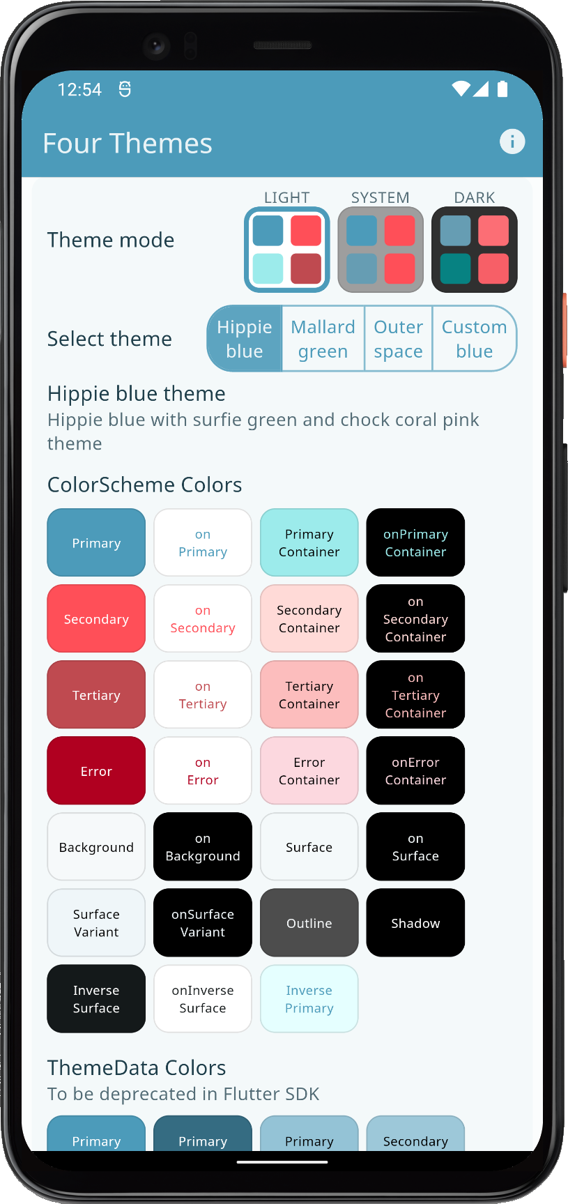 | 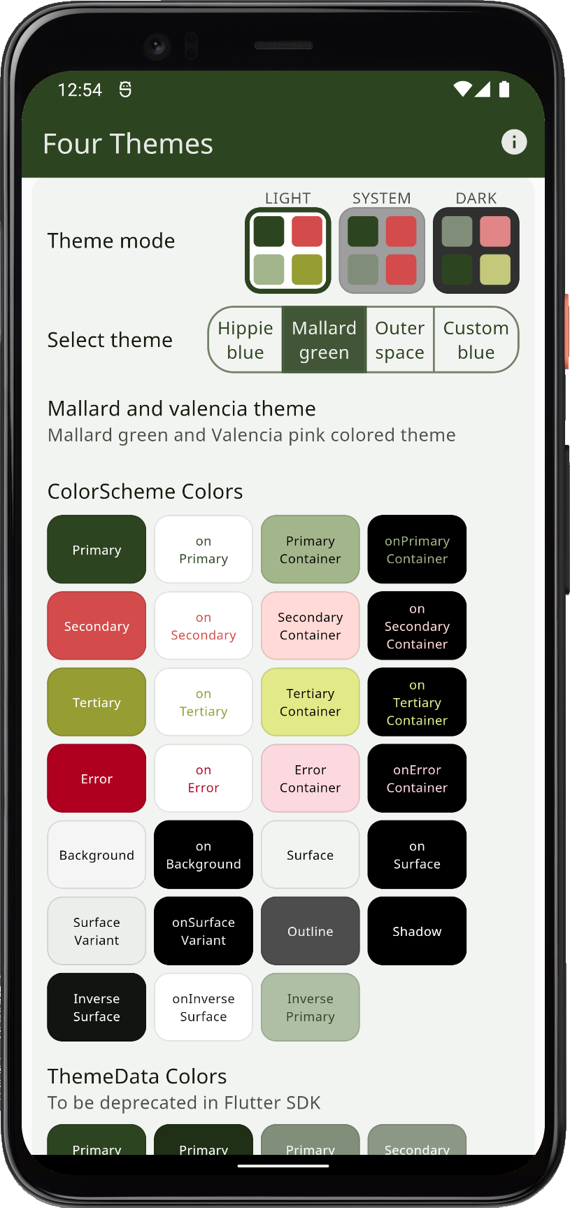 | 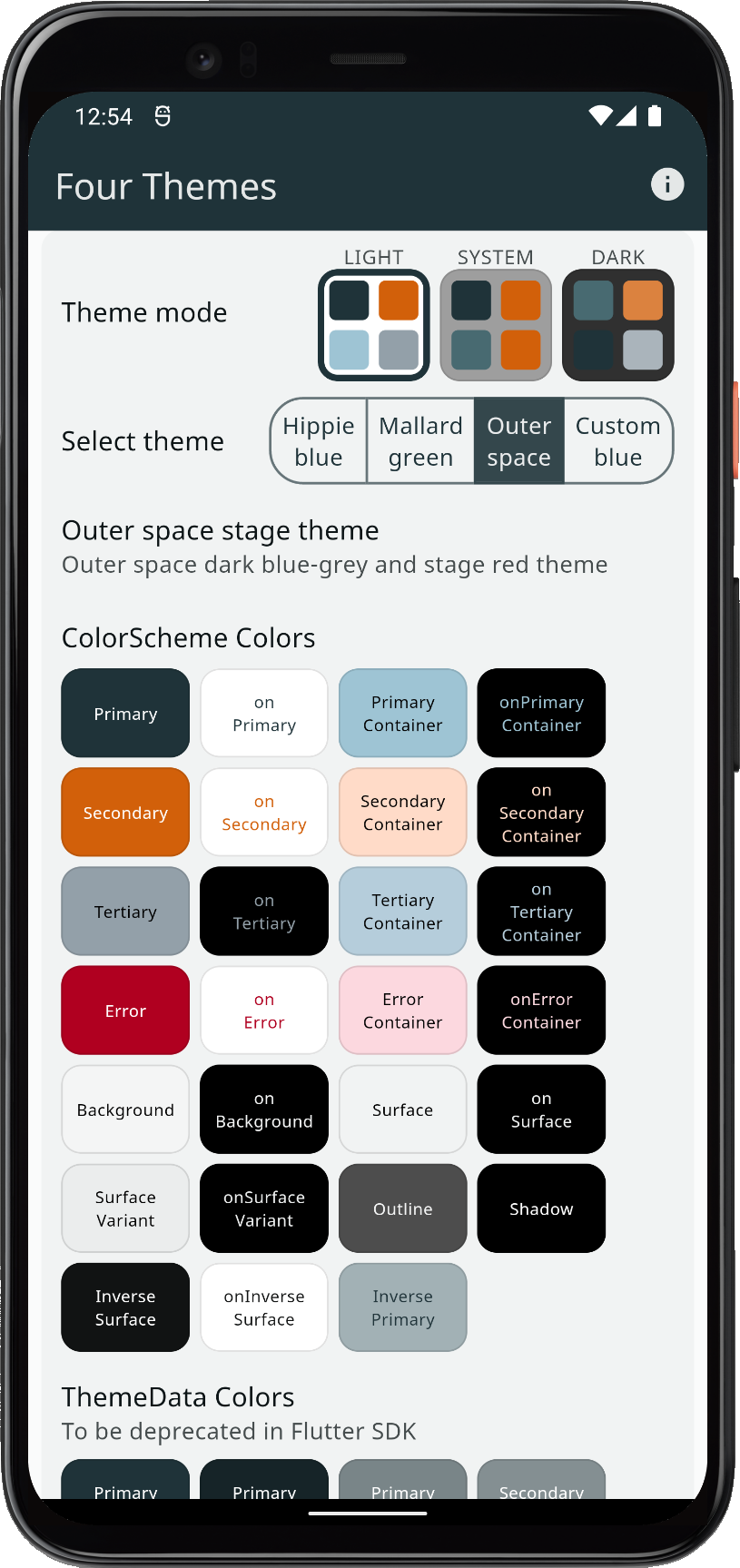 | 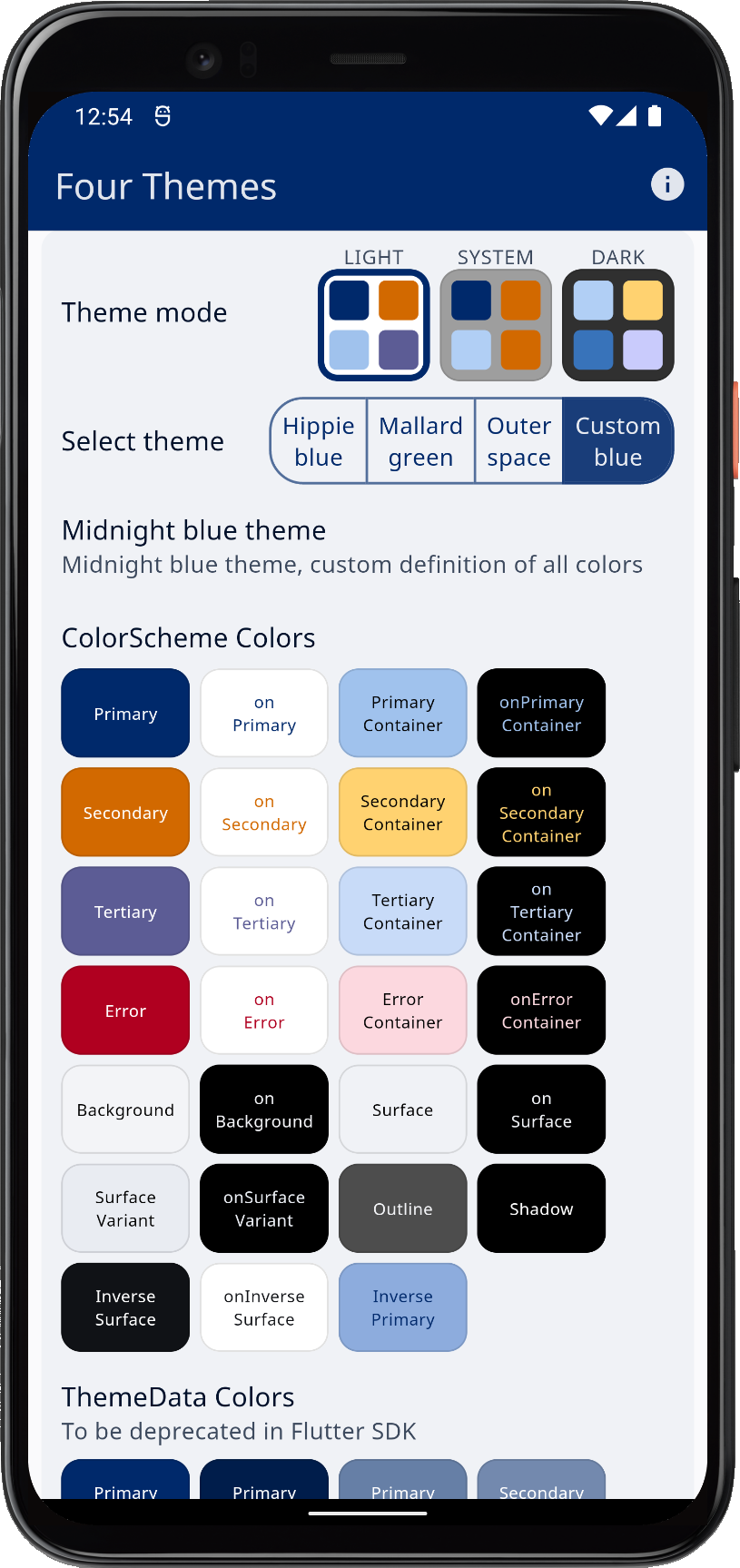 | |||
| Using three built-in schemes, plus a custom color scheme as application light theme options | ||||||
In dark theme mode, they look like this:
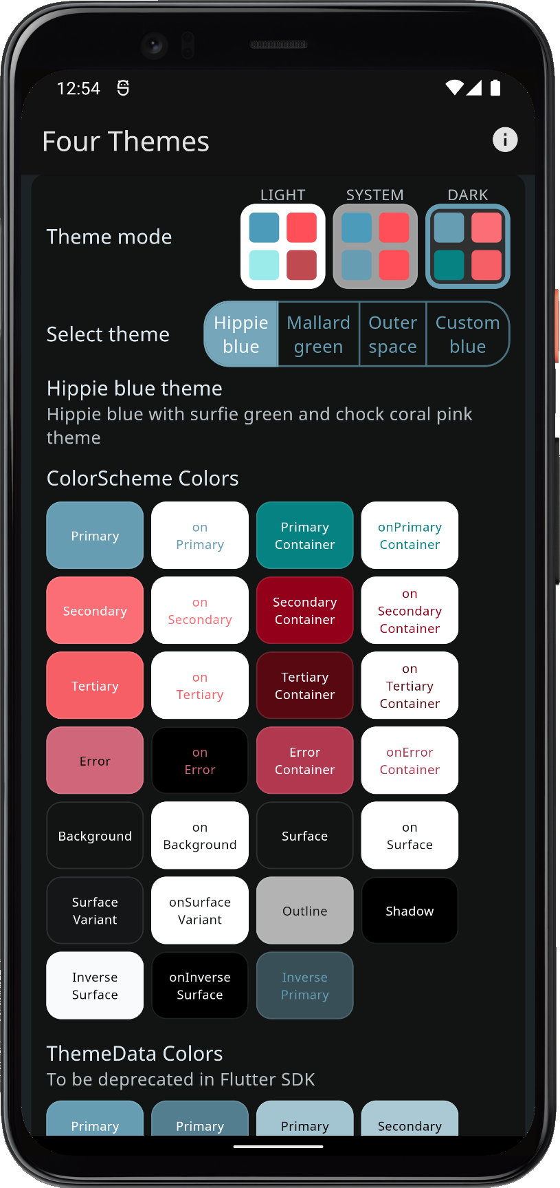 | 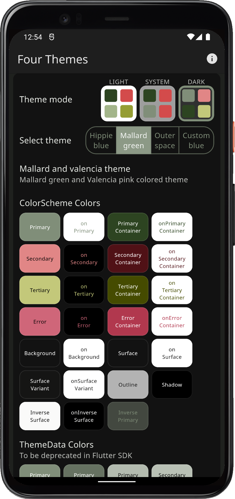 | 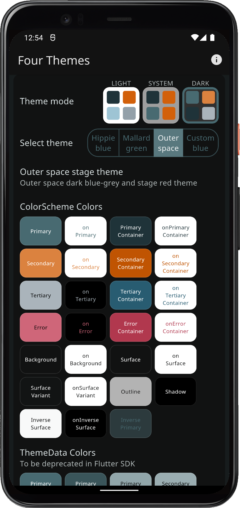 | 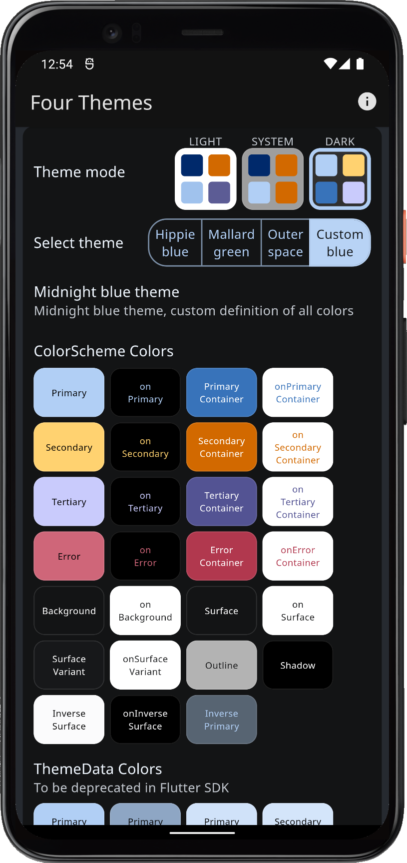 | |||
| Using three built-in schemes, plus a custom color scheme as application light theme options | ||||||
Scroll down to see the theme showcase further below. It presents the theme with common Material UI widgets. You can try this example as a Flutter web app here.
Seeded ColorScheme
When key colors are used to generate Material-3 Tonal Palettes, the same key color(s) should in Material-3 color system design be used to generate the Tonal Palettes for both the light and dark mode theme.
The ColorScheme then uses different "Tones" (shades) from the identical key color sourced Tonal Palettes to select appropriate tones for the light and dark mode from these palettes. In the Themes Playground guide, we explore these basic concepts more and show visualizations of the Tonal Palettes.
Below, we compare the look of the Mallard green theme, using its theme as defined, versus using its colors as key colors to generate the ColorScheme from those colors. The result is usually very balanced and pleasing. However, if we look at the result when using only the primary color as key color, it is not at all the same ColorScheme as the original one. The result is the same result as creating the color scheme with ColorScheme.fromSeed and giving it the Mallard scheme's primary light theme mode color as input.
As we one-by-one turn on using secondary and tertiary colors as keys, we see that the result gets a bit closer to the original design intent. Still, the colors are quite a bit different. In this example when secondary and tertiary are used as key colors, the Tonal Palette generation is using the chroma from these colors, but limited to same max values as the ColorScheme.fromSeed algorithm uses for its single seed color.
The comparison below shows the Mallard green theme, in light and dark mode, when using:
- Scheme colors as defined by its color values, used to make the
ColorScheme. - Seeded ColorScheme, with only primary as input, like
ColorScheme.fromSeed. - Seeded ColorScheme, with primary and secondary colors as key color inputs.
- Seeded ColorScheme, with all main colors used as key color inputs.
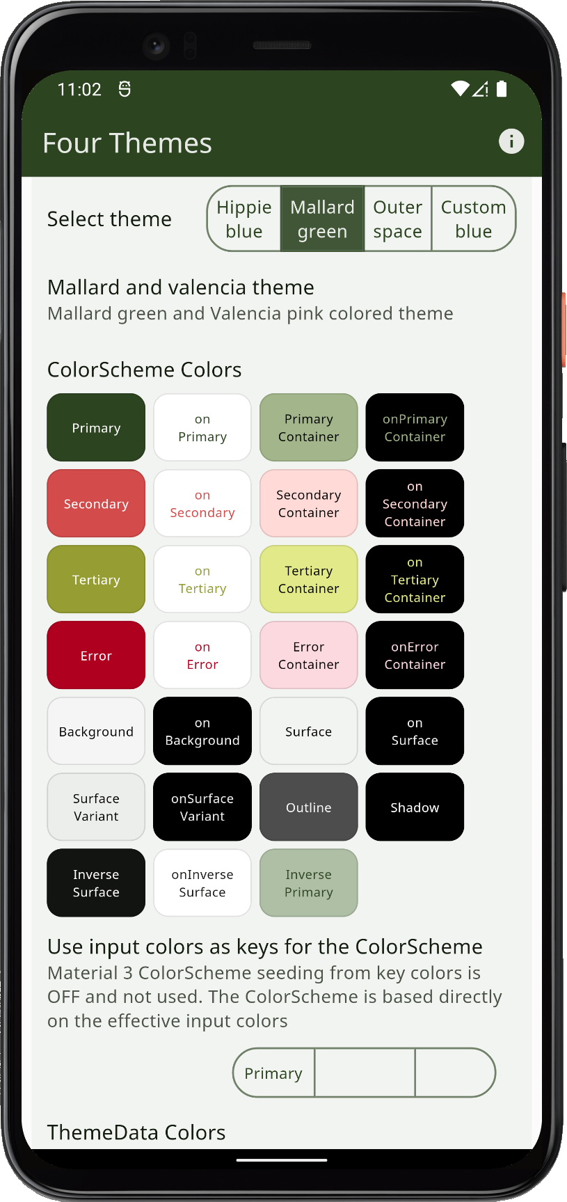 | 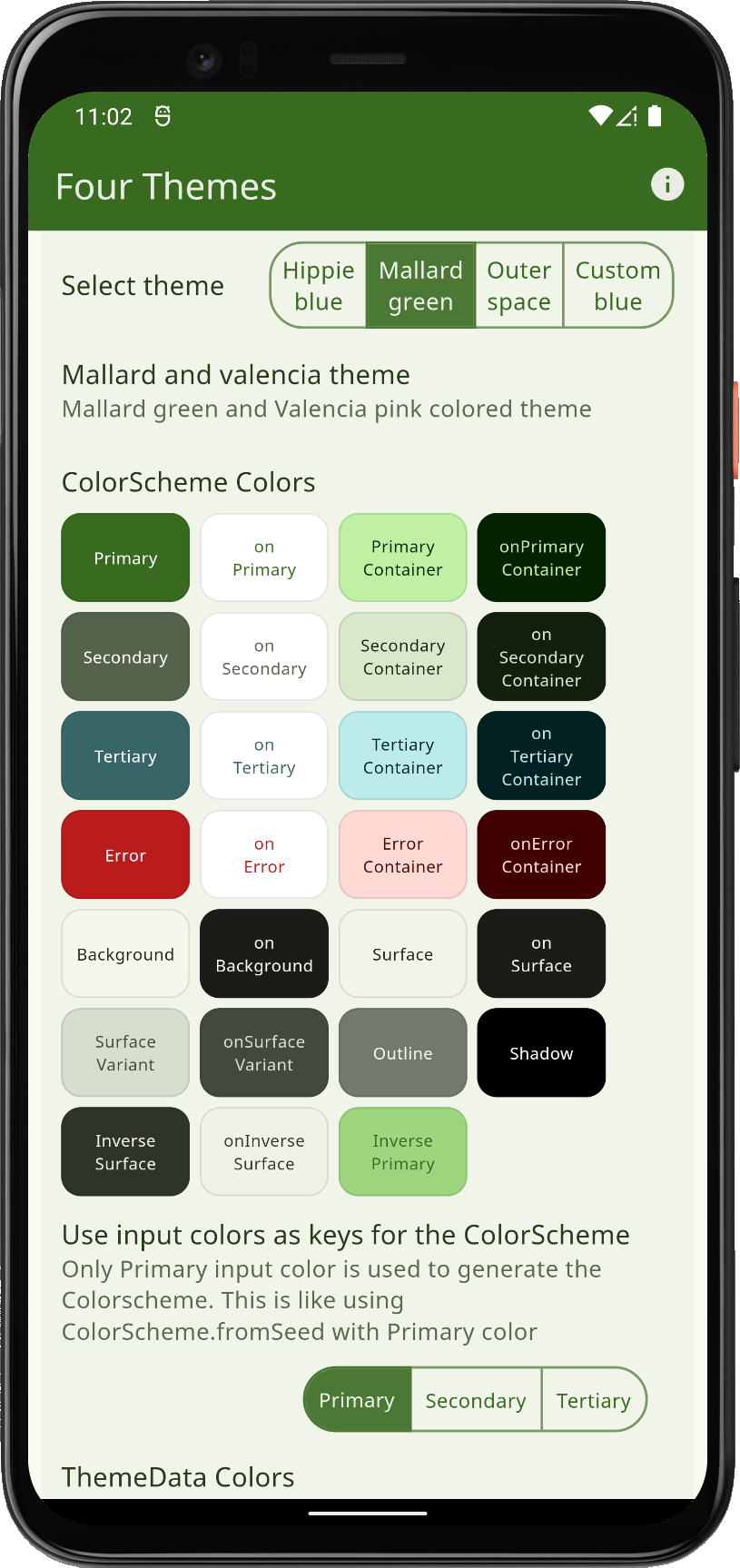 | 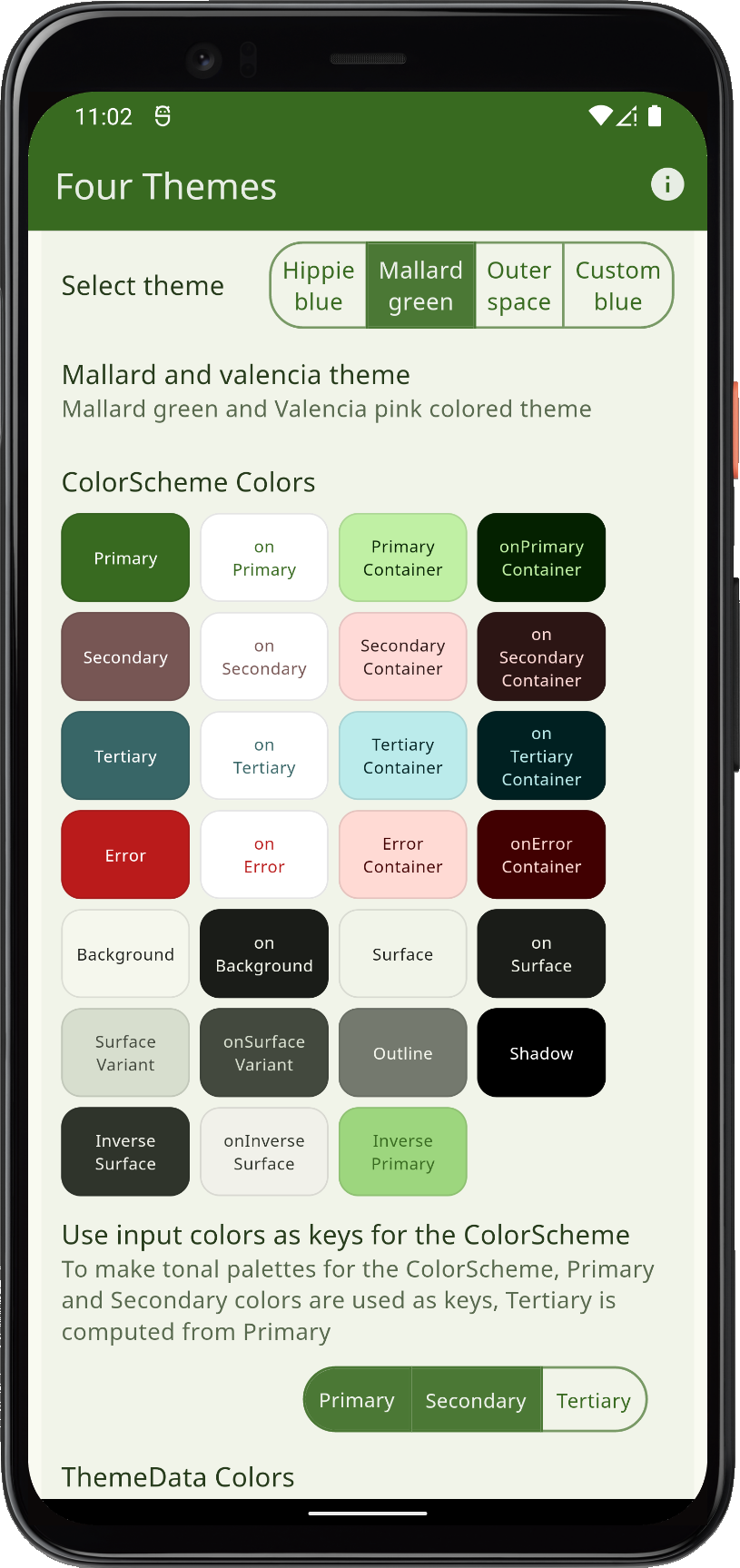 | 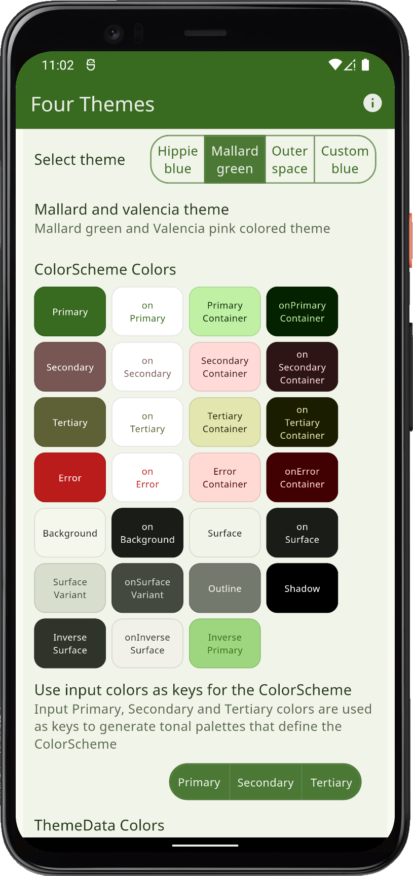 | |||
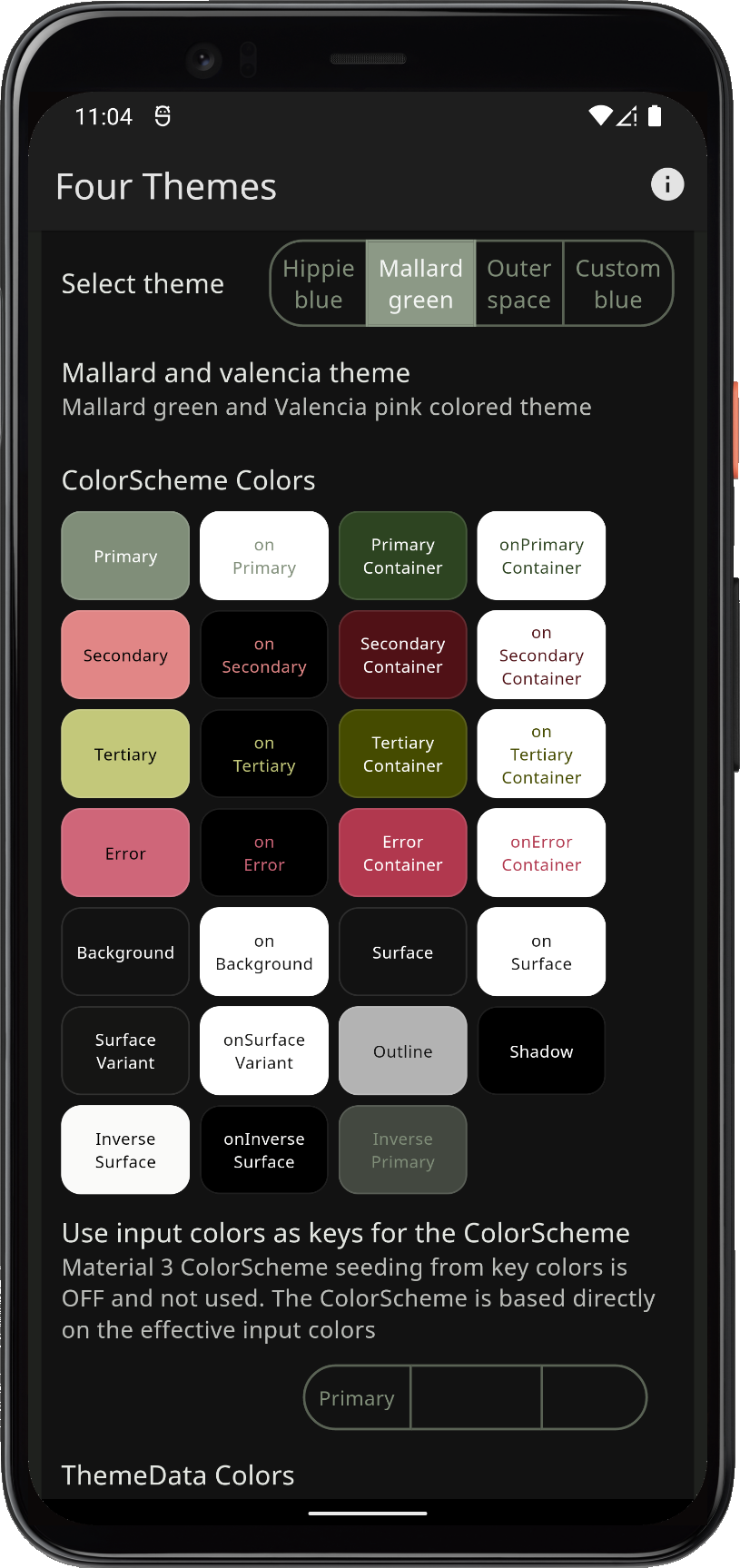 | 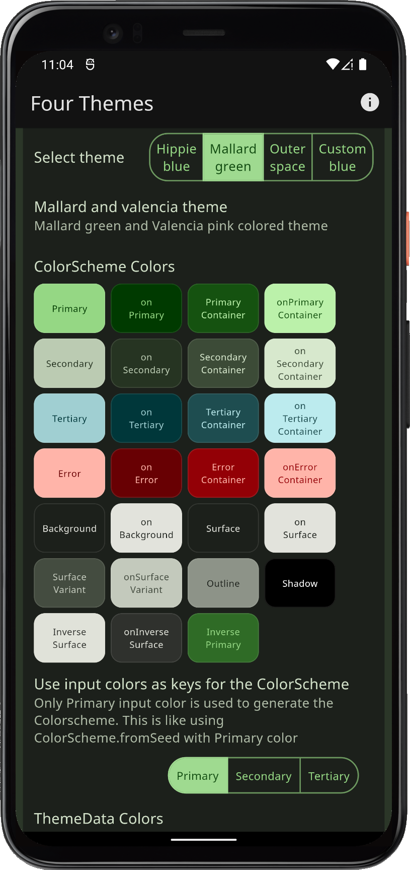 | 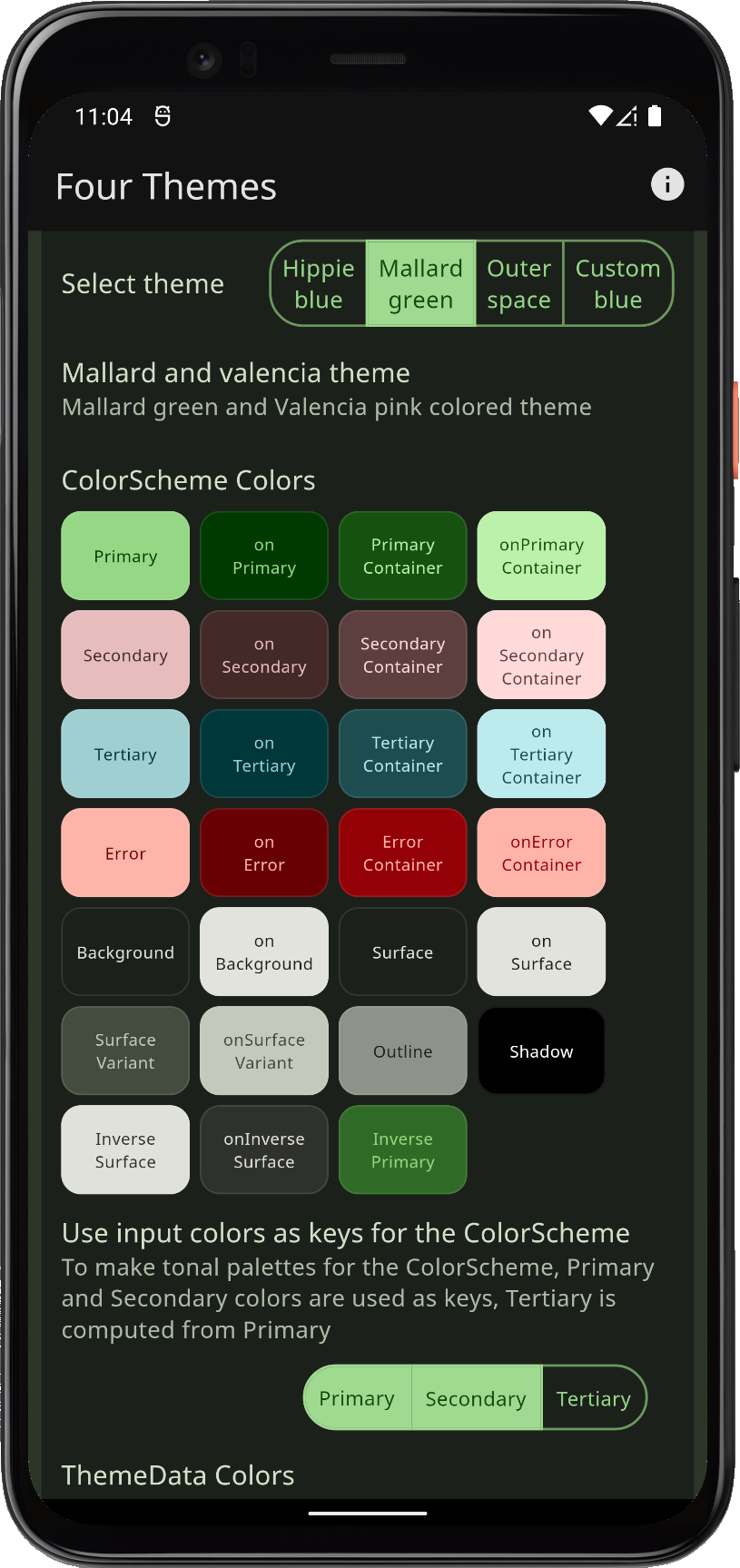 | 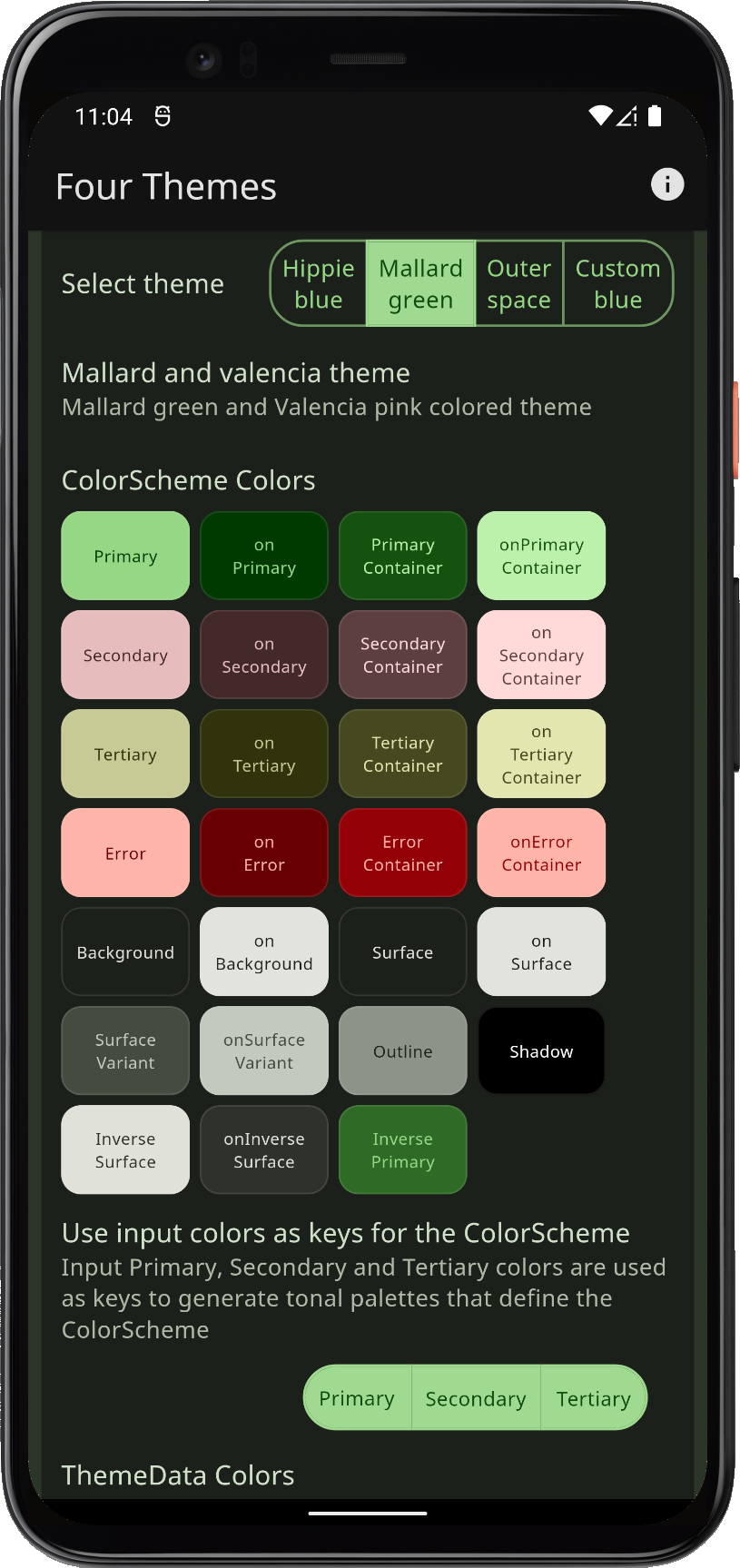 | |||
| Comparing Mallard green theme, and using its color values to generate a M3 ColorScheme | ||||||
The color math in the Material-3 tonal palette generation is very sophisticated, but in Flutter SDK little of it is exposed directly. FlexColorScheme uses package FlexSeedScheme package. It opens up more of its capabilities via an easy-to-use API. Its API also lets you change the key color chroma limits and even which tone is used for what for color in the resulting ColorScheme. This can make generated schemes more vivid or muted. The number of ways you can tune the tonal palette generation is almost limitless.
This example keeps the primary color surface blend level at the same value for the seed generated ColorSchemes. Seed generated ColorSchemes already mix a bit of their primary color into the generated neutral tonal palettes, that is there already as a base when using surface blends with them. Their surface blend coloring gets a lot stronger at lower blend levels. This happens because the mixing starts with a hint of the primary in the base surface colors already.
FlexColorScheme primary color surface blends work well with seed generated ColorSchemes too. It is, however, often needed to reduce the blend strength. If you want the actual Material-3 default surface blends, then keep blend level at zero.
The key colors themselves are seldom included as colors in the generated ColorScheme. This can be problematic if you want to use specific colors in your custom scheme for branding purposes. The FlexKeyColors configuration data class contains additional properties where you can instruct it to keep a color defined in FlexColorScheme at its defined input value. Set e.g. keepPrimary: true to ensure that the actual primary color you used to seed your ColorScheme, is also used as the primary color in the otherwise seed generated ColorScheme from the used color. In the next example, we will explore this as well.
