ThemeData
The Flutter ThemeData object is a very large theme style and behavior controlling data class. It can change the look and feel of your Flutter application completely. It is not really that difficult to use, but it has many quirks and oddities, especially when it comes to colors. This is mostly due to past legacy and things that were not considered early on. Some parts were done differently first, later things changed, but those earlier ways are still supported in order to not break past behavior.
With many new ways to define and setup colors added later, it can all become a bit confusing. This is further amplified since the official documentation, and most theming guides, still use the old factories that do not produce nicely colored and color-consistent themes.
When you make themed Flutter applications, you should base the colors of your application on a light theme mode suitable ColorScheme, and a dark theme mode suitable ColorScheme. Then create your light and dark ThemeData using these color schemes, by assigning the ColorScheme for each mode to the colorScheme
property in ThemeData.
In your MaterialApp you then assign the ThemeData for your light, and dark theme to the theme and darkTheme properties respectively in the MaterialApp.
void main() => runApp(const DemoApp());

class DemoApp extends StatelessWidget {
  const DemoApp({Key? key}) : super(key: key);
  @override
  Widget build(BuildContext context) {
    return MaterialApp(
      debugShowCheckedModeBanner: false,
      title: 'Custom ThemeData',
      theme: ThemeData(colorScheme: schemeLight),
      darkTheme: ThemeData(colorScheme: schemeDark),
      themeMode: ThemeMode.system,
      home: HomePage(),
    );
  }
}
Legacy Complexity
In theory, this gives you an application that uses the defined color schemes on all the Flutter SDK built-in Material UI widgets. Well it should, and it almost does, especially if you used Flutter's ThemeData.from a ColorScheme factory. However, even it has issues. The used color scheme is not consistently applied on all built-in Flutter SDK Material UI Widgets. To get it completely covered, you also have to assign a few colors from your ColorScheme to a few color properties that still only exist as direct color properties in ThemeData. The situation is a lot better when your ThemeData sets useMaterial3: true, but it is not perfect either.
This is all further complicated by the fact that under the hood some Flutter SDK UI widgets still use the original direct color properties in ThemeData. These properties are now mostly assigned color values via ThemeData.colorScheme. Exactly which colors will end up where, depends on which ThemeData factory constructor you use. The factory ThemeData.from does the best job when useMaterial3 is false. When it is true vanilla ThemeData factory works reasonably well and uses mostly the same assignments as if the from factory had been used. Still there are issues in M3 mode as well, some related to legacy and some to new issues.
Some older components still do not use the ThemeData.colorScheme properties for their default color values directly, they still use color property values from ThemeData, that may have gotten values assigned from ThemeData.colorScheme, this behavior varies depending on used ThemeData creation factory!
Very basic and old widgets, like for example Material and Card fall into the category of widgets that actually still use ThemeData color properties as their default color values in M2 mode. While some newer widgets use colors from ThemeData.colorScheme directly. Additionally, the colors in the ColorScheme held by the colorScheme property in ThemeData can actually not represent all the colors that exist in ThemeData's color properties. Thus, some color properties never get any ColorScheme based values assigned to them in M2 or M3 mode. They are left to default values assigned by the ThemeData factory, unless you explicitly assign them color values that fit with your color scheme. If this is not done, it can then look odd if some widgets, or your app uses these colors and get the factory default colors, while the rest of your app's typically use the ColorScheme based colors.
Luckily there are not so many widgets left that this mess still applies to, but there are a few, for example CircleAvatar in M2 mode. It can all be confusing and a bit frustrating to fight with ThemeData and its direct color properties. If not done correctly, it may result in themes with color schemes that are not entirely consistent or logical across all standard SDK widgets in your application. Even more so if you expect ThemeData colors like primaryColor, primaryColorLight and primaryColorDark be derived from your colorScheme.primary color, that is just not always the case.
In the chapter Roads to ThemeData we will look at all the different ways to define a ThemeData object. We will then see different results, like the ones below.
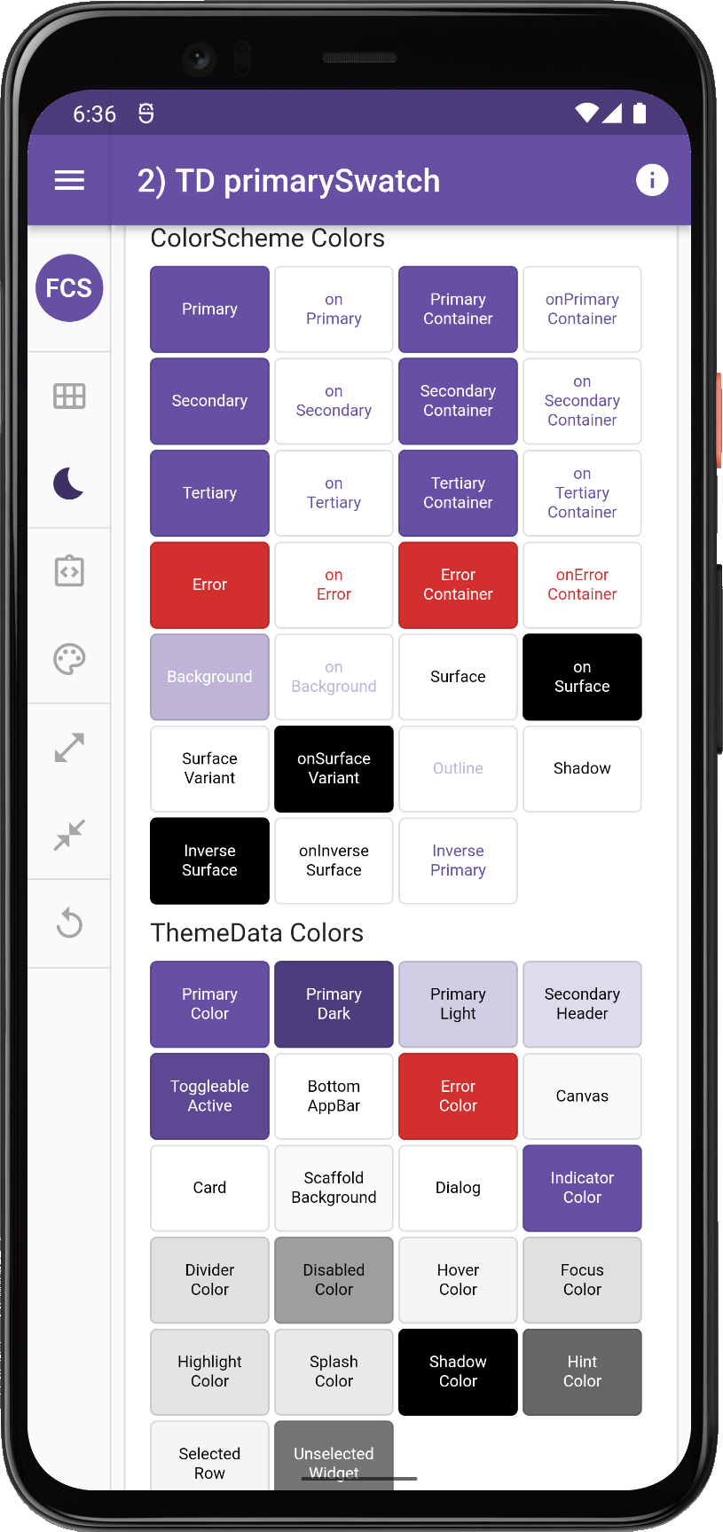 | 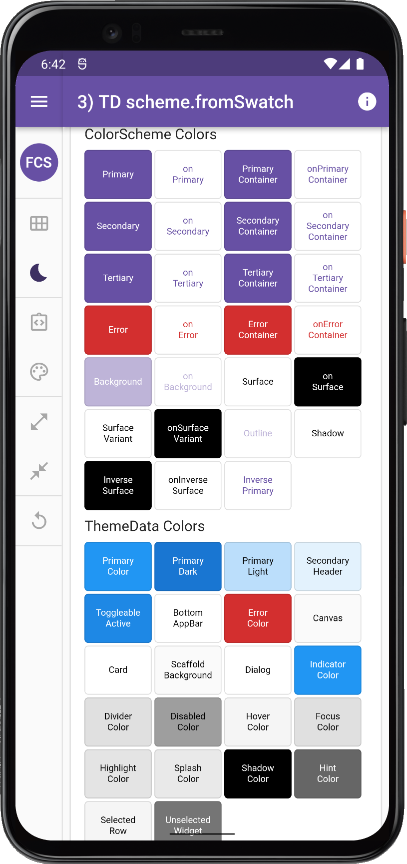 | 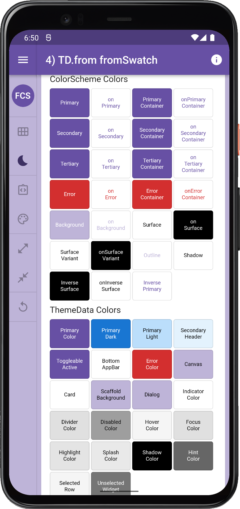 | 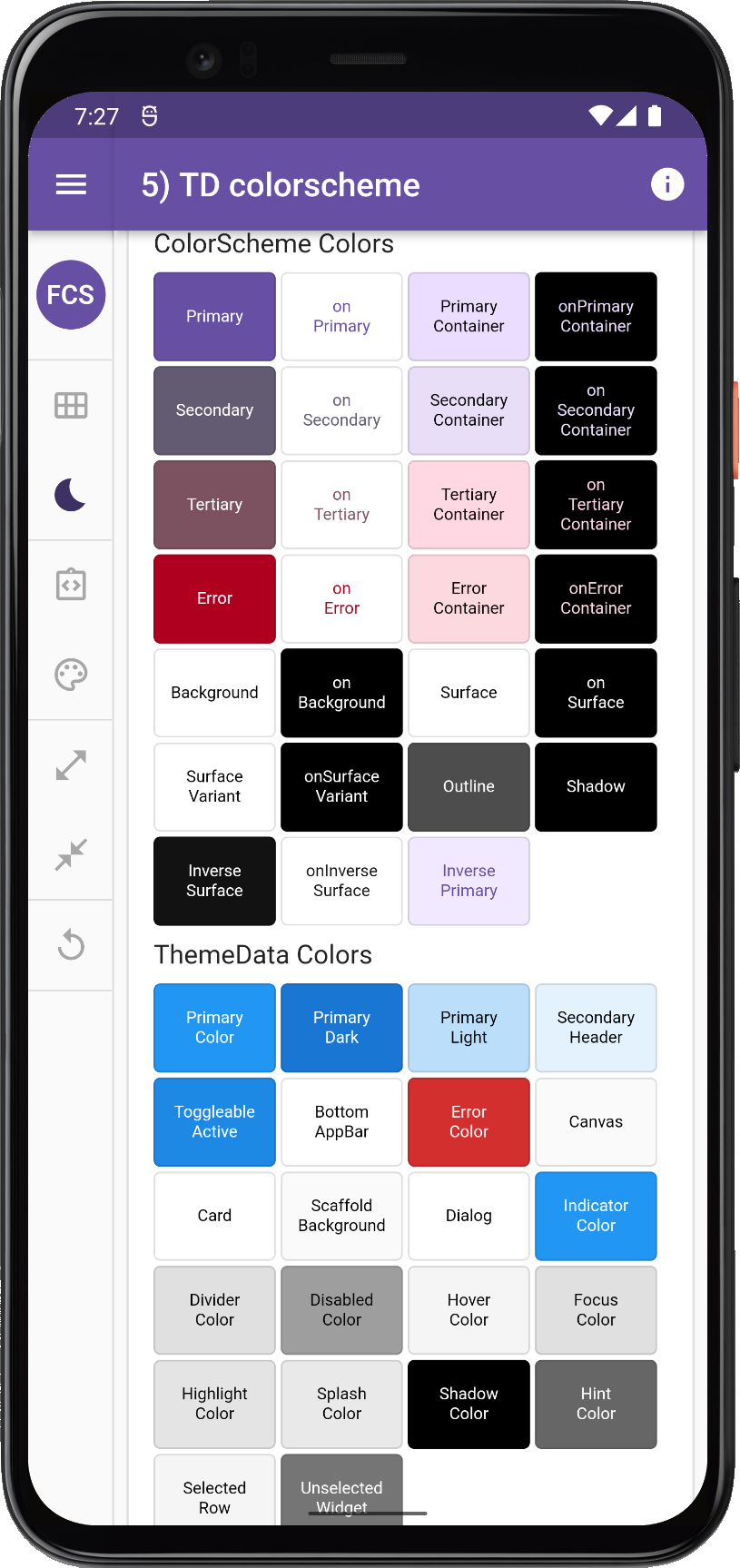 |
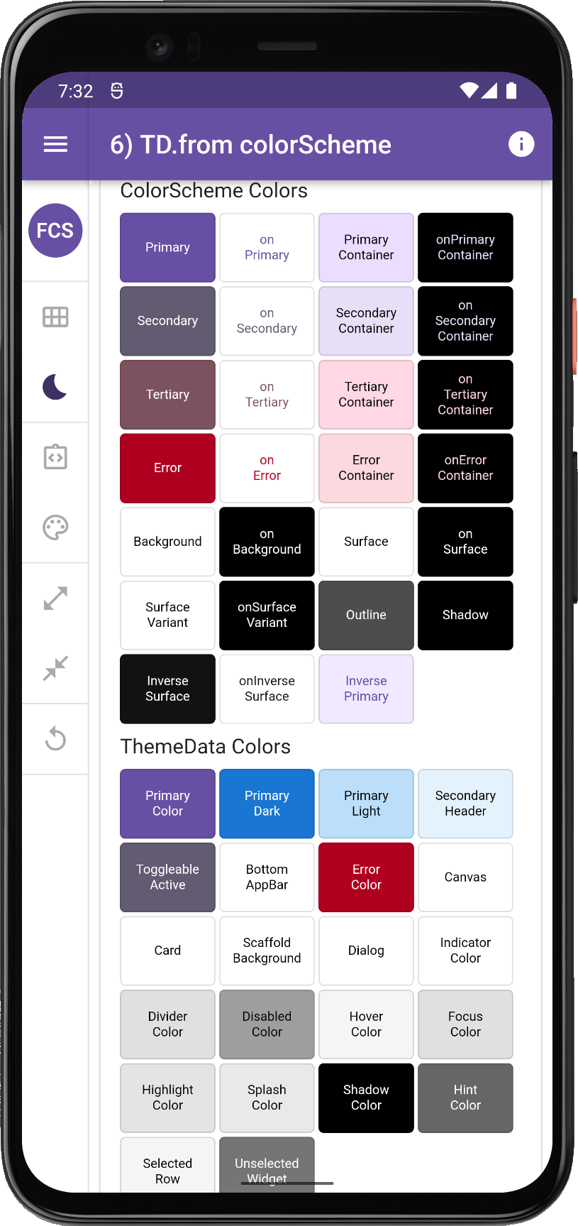 | 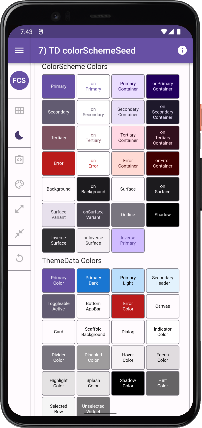 |  | 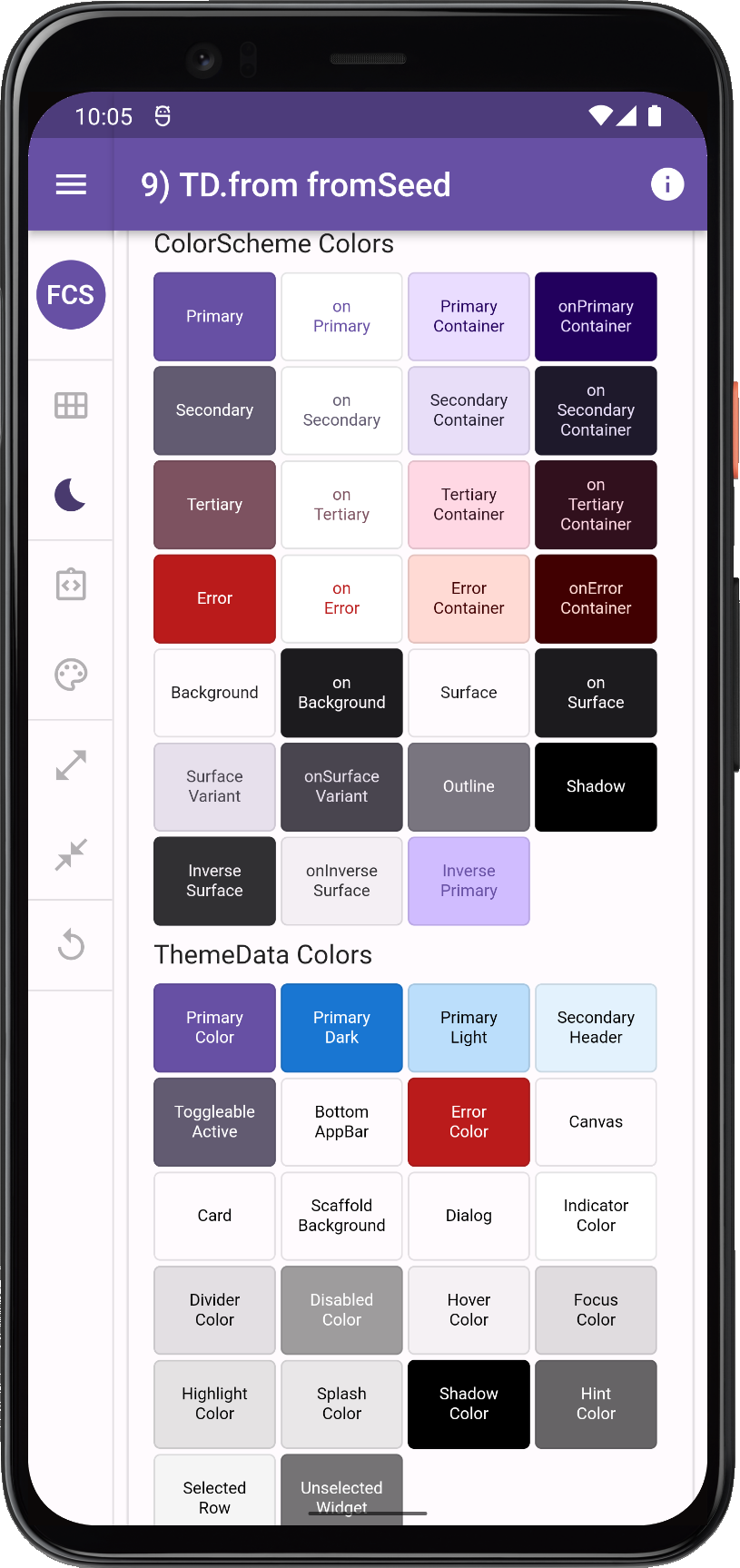 |
| Many ways to make ThemeData using same ColorScheme or same seed color | |||
ThemeData, the results can vary a lot, even if we use the same input colors.Light and Dark Themes
In some older apps and theming guides you might see setups where the light and dark themes are both assigned to theme in MaterialApp, by using a ternary operator based on desired Brightness to select used ThemeData. Don't do this!
ThemeData and dark one, on only the theme property in MaterialApp.This is something that was used before there was a darkTheme property in the MaterialApp. Prefer to assign your theme mode appropriate ThemeData to the correct properties in the MaterialApp.
If your app does not offer a way to toggle the theme mode via the themeMode property, then keep themeMode at its default ThemeMode.system, so that the app theme automatically follows the device theme mode.
If you do offer a way to override and set the app to light or dark theme independently of the system settings, then always also include in the settings, an option to use the system mode that follows the system setting too. This should even be your default value for it. Now you have covered all options, and users can set the theme mode as they prefer.
High-Contrast Themes
The ThemeData assignment also applies to the highContrastTheme and highContrastDarkTheme theme. If your app has dedicated designs for high-contrast accessibility themes, do assign them to these properties. These properties are all there to give you the right device system settings driven behavior. So your app can follow the device system theme mode and its high-contrast accessibility settings.
highContrastTheme and highContrastDarkTheme theme properties.ThemeData Deprecations
There is a Flutter development plan in progress to deprecate most direct color properties in the ThemeData class. Flutter SDK widgets will after that only use ColorScheme based colors that are in the ThemeData colorScheme property, as default colors for colors on their elements.
This design document describes the plan and reasoning. There is also a color property deprecation check list in issue 91772 to mirror this plan. It has taken a while, but there is activity and progress being made continuously in the Flutter master channel. Many of them have already dropped into stable releases.
For FlexColorScheme the progress of these actions is monitored closely. Needed changes and updates to FlexColorScheme are always implemented when relevant changes in ThemeData reach the Flutter stable channel. The typical maintenance need is removing deprecated ThemeData properties and to check if some new sub-theme color property needs to be modified or added, in order to replicate past FlexColorScheme theming behavior, when its corresponding color property is removed from ThemeData.
ThemeData factories
There are 6 different constructors in Flutter to make a ThemeData object. All constructors of ThemeData except the ThemeData.raw are factory constructors. This is why they are not const and why they can execute different logic and produce very different results that driven by conditions and complex logic based on what properties you provided.
This is nice, but it also big source of confusion, as the factory contrustors contain lot of logic to deal with legacy ways in none breaking manners with past methods.
ThemeData.raw(...)
This is the actual const constructor of the ThemeData object. It requires all its none deprecated properties to be specified. Normally you would not use this constructor directly. It is of course possible to do so, but very tedious.
ThemeData(...)
This is the main factory used to construct a ThemeData object. This is the only practical constructor to use if you also want to modify a lot of properties, even if it is just to correct some of the things it does not do very well. It contains a lot of logic dealing with color assignments, constructing the text themes, etc. It ends by assigning all its results to all the properties in ThemeData.raw(...) and returning it.
ThemeData.light(...)
This just returns ThemeData(brightness: Brightness.light) with the optional useMaterial3 flag set to true or false. Not really a big shortcut, you might as well use ThemeData(brightness: Brightness.light) and have the convenience of adding other properties when needed. I don't know why this API exists, it is not needed.
ThemeData.dark(...)
This just returns ThemeData(brightness: Brightness.dark) with the optional useMaterial3 flag set to true or false. If useMaterial3 is false, this factory and consequently also the version ThemeData(brightness: Brightness.dark) returns a horrible looking dark theme. It is a grey dark theme, not really dark at all. This dark theme is also not following the Material-2 dark mode specification. This theme is based on a poor Flutter dark theme implementation and default that was made before it implemented a way to make an actually decent looking Material-2 dark mode theme. DO NOT use this if you want a decent looking dark theme when useMaterial3 is false. If useMaterial3 is true, it produces a decent default dark mode theme suitable for Material-3.
As with its light companion, this factory is not really a big shortcut, you might as well use ThemeData(brightness: Brightness.light) and have the convenience of adding other properties when needed. I don't know why this API exists, it is not needed and its result when useMaterial3 is false is mostly useless.
ThemeData.fallback(...)
This is defined as factory ThemeData.fallback({bool? useMaterial3}) => ThemeData.light(useMaterial3: useMaterial3);. It is used in some cases by the framework to guarantee a none null valid default fallback ThemeData object. If you are not writing a theming package, you probably won't need it.
ThemeData.from(...)
This factory creates a ThemeData from the passed in ColorScheme using better logic than ThemeData normally uses when useMaterial3 flag is set to false. Better, here refers to that colors for the ColorScheme are applied to important legacy colors in the direct ThemeData color properties. This ensures that many Material-2 widgets and surfaces will actually use the colors in the ColorsScheme. Ideally, this factory should not be needed either. It was added to not break what happened when you just pass in a ColorScheme to the colorScheme property in the ThemeData factory. For less confusion it would have been better the break the past result when passing in a ColorScheme to ThemeData factory and instead introduce the result the ThemeData.from produces, into it when a colorScheme is assigned.
Ironically when you set useMaterial3 to true, in plain the vanilla ThemeData factory, it does mostly the same assignments to the required direct color properties in ThemeData. It does it for passed in colorScheme, seed generated scheme or default theme, that the ThemeData.from factory does in M2 mode. There are some minor differences that are actually probably oversight bugs. See issue Divider Color Inconsistencies #117755 for more information.
This better theming result from the ThemeData.from(...) a ColorScheme factory, is not without issues either. To get even better results, you will need to fix some colors anyway. You will need to do this in both M2 and M3 mode, but much less in M3 mode. The need for this makes the ThemeData.from(...) factory pretty pointless, even if it for Material-2 and Material-3 produces the best results. Still, it is better to learn how to apply the things it does correctly, then apply them yourself with vanilla ThemeData factory, and at the same time correct the things it does not do so well. Plus at the same time you can apply all other theming customizations that only the ThemeData factory provides. In this guide we will later show how to make a correctly ColorScheme colored ThemeData with the vanilla ThemeData factory.
ColorScheme constructors
The ColorScheme in ThemeData, provides the colors to all the different elements in all UI widgets. As mentioned in previous chapter, default color mappings are based on Material-2 and Material-3 specifications. Which default color mapping and other default value specification gets used, is based on the ThemeData(useMaterial3: true/false) property, it defaults to false. The ColorScheme class contains 30 different color properties, to get a good M2 and M3 ColorScheme best results are achieved when colors are applied that follow the respective Material version's color system guidelines, for every color property in the ColorScheme that it uses.
Defining 30 colors for each theme mode ColorScheme that follow the M2 or M3 guidelines is no small task. Threfore in addition to the default constructor ColorScheme(...) there are factories that can help you create M2/M3 mode suitable ColorSchemes. We go though them briefly below.
ColorScheme(...)
This is the default const constructor, you can use it to construct a ColorScheme manually suitable a theme that uses either M2 or M3. It requires 10 of its 30 properties to be defined. The rest of the color properties will use the given required properties as fallbacks to give them appropriate, but not necessary ideal color values from the required values. This constructor offers no default or help in defining the ColorScheme. It is often used if you have used external tooling that have generated the ColorScheme for you, fully populated with all its Color values.
ColorScheme.light(...)
This const constructor will give you a default Material-2 based light theme mode ColorScheme if you do specify any color values. It includes the M2 correct, surface, background, error colors and contrasting onColors for them. It also has default for primary, onPrimary, secondary and onSecondary colors. You can override these color values with your M2 theme colors. To make a correct custom M2 ColorScheme you only need to specify those 4 colors, often not even the onColors, if your primary and secondary colors happen to have the same brightness as the M2 defaults. You can override any of the defaults and also assign color values to all the other color properties, although, when using M2 theme mode, the colors are not used by default by UI widgets. You can of course still use them in M2-mode as custom theme-accessible colors, and also use them as custom colors default colors in component themes.
You can also manually create M3 compatible ColorScheme with this constructor, but it does not help you anymore than the default constructor ColorScheme(...)` does, basically not at all.
ColorScheme.dark(...)
This const constructor is the M2 default dark theme mode equivalent of ColorScheme.light(...). Same usage guidance applies to it as for the light version.
ColorScheme.highContrastLight(...)
This const constructor is an M2 equivalent of ColorScheme.light(...) but with default fallback colors that offer higher contrast than ColorScheme.light(...), it is used as an example of making a theme with higher contrast for improved visual accessibility.
ColorScheme.highContrastDark(...)
This is the dark mode equivalent of ColorScheme.highContrastLight(...).
ColorScheme.fromSeed(...)
This is the factory constructor you should use to create a Material-3 Color System based ColorScheme. The Material-3 color system uses a new color space and algorithm developed by Google to calculate color palettes with visually consistent and pleasing color gradients. The color space is called HCT for Hue, Chroma and Tone. You can read more about it in the Material-3 guide. This developement blog post also offers more insights add link.
To create a ColorScheme you specify the Brightness of the scheme light (default) or dark and give it a seedColor. The seed color is your main color for the ColorScheme. It may often be you brand color. You should use the same seedColor values for both e light and dark ColorScheme. Do note that the Color used as seedColor will typically not end up as your primary color in the produced ColorScheme, which if it is your brand color you want. To get the brand color used as seed, to also be used as primary color you can give it as an override input to the factory, like ColorScheme.fromSeed(seedColor: brandColor, primary: lighBrandColor). That is it, you now have a light theme mode M3 color scheme using your brand color as primary color. The rest of the colors, will all match reasonably well with it, but you can also manually override all other colors in the seed color computed ColorScheme.
When you make your dark mode ColorScheme you would typically use the same color as the lightBrandColor used for the light scheme as the seed color in dark mode too. Companies generally only have brand colors intended to be printed on white paper, more seldom hand-picked brand colors for presentation on black/dark color that might be useful in an application's dark mode theme.
-
For the above, the most typical case use:
ColorScheme.fromSeed(brightness: Brightness.dark, seedColor: lightBrandColor) -
If you have a dark mode brand color, it probably is a lighter tone of the one used on white paper. If that is the case, you should still use the light mode brand color to seed the dark mode
ColorScheme, but use the dark mode intended brand color asprimarycolor override. When you do that, you may also need to ensure thatonPrimaryhas the correct contrast color for theprimaryoverride. Generally this should work well for this case:ColorScheme.fromSeed(brightness: Brightness.dark, seedColor: lightBrandColor, primary: darkBrandColor). -
For a correct M3 style theme, it is important to use the same seed color in the light and dark seed generated
ColorScheme. If you don't care about M3 design spec and guidelines, you can certainly experiment with a totally different seed color and look in dark mode. -
If there is a brand color for dark mode that has a totally different hue than the light mode brand color, then do use that as both seed and primary override color when making the dark mode scheme. Like this:
ColorScheme.fromSeed(brightness: Brightness.dark, seedColor: darkBrandColor, primary: darkBrandColor).
ColorScheme.fromSwatch(...)
This is a very bad and old way of making a ColorScheme from a MaterialColor based color swatch. It produces horrific results by default in both light and dark mode. Don't use it. You will see and find out why later. If you want to make a ColorScheme from MaterialColor swatch colors, consider using any of the above constructors instead and assigning the required swatch colors to desired ColorScheme properties, in the way that fits your need. This factory constructor needs to be deprecated, it produces results that are totally useless.
SeedColorScheme.fromSeeds(...) (Third party)
To make a Material-3 mode compatible seed generated ColorScheme, with much more configuration options and control over the result than ColorScheme.fromSeed(...) offers, consider using the replacement SeedColorScheme.fromSeeds(...) from the package FlexSeedScheme. FlexColorScheme also uses this package internally to offer more control over seed generated color schemes.
FlexColorScheme and ThemeData
At its core FlexColorScheme.toTheme only creates a ThemeData object. You can think of it as super fancy ThemeData factory. It helps you make a consistent ColorScheme based theme, and to produce a more refined Flutter ThemeData object. Since its output is a standard ThemeData object, you can adjust it further as much as desired by using normal ThemeData.copyWith on it and all its component themes. If some detail is not to your liking and its API does not support changing a particular part, you can still use it for everything else and just adjust that part in the result it produces with copyWith, before you assign it to you app's theme.
One of the fundamental things FlexColorScheme does, is that it fixes minor inconsistencies and gaps that exist with Flutter's ThemeData and ThemeData.from factories. It also handles the complexity of using the ThemeData factory directly. It releases you from the burden of knowing what colors in it affect which widgets how. The messy state of ThemeData and all its legacy is a more obvious issue in Material-2 mode, when using the newer Material-3 mode, the issues with poor defaults and colors not using ColorScheme colors are much fewer, but they still exist when it comes to some legacy colors in ThemeData and legacy widgets as well.
FlexColorScheme makes a few opinionated, but subtle theme modifications compared to the ThemeData.from themes created from a ColorScheme. By default, FlexColorScheme theming refrains from touching component theme properties not related to making the colors more consistent. Some minor adjustments are needed. This is covered in detail in the API guide section in Core defaults.
When you opt in on using its opinionated component themes, the story changes. It then does significant customization using Flutter's component themes if you are using Material-2 mode. In fact, its M2 mode emulates M3 to a large degree when it comes to the border radius of widgets. When you use Material-3 mode, and activate its opinionated component themes the components mostly default to Material-3 defaults. Some component themes with a long legacy in FlexColorScheme have a slightly different style than M3 defaults, in order to not break their past established FCS M2 mode styles that existed before the components supported M3. The Themes Playground offers some quick settings buttons to toggle such default to match Material-3 default, when component themes are opted in on in FlexColorScheme. It is still useful to recall that both its M2 and M3 modes do come with some opinionated default style over M2 and M3 defaults, that said M2, and even more so M3, are both also very opinionated styles, the Material style.
The sub-theme definitions for both M2 and M3 component themes are still all done within the standard ThemeData object. FlexColorScheme cannot make themes that you cannot repeat yourself by defining the same ThemeData object and all its component themes manually.
It is, however, very tedious and verbose to do all the things it can do manually. Personally, I don't even attempt it anymore, even if I could. It is so much quicker and simpler to use FlexColorScheme to accomplish many of the complex theme definitions it does.
