Themes Playground
This chapter goes through the basics of how to use the Themes Playground. Generally it is easy, and you probably don't need a guide, but if you get stuck on some finer points, you may find answers here.
What is the Playground?
The Themes Playground is a useful tool to find FlexColorScheme themes and settings you like. You can use it to discover what you can do with FlexColorScheme. The playground persists all its settings, and you can reset them back to their default values, so don't be afraid to experiment.
The most useful and popular feature of the Themes Playground is that it can generate the Dart and Flutter FlexColorScheme setup code needed to produce the shown active theme configuration. It even shows and modifies the code as you change settings, and you can see the code side-by-side as you change settings. This is a fun way to get familiar with the API. Beware, fiddling with all the different themes and settings can be quite addictive, happy theming! 💙
The latest stable version of Themes Playground can be used as a web app here.
The Themes Playground is a "what you see, is what you get" visual configuration tool for the FlexColorScheme package API. As you interactively modify the theme, that the Playground app itself uses and shows, it also generates the FlexColorScheme package API configuration needed to reproduce the same theme in a Flutter application.
The FlexColorScheme package, then when given an API configuration produced by, and copy-pasted from the Themes Playground, produces Flutter ThemeData object used as a theme in a MaterialApp. FlexColorScheme works as fancy ThemeData factory, with an often much shorter API for the features it supports.
The Themes Playground app is primarily intended to be used by developers using the FlexColorScheme package. It can of course also be used to demonstrate a large number of Material theming features available in Flutter.
Available Themes Playground Versions
There are Theme Playground version builds corresponding to the last major releases of the FlexColorScheme package available. For Version 7 there are also Playground builds for the different minor releases.
You should use the same major version of Themes Playground as the flex_color_scheme package you are using.
NOTE!
If you use a higher version of a WEB build and try to load a lower version again with the same browser, it will most likely fail and not load. This happens because older and newer builds run on the same domain and share the same browser local storage file. This allows newer versions to load data configured in older versions. However, older versions may not understand some data stored and inserted by the newer versions and they will fail. You can get the web build for an older version to start again by clearing stored browser data:
"Settings" → "Delete browsing data..." → "Cookies and other site data".
You do of course lose any config you had used then. This issue could be fixed, but would require updating rebuilding the old builds and there are currently no plans to do so.
Version 8.0.0 and later uses a new local storage name to avoid this issue, so it will not conflict with V7 and older versions. There are few storage settings in V8 that are backwards compatible anyway.
You can also build Windows, macOS or Linux desktop versions of the Themes Playground, it is highly recommended, as it runs much smoother and nicer than the WEB build. The Themes Playground app is bundled with the package GitHub repository as Example 5. If you need a Themes Playground companion build for a specific older FlexColorScheme version, you can download a ZIP bundle from the GitHub repo for any past release here.
Quick Guides
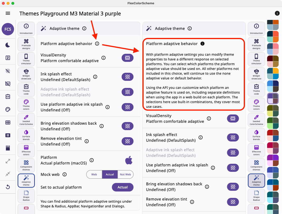
The Themes Playground app has a lot of in-application expandable documentation and information. Wherever you see an info icon (i), you can tap on it to expand it and read more about the feature.
Many Layouts
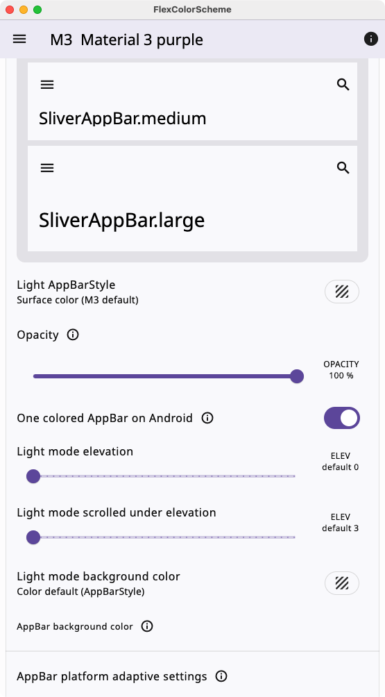
The Themes Playground application offers several different layouts, some automatic responsive ones, and others that you can switch between manually.
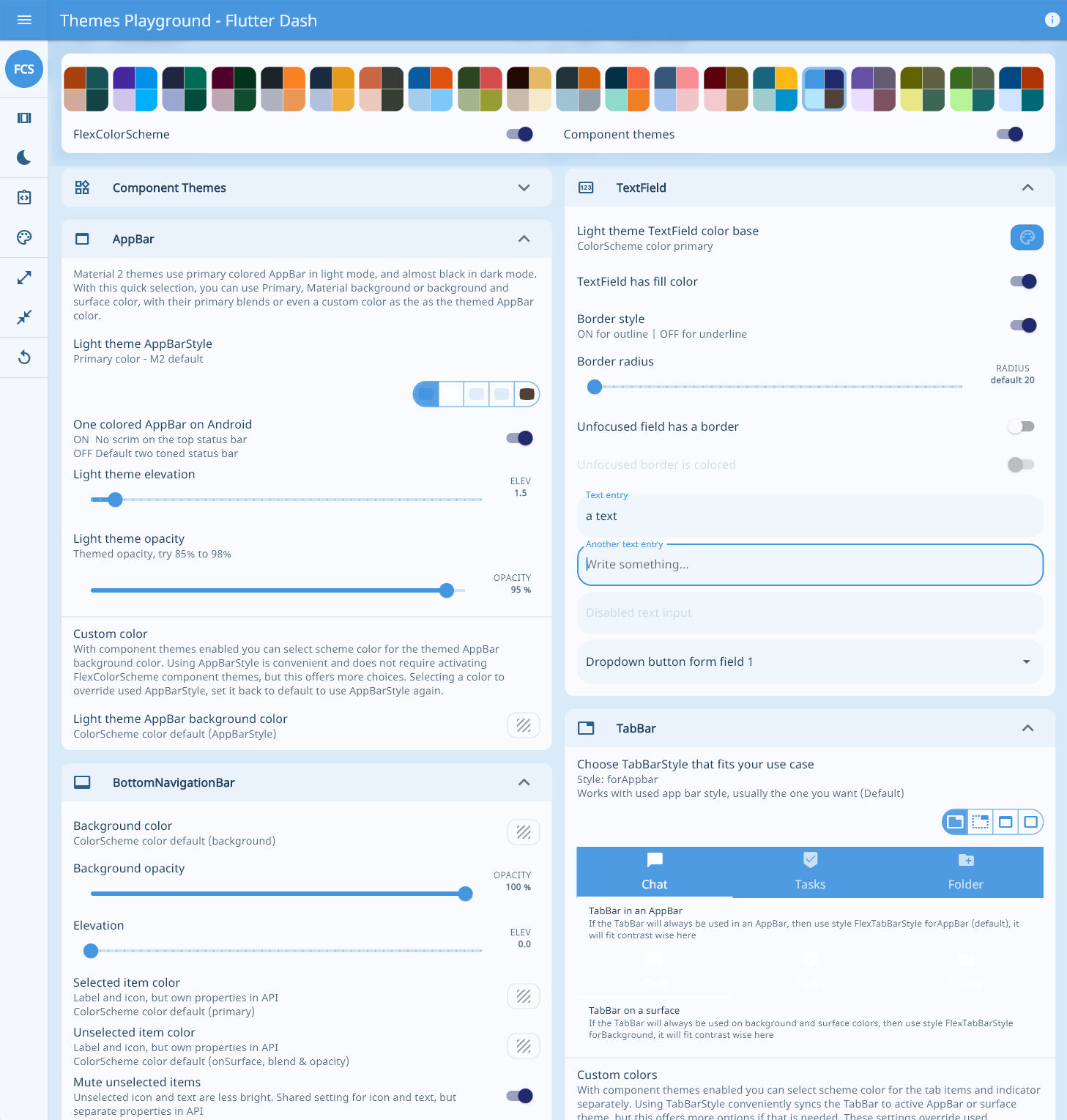
- One theme topic single page view (phone)
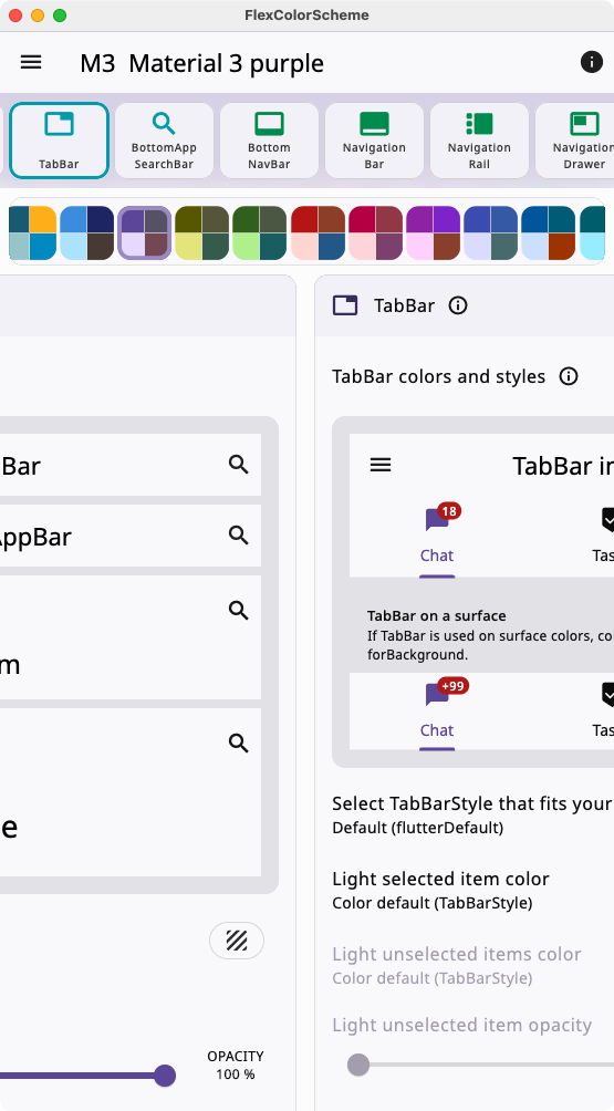
- Two topics single page view (small tablet)
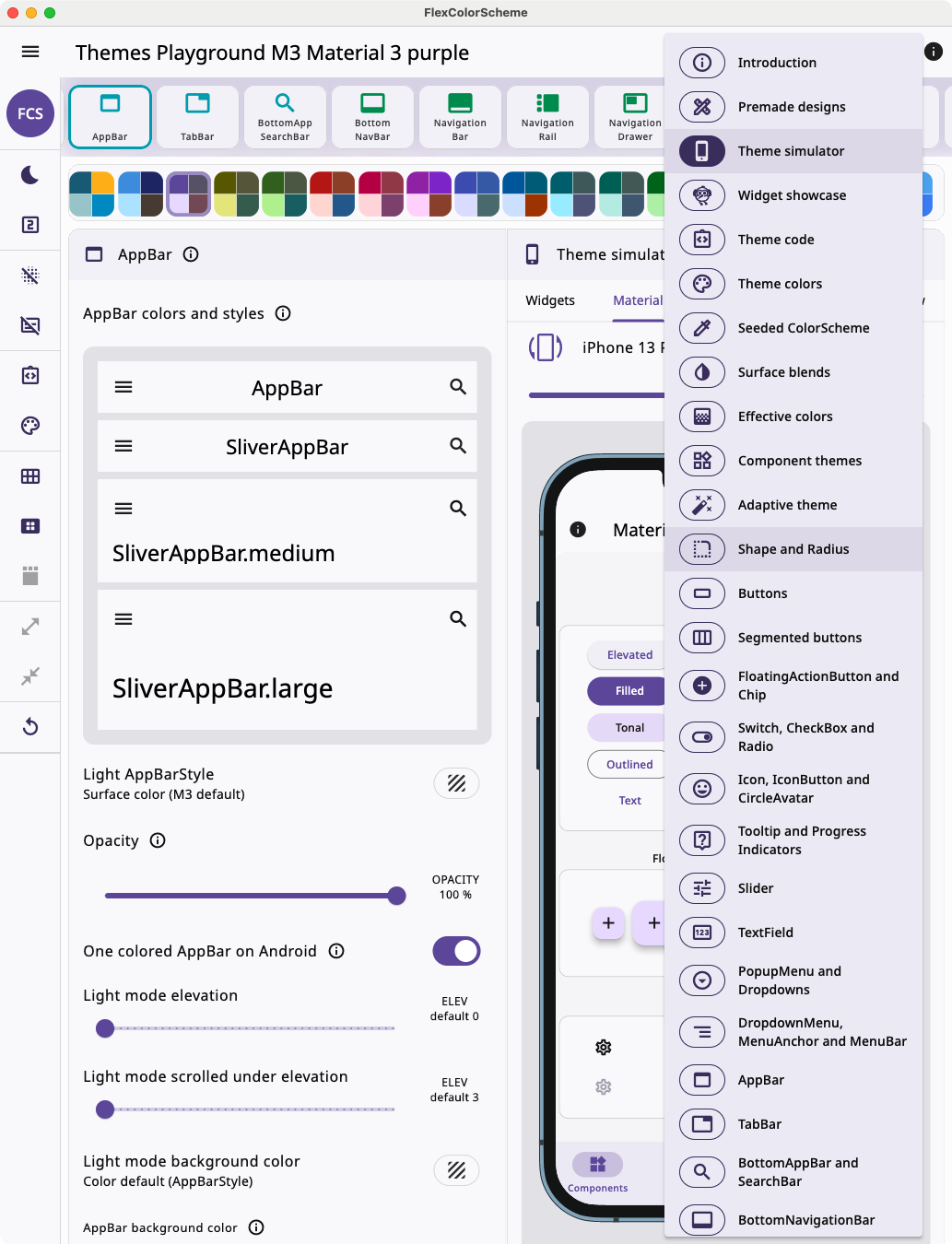
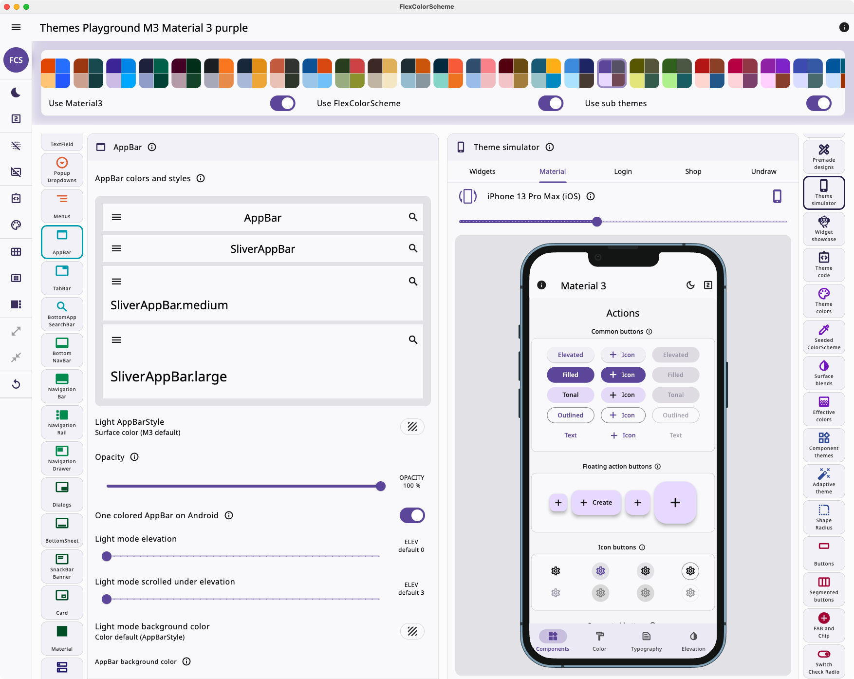
- Two topics side-by-side with colors at the top (desktop, large tablet)
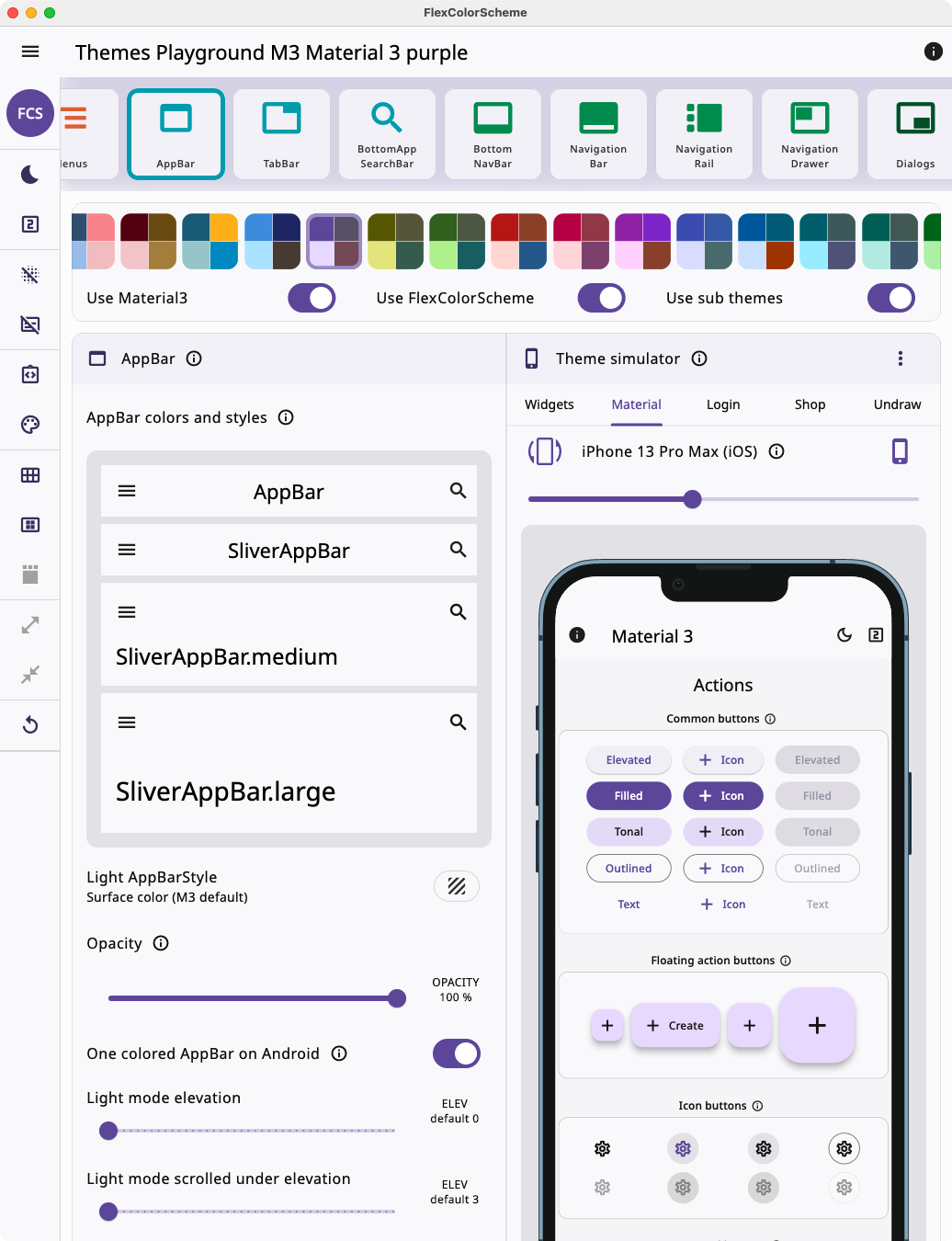
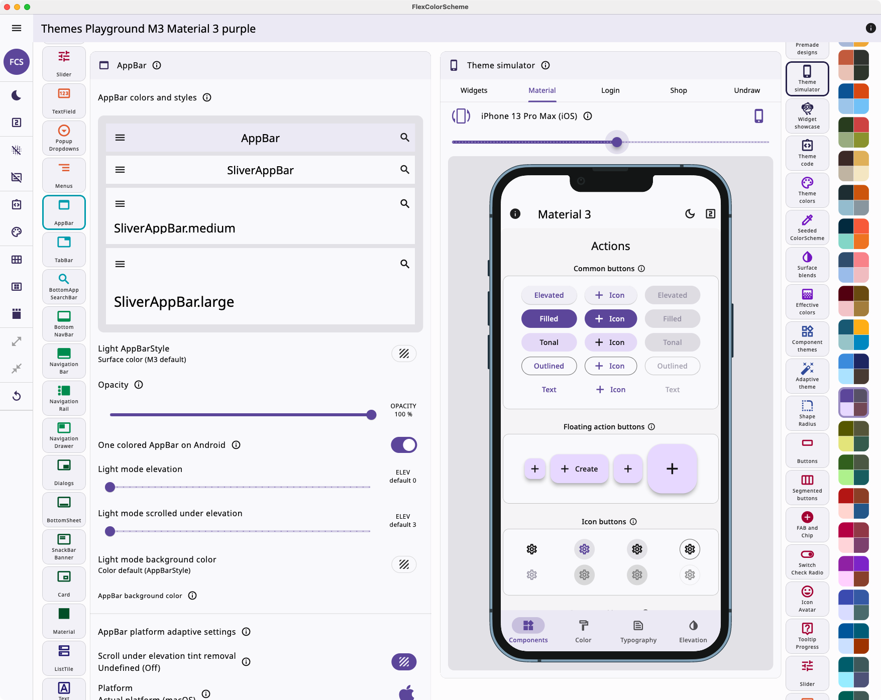
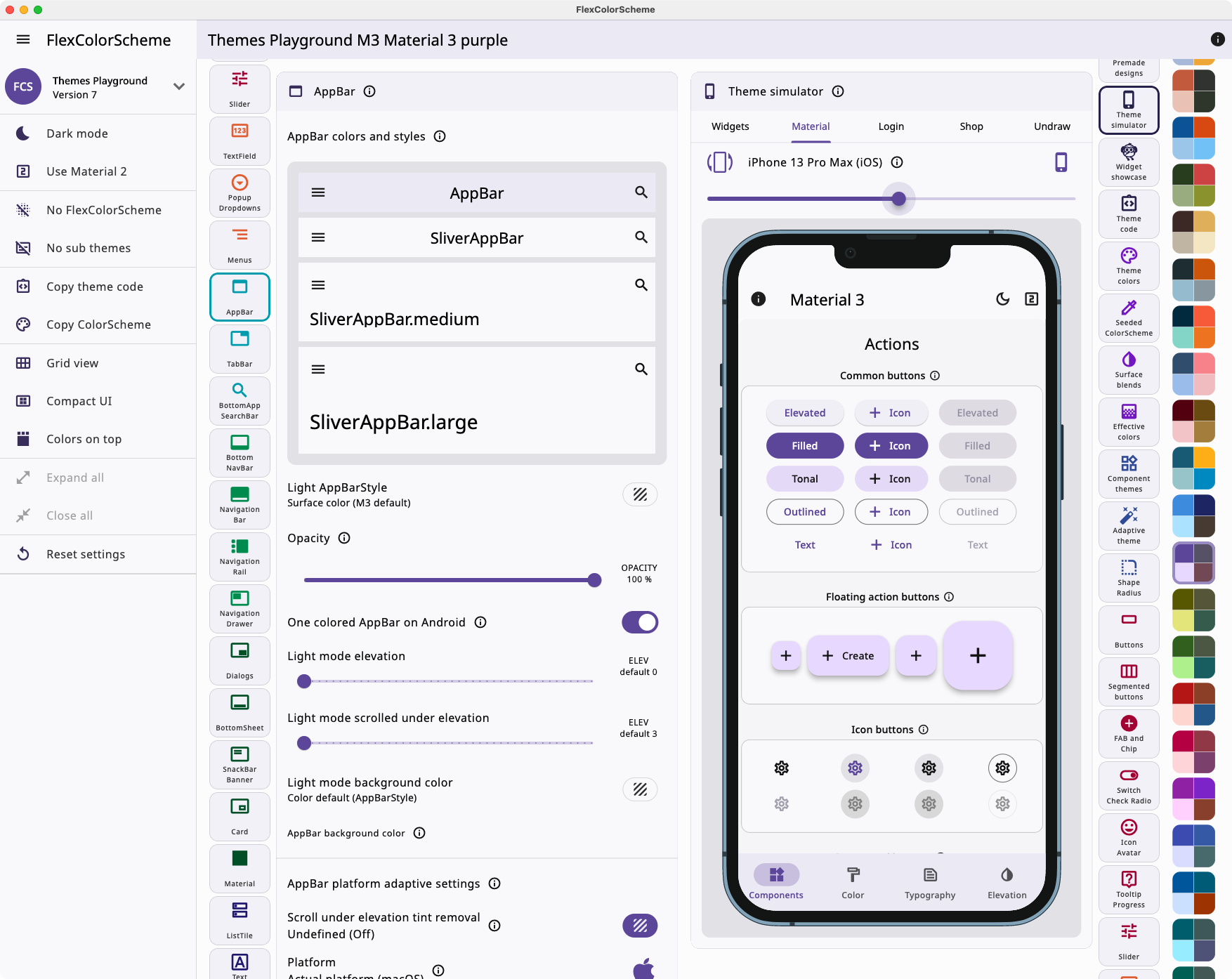
- Two topics side-by-side with colors on the side (desktop, large tablet)
The views 1 to 4 are all part of the page view layout mode. This mode switches layout automatically depending on screen media size. It switches between layouts 1, 2 and 3 or 4. The choice between 3 and 4 is a manual user preference toggle in the side command bar. There is also a large and compact interface mode, making theme topic panel spacing as well as theme topic and color selection buttons smaller or larger.
1) One theme topic single page view
In this view, the theme topic panel can be swiped horizontally, with e.g., the thumb to casually move to the next theme topic panel. When scrolling vertically, the theme topic selection buttons and theme colors selection also scroll away to reveal more content.
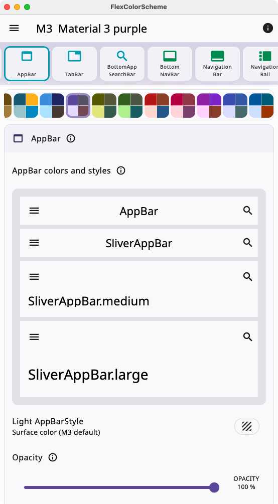
2) Two topics single page view
In this view, the single page view shows two theme topic panels side-by-side in a tight layout. This size shows up at typical tablet sizes, on some tablet sizes in vertical mode. The layout can be toggled between compact and large UI. The right column can show any selected theme topic as well, but the secondary topic selection is done via a popup menu.
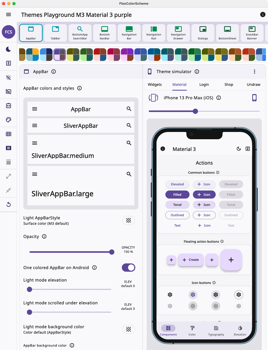
In this view, you can still also swipe the topic panel to go the next one. The left one will change to the next topic, but the right one, that you select via the popup menu, remains the same.
3) Two topics side-by-side with colors at the top
This view shows up at desktop sizes or large tablets in landscape mode. There are separate scrollable theme topic selectors on the left and right side of each viewed theme topic panel.
This view makes it quick and easy to select the desired theme topics for the left and right side. The color selection is at the top. The UI mode can be toggled between large and compact.
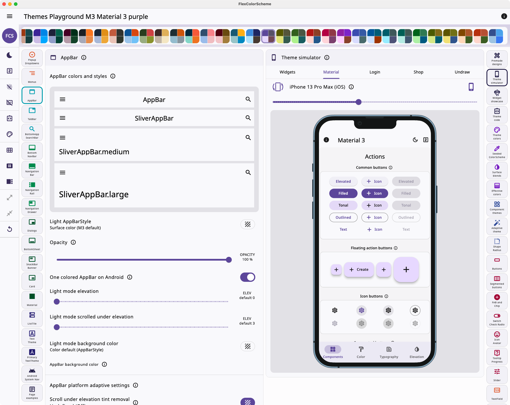
4) Two topics side-by-side with colors on the side
This view shows up at desktop sizes or large tablets in landscape mode. The main difference to the previous one is that the manually controlled option to place the colors on the side has been used. The purpose of this layout is to offer more usable vertical space on height-limited desktop resolutions that are width focused. This applies, for example, to typical 16:9 full HD screens (1920x1080 pixels).
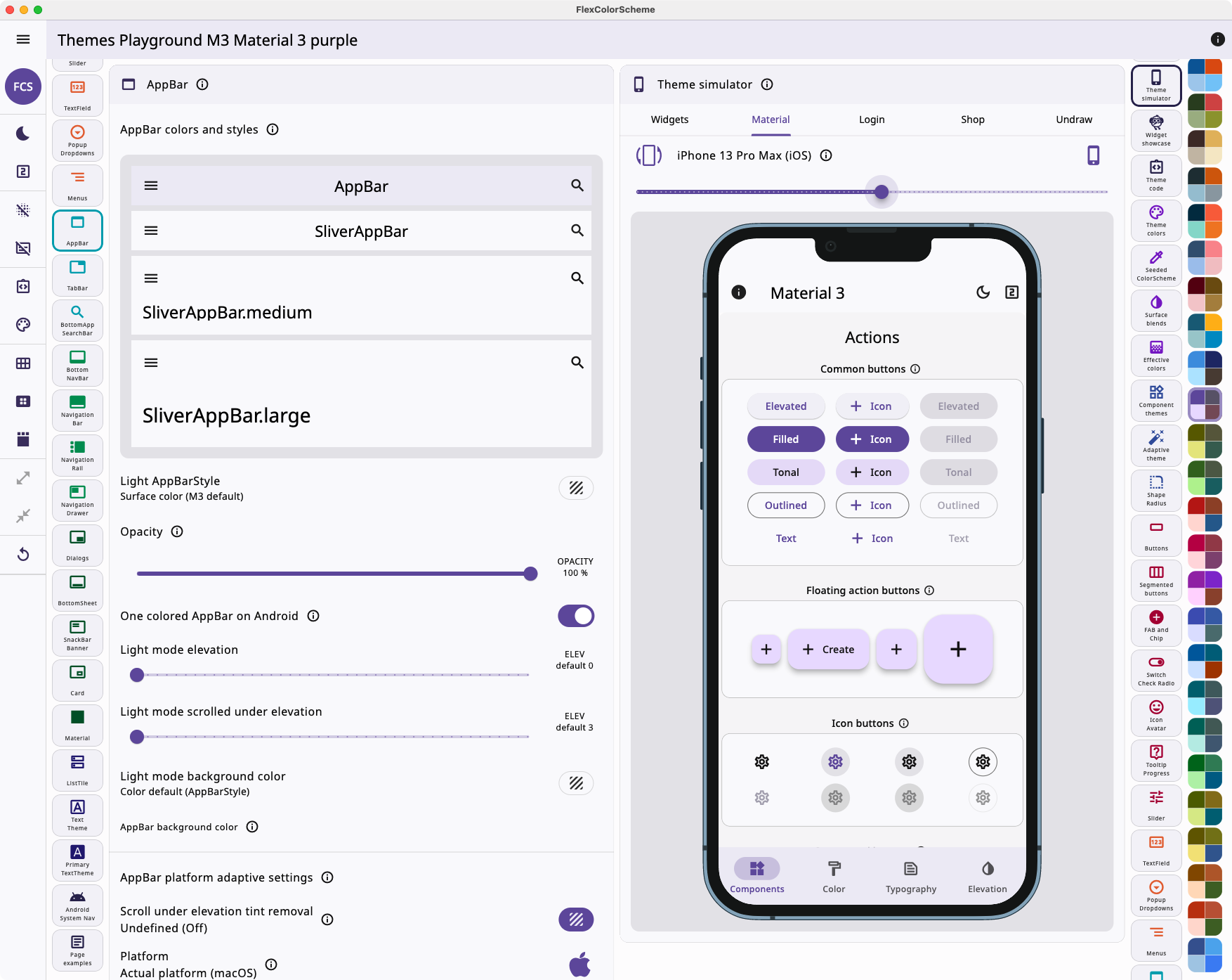
In all views, the side command menu can also be toggled. On larger media it toggles between a full-sized side command menu or side rail. On smaller media it toggles between side rail and hidden in a side drawer.
Theme Topics
The theming topics that you can act upon or use as views for more information and to see the results are displayed in theme topic panels. You select which theme topic to view and use, via the theme topic buttons.
The theme topic panels are grouped into related topic groups that share the same color on their used theme topic icons. This provides visual ques when navigating all the different theme topics.
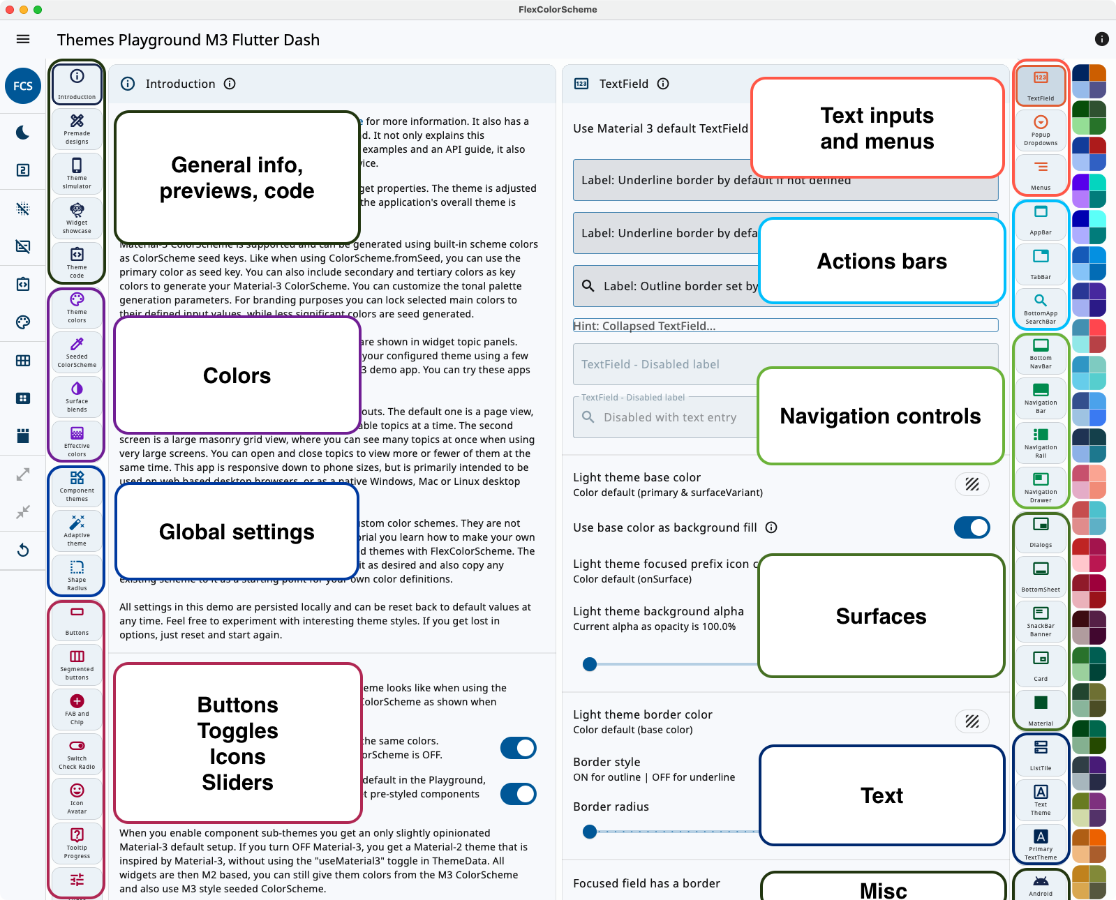
Interactive Theme
When you change settings in this application, be it colors, border radius and other styles, it is important to recognize that there is no code in this application, that sets color and style on any of the displayed components being modified.
What is happening is that you are manipulating the global theme for the application, and the application is being rebuilt with a new theme interactively and in real time. Every time you modify settings, it creates a new ThemeData object that the application uses. This is probably not something you would do in a typical application, not to the extent this application does it anyway. Still, as demonstrated in this application, you clearly can.
Some theme changes can be a bit taxing calculation wise. Some changes that appear to be lagging behind do so only due to the theme change animation. The MaterialApp always lerp animates a theme change from all its previous ThemeData property values, to its new ThemeData property values. So when you drag sliders to change border radius, this triggers an animation from a complete ThemeData based on the previous slider value to the next one, based on the new slider value, for every rapid slider value change. This can be seen as a slight delay in the manifestation of the latest value, as the theme is animating to the last slider value. This can certainly be avoided by not triggering a theme change until the slider change is complete, but in this case we preferred to show the change as the slider is being adjusted.
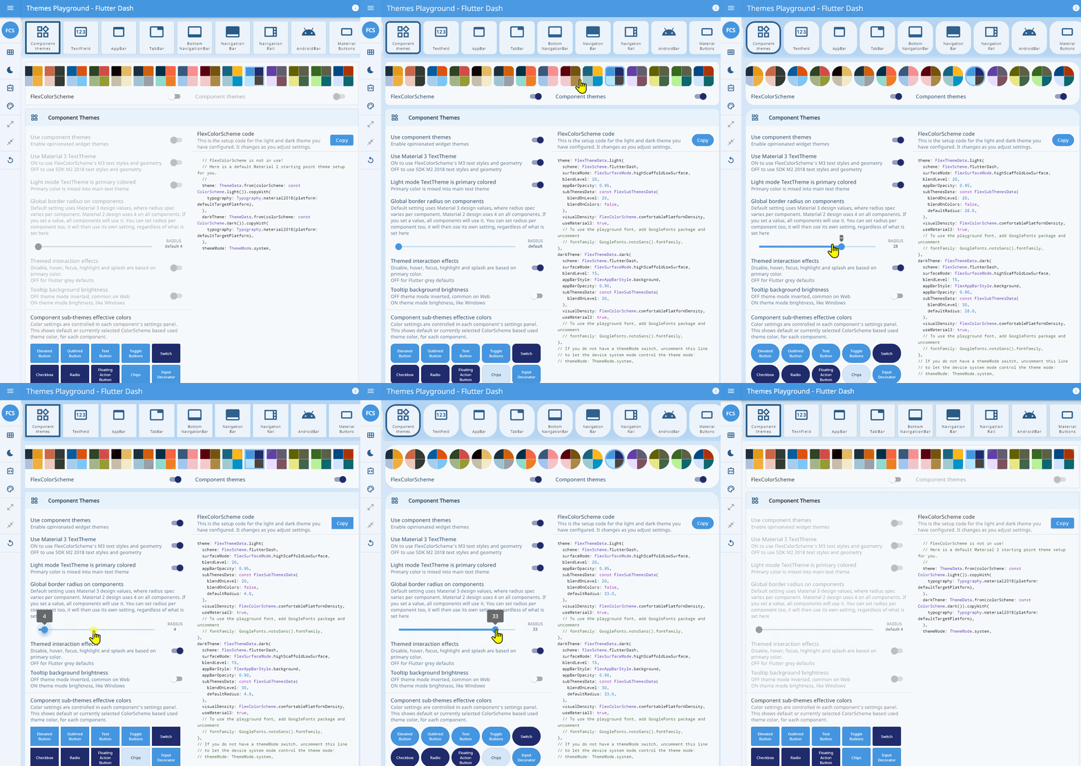
In the above recording you can see how the application's look, and all widgets in it, change as we switch FlexColorScheme theming from being completely OFF to ON, and then turn on using component sub-themes, and lastly as we manipulate the defaultBorder radius for all widgets. Observe that it also changes all buttons, cards and other elements used by the application itself.
Code Generation
When you open the page view on a large enough screen, you will see the generated setup code side-by-side with the settings you are changing. Not only is the entire theme of the application changing as you modify settings interactively, the generated code that you need to define the theme is changing as you change settings too.
In the above screen recoding you can see this. For example, pay attention to the defaultRadius value above as the slider is dragged around.
The generated code aims to exclude code when API default values can be used, and to also exclude settings that become redundant if covered by some other value.
Copy Setup Code
Whenever you want the code, you can copy it to the clipboard with the copy button and paste it into your project to use it.
You can also, at any time, use the drawer, side rail or side menu action item "Copy theme code". This will open a dialog that shows the current theme setup code, with a copy icon button as well. This action button and dialog view can be practical on smaller sized media where you cannot see the code side-by-side with the configuration controls.
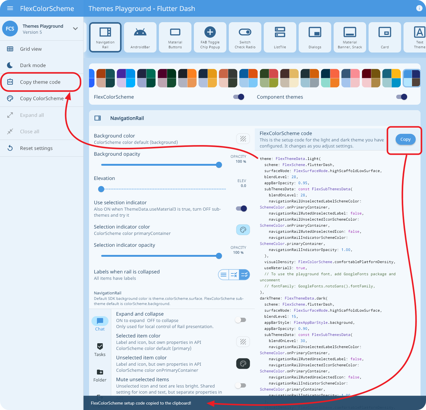
When you have copied the code for the setup you configured, you can paste it into your application and use it as-is, or use it as a base for further modifications. You can also paint and select only parts of the code, and copy just a few lines. This might be useful if you only modified a few settings from previous configuration.
If you want to quickly test out themes on a pre-made template app, you can use the Copy Playground Theme. It is useful since it includes presentation of all colors and common Flutter Material UI widgets. You can use them to verify that the theme looks as intended.
Smart Controls
The user interface disables controls and settings that are not available in a given configuration. For example, when you turn OFF FlexColorScheme, there are not many controls that can be operated, with opinionated component sub-themes OFF, most controls are still disabled.
When you enable component sub-themes, most controls are available. However, there are a few that are disabled in certain combinations, or only appear under some given conditions. Like using computed dark theme, or which color input to use on custom dark theme as keep color for the seeded ColorSchemes, to mention a few.
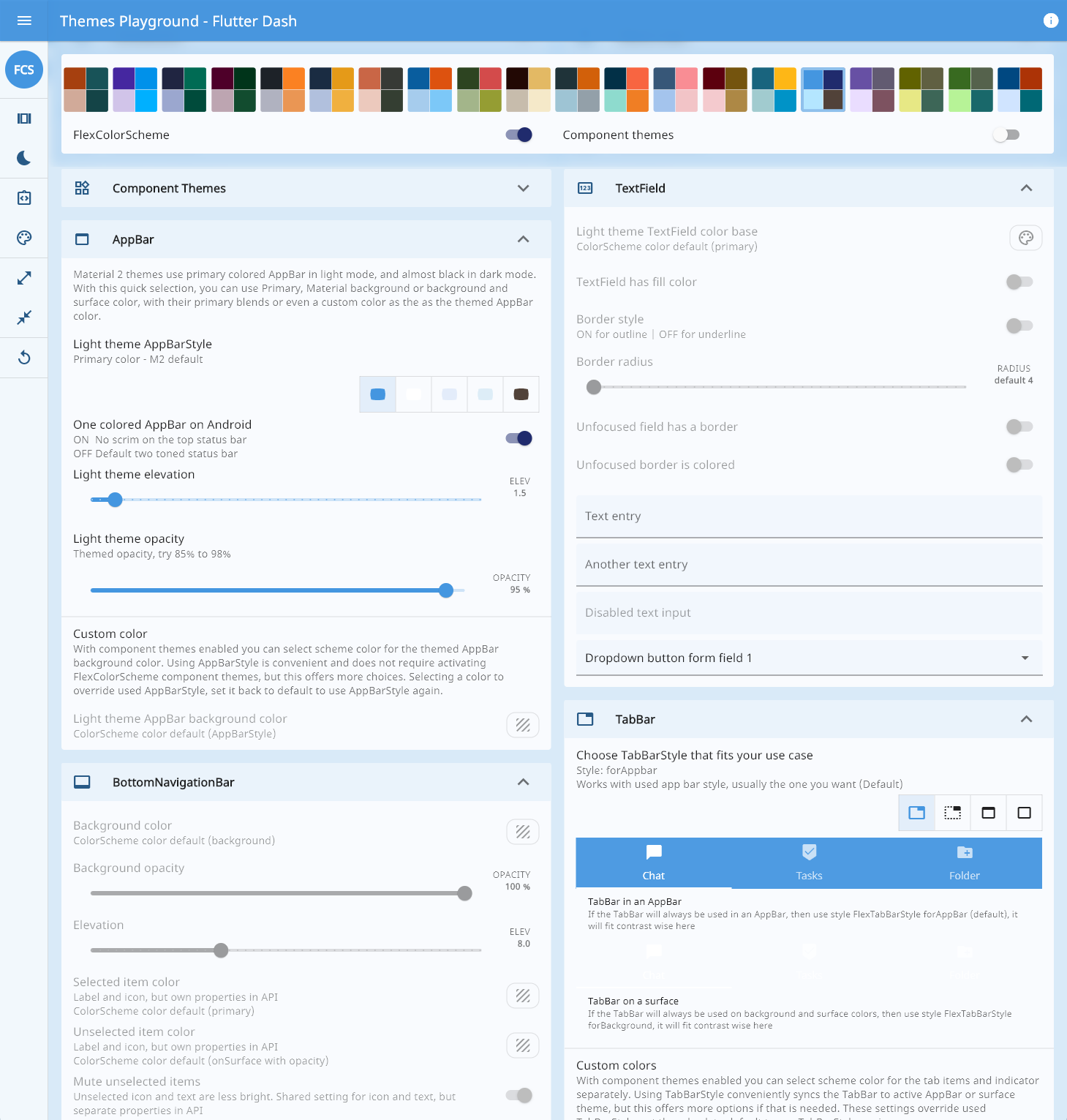
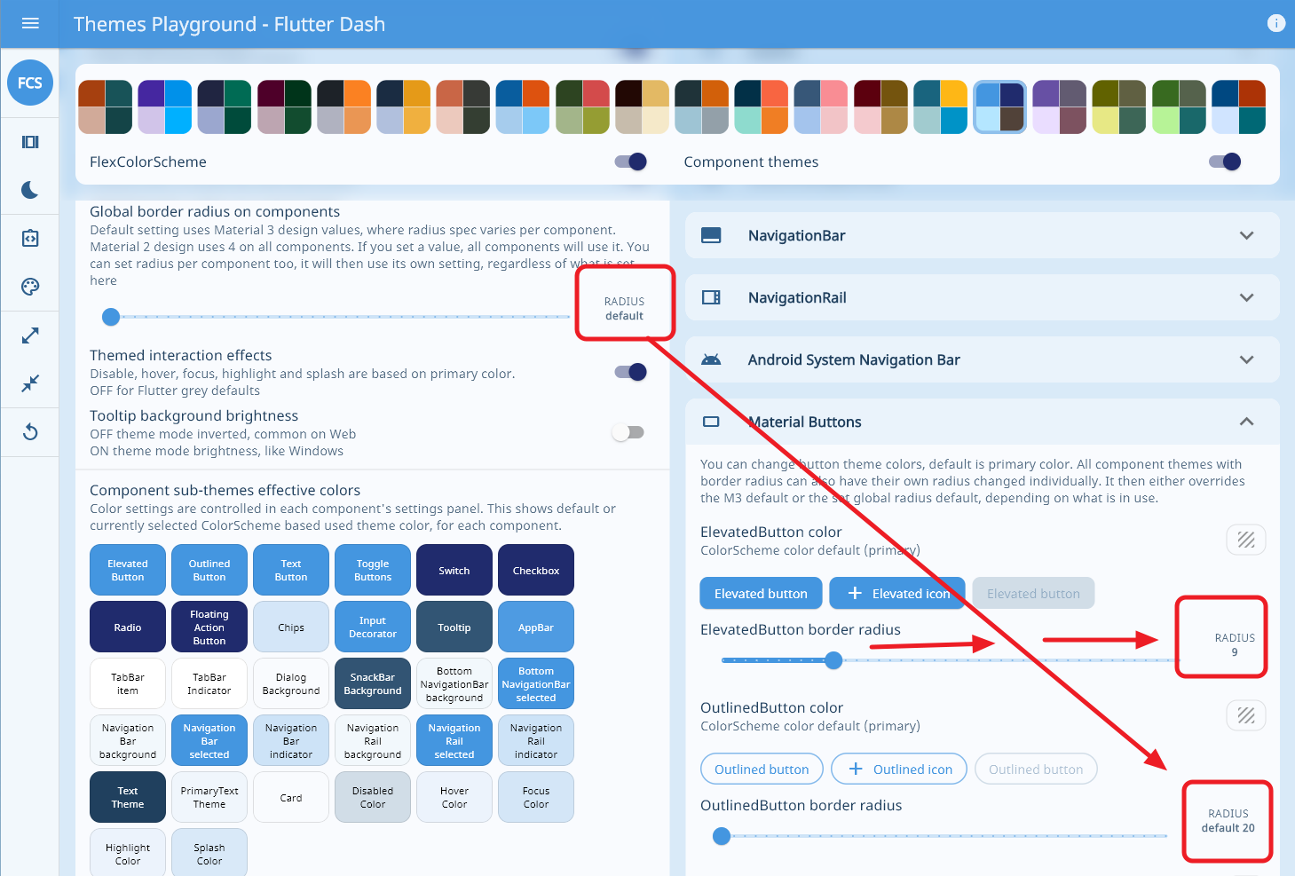
Controls also know and show different default values depending on your settings. If you turn OFF using FlexColorScheme, toggle using component sub-themes, and even change using the default radius to a fixed value. Widgets know and tell you what their default value is in each situation.
The default value means the default style and behavior a component will use when a given property value is undefined. When you turn OFF using component themes, or FlexColorscheme entirely, it shows the default for that mode. In the above example, the radius widget also becomes disabled.
The undefined defaults are different if FlexColorScheme is not used at all, then you are looking at Flutter SDK default behavior for the widget. If you turn ON FlexColorScheme, but keep component sub-themes OFF, then you are looking at the FlexColorScheme core defaults. Mostly they are the same as when not using FlexColorScheme at all, but for certain colors and elevations they differ. The FlexColorScheme core defaults explains, how, when and why FlexColorScheme without component themes enabled, differs from Flutter SDK defaults.
With component sub-themes ON, you again get different defaults, especially for border radius that default to Material-3 specifications where border radius varies per component type.
If you when using component sub-themes keep defaultRadius undefined, then each component widget will use its Material-3 default border radius value, and show that value when an individual widget border radius has not been specified with its slider.
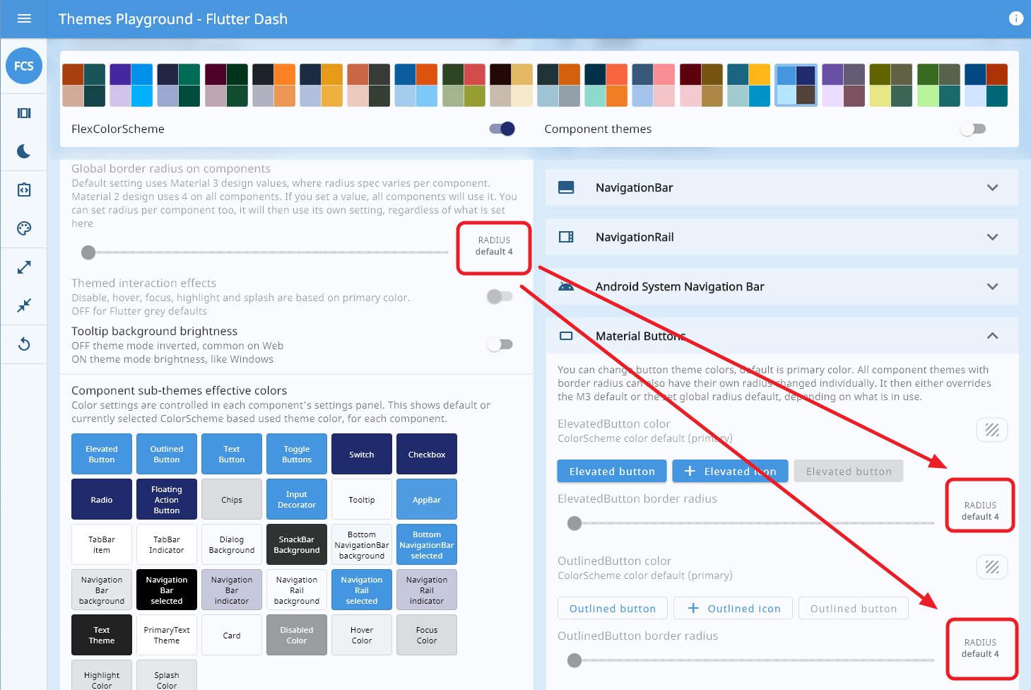
When you set a global default radius, component themes will show and use that value as their default border radius when not defined, and also state that it comes from the global border radius default. If a component widget has specified its own border radius, it shows that value. If you then turn OFF component sub-themes, it will get disabled and show Flutter SDK Material-2 default border radius (4 dp) again.
This type of logic applies so far to border radius, various differences in default colors and elevations, when FlexColorScheme is not used at all, is used, but component themes are not enabled, and when they are enabled.
Small details like this help you keep on top of what default values are used when. Configuration controls are only available when they actually have an impact on the theme. Thus, they can only be operated when they can impact the produced theme. This helps you avoid trying to adjust things that have no impact in a given mode.
Input Colors
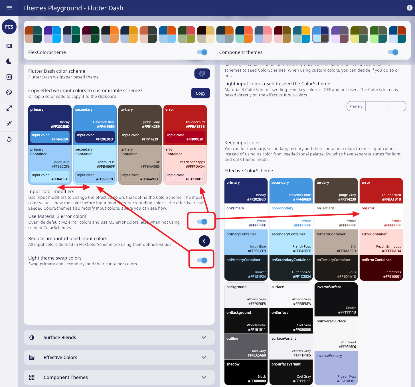
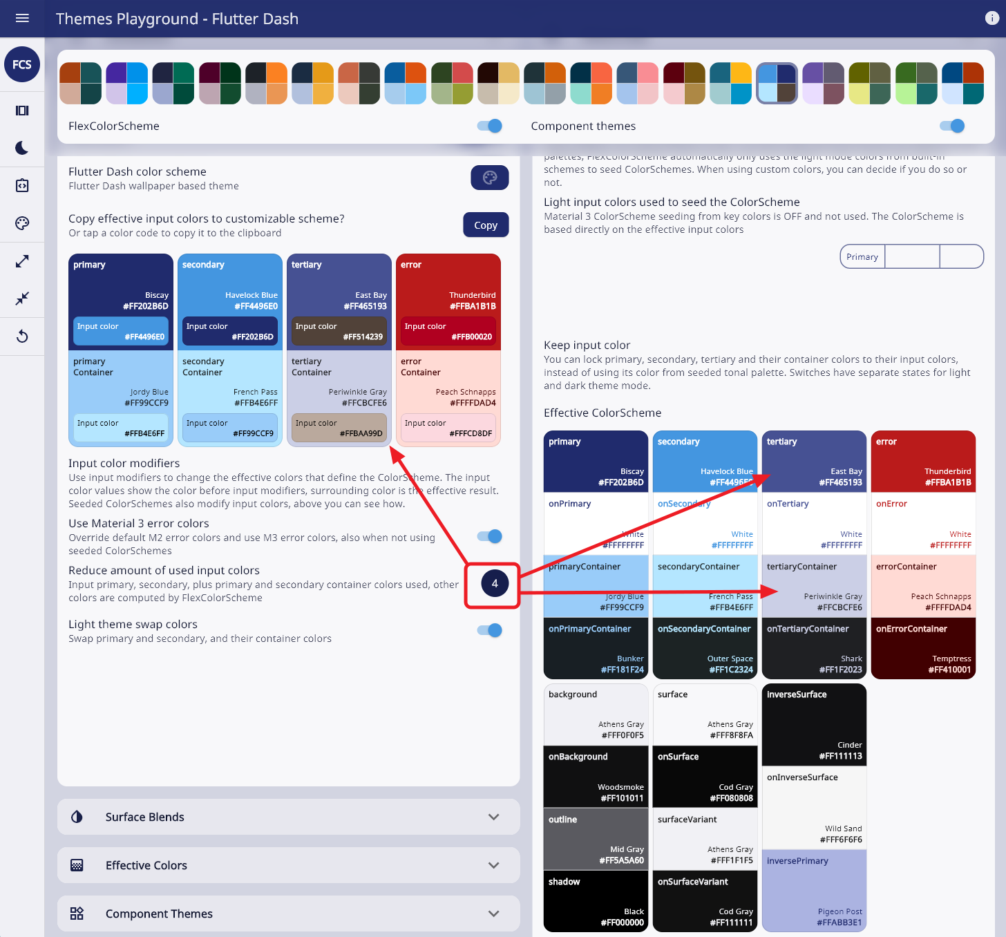
The input colors is your view into your scheme's raw input colors, as the color values are defined by each built-in theme. There are a few settings you can use to modify these input colors with, before they are used to create the effective ColorScheme for the theme.
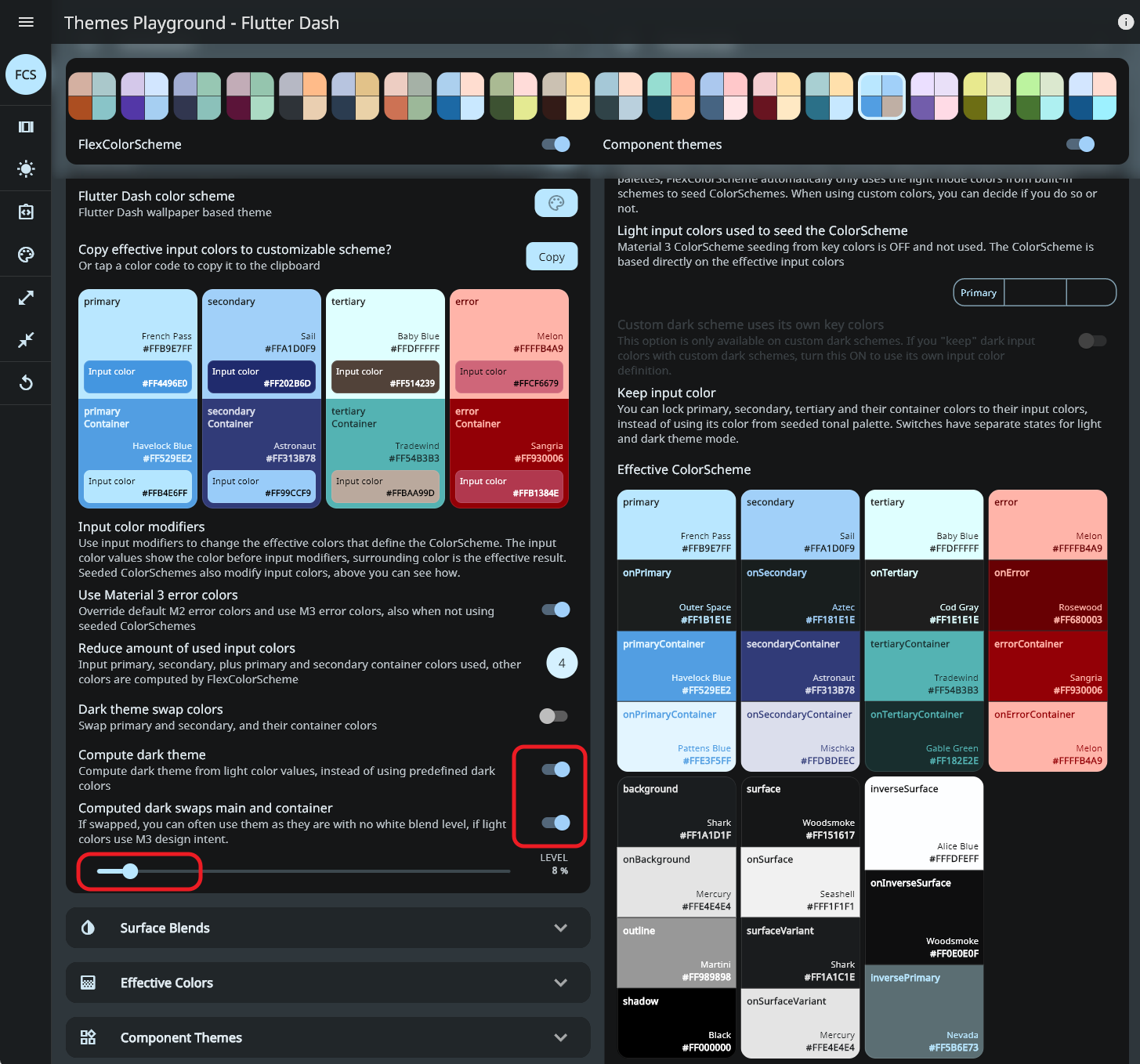
You can swap primary and secondary colors, including their container colors. Reduce the number of used colors, and in dark mode use computed dark theme. Using a computed dark theme is useful when making a custom theme if you have only defined custom colors for your light theme, you can then let FlexColorScheme compute the colors for your dark theme.
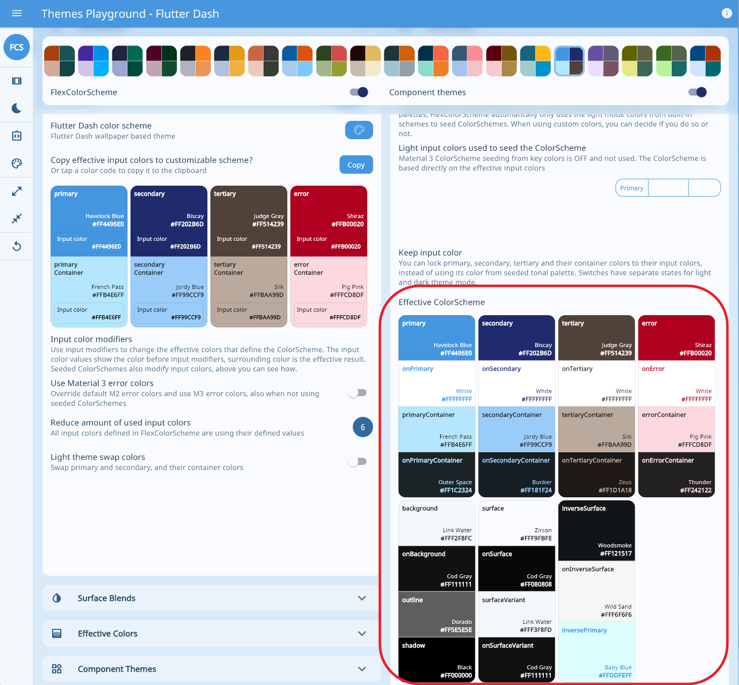
In the above case, using the masonry grid view on a large screen is helpful, since we can open and close panels to configure the view like above, and then see the input colors and the detailed full effective ColorScheme at the same time.
Seeded ColorScheme
Using seeded ColorScheme is a way to use different Material-3 ColorScheme generation algorithms. They generate complete and balanced color schemes for both light and dark theme mode, from only one or a few input key color values.
Flutter SDK only allows you to use a single key color, a main or primary color, as seed color to generate the ColorScheme. With FlexColorScheme, you can do so too, but you can optionally use secondary and tertiary colors as additional input key colors to generate the effective ColorScheme.
The used input key colors could also be extracted and sourced from images, like e.g. the device wall-paper, or even from image used in an app or seen in a flow of images, and then used in FlexColorScheme to generate the ColorScheme from them. In a future version of the Themes Playground this might be added as a way to generate a ColorScheme and theme from it. There are no additions needed in FlexColorScheme to do this, all it needs is one to three key colors extracted from an image to generate a theme using them.
Using a Seeded ColorScheme is also a form of input color modifier, since it takes the color values defined for the light theme's primary, secondary and tertiary colors, and computes a new derived ColorScheme from them.
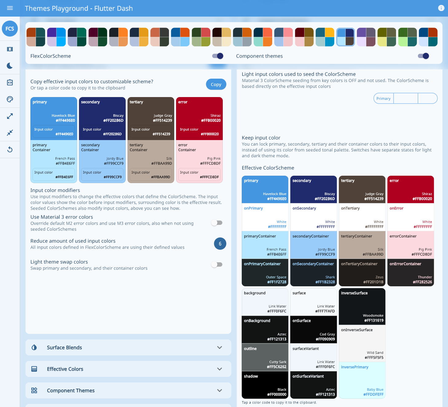
Below we can see the Flutter Dash theme:
-
As defined by built-in colors, with no seeded
ColorScheme. -
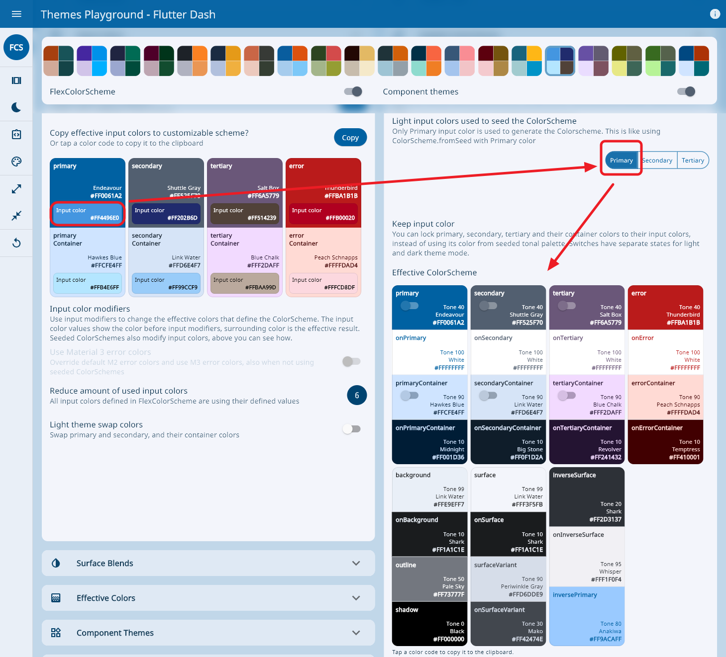
With a single color, the built-in light theme mode primary color from the Flutter Dash theme, used as key color to seed the generated
ColorSchemeused to make the theme. This is identical to theColorSchemewe get when we use Flutter SDKColorScheme.fromSeedwith the primary light theme mode color. -
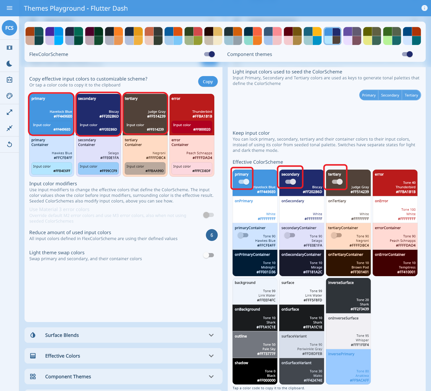
Using three key colors, from the built-in light theme mode Flutter Dash theme. Its primary, secondary and tertiary colors are used for each main generated Tonal Palette. This type of seed generated
ColorSchemeis not directly available in the Flutter SDK. -
In the last version we lock the main colors, primary, secondary and tertiary. To keep using their defined Flutter Dash "brand" colors, but let all the other colors for the ColorScheme be computed. Generally, they look very balanced and nice and will typically make an app using Material-3 color system look great, but you may often need to keep using main colors as defined by the brand or customer requirements.
Tonal Palettes
What are Tonal Palettes? They are described in detail in the Material-3 color system guide here. The short version, a Material-3 ColorScheme uses six different Tonal Palettes, with 13 colors tones (shades) each:
- Primary palette
- Secondary palette
- Tertiary palette
- Error palette
- Neutral palette
- Neutral variant palette
The ColorScheme uses colors from these palettes for its colors, by using a predefined tone for each color from a given palettes. The light and matching dark mode ColorScheme use the same tonal palettes, they just use different tones from the same palette for corresponding colors.
The Material-3 color system calculation algorithm produces the above tonal palettes based on given input color, and then colors from the palettes are assigned to the resulting ColorScheme.
When you use seed generated ColorSchemes in the Themes Playground, you can see all the generated Tonal Palettes. They are shown in the order primary, secondary, tertiary, error, neutral and neutral variant.
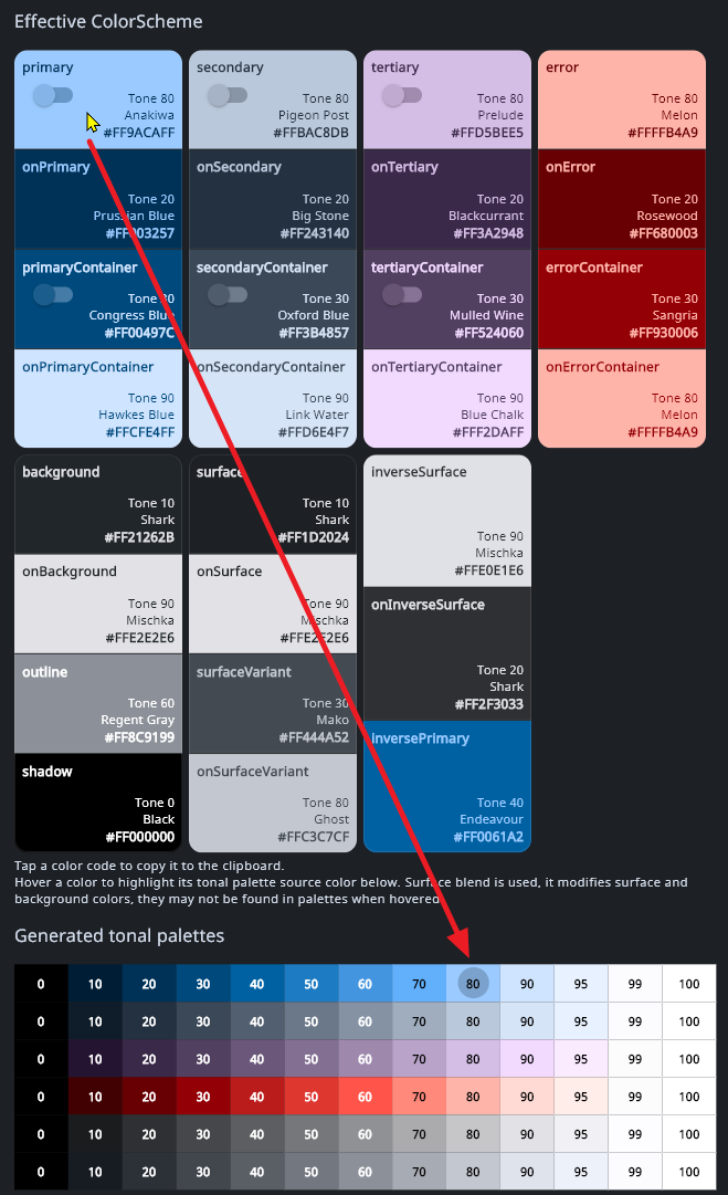
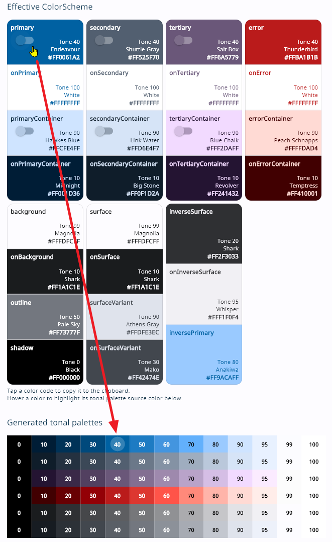
Below we can see the Tonal Palettes when using the Flutter SDK default Material-3 based ColorScheme tonal palette generation algorithm, using a single input key color. It is shown in both light and dark theme. We can see that the Tonal Palettes for both light and dark theme modes are identical, what varies is which tones are used for each color by the light and dark theme mode ColorScheme.
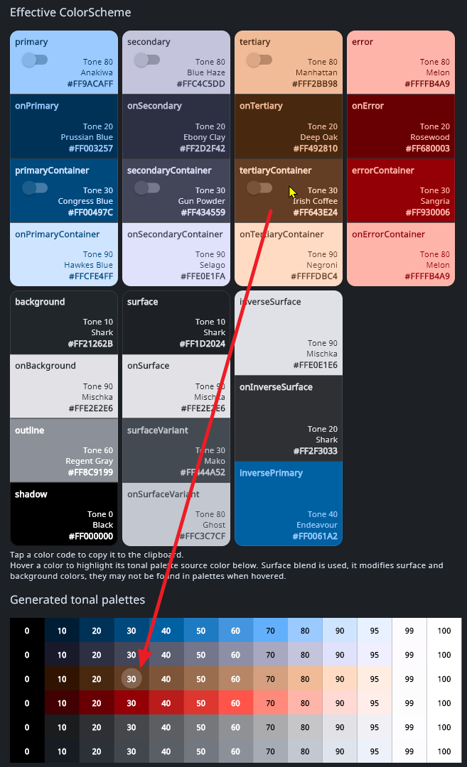
For example, tone 40 is used from primary Tonal Palette for the ColorScheme.primary color in light theme mode, while tone 80 is used in dark theme mode. On the web and a desktop build of the app, if you hover with the mouse over a seeded ColorScheme color, its source color will be highlighted in the computed Tonal Palette.
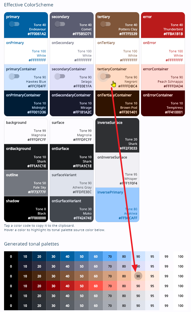
For comparison, we above see the same Flutter Dash theme based generated Tonal Palettes when using primary, secondary and tertiary colors as seed key input colors, instead of only primary color. In the "all keys" setup, we as an example show the tone mapping of the tertiary container color, in light and dark theme mode.
Flex Tones
Above, we saw that even when we used three input colors as keys, we did not get so much of the chroma in the used input color in the resulting Tonal Palettes for the secondary and tertiary colors. This is because the default Material-3 tonal palette calculation algorithm locks chroma for secondary tonal palette generation to 16, and it uses the hue from the same used key color.
For the tertiary tonal palette, chroma is locked to 24, so a bit more colorful than secondary, which can also be seen in the produced palettes. Additionally, hue is rotated +60 degrees from the input key color hue, effectively generating a new hue, based on the single input key color.
The primary tonal palette uses the chroma and hue from the key color, but chroma is only used if it is higher than 48, if it is lower, 48 is used. This ensures that it always has a suitably high color saturation.
The neutral palettes are also using the same key color as input, but with very low chroma, 4 for the neutral palette and 8 for the neutral variant palette. This will create neutral surface colors that contain a hint of the key (primary) color in the surfaces as well. This is similar in concept to the primary color surface blends that FlexColorScheme has used since version 1.0. In the Surface Blends chapter below, we see that surface blends can optionally also be used when using seed generated ColorSchemes. Many of the example screenshots above already did so.
Lastly, the error tonal palette is simply made from a fixed color value, having hue 25 and chroma 84.
When we used key colors also for the secondary and tertiary tonal palette generation, it substituted the hue used for secondary and tertiary tonal palettes, to use the hue in their own input key colors, and no longer relied on the values derived from the single input main/primary seed color. We did, however, not do anything to the chroma limits, used by the default Material-3 design specification Tonal Palette color generation algorithm's parameters.
FlexColorScheme would not be "flex" if it did not allow us to modify chroma as well. We can define custom parameters for all key colors that define their chroma limits. Using them can modify the limits for the input colors when we generate their tonal palettes. We can lock it to a given value, or we can let it use whatever chroma it has, or we can say it can use whatever chroma it has, as long as it is over a certain limit. This is useful because if the chroma is very low in the input key color, we basically get an almost greyscale tonal palette, like the neutral tonal palette colors.
With the FlexTones API you can define these limits as desired for the tonal palette generation. We don't have to limit the design to the default parameters used by ColorScheme.fromSeed. We can tweak them, but still use the same algorithm and principles, but tuned to fit our design goals, while still benefiting from these marvelous color generation algorithms.
We can do even more than this, we can also modify the mapping of which tone is used for what color in the ColorScheme from the generated Tonal Palettes, as long as it is from the source palette intended for the target color in the ColorScheme. Not all tones are useful, but for some use cases and design goals, you can very well go up or down a tone value for some colors in the ColorScheme mapping. This can give you a stronger, more contrasty look or an even more muted one than the Material-3 default design.
Current version of Themes Playground "only" lets you change FlexTone settings between nine pre-made configurations. It is simple to make custom configurations with the API. The pre-made ones are mainly intended as examples. You can read more about FlexTones and its usage in the package FlexSeedScheme API reference. If you make a very nice one, please do share it in the FlexColorScheme GitHub discussions show and tell section, perhaps we can add it as another pre-made config.
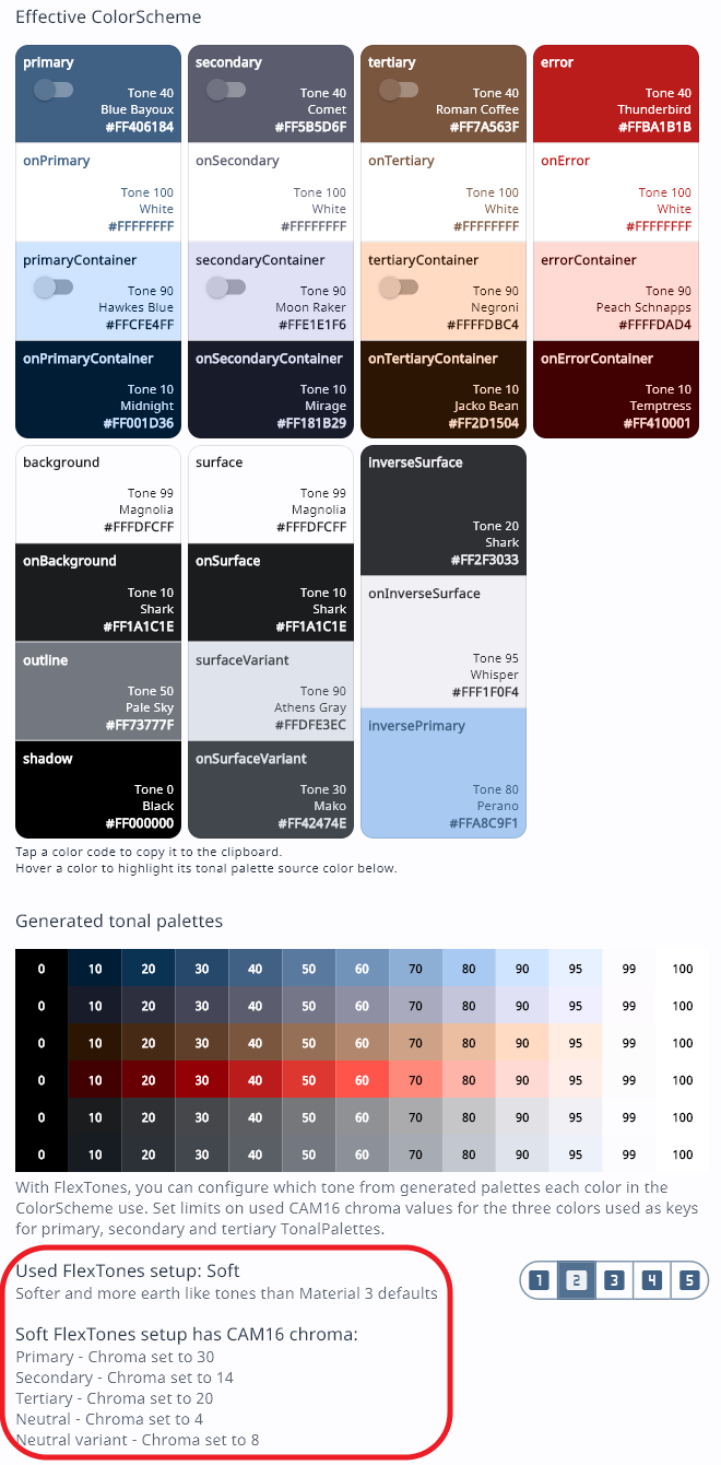
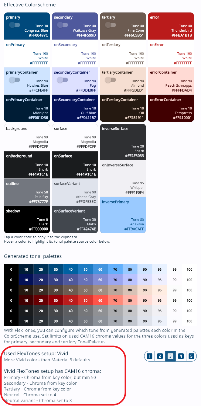
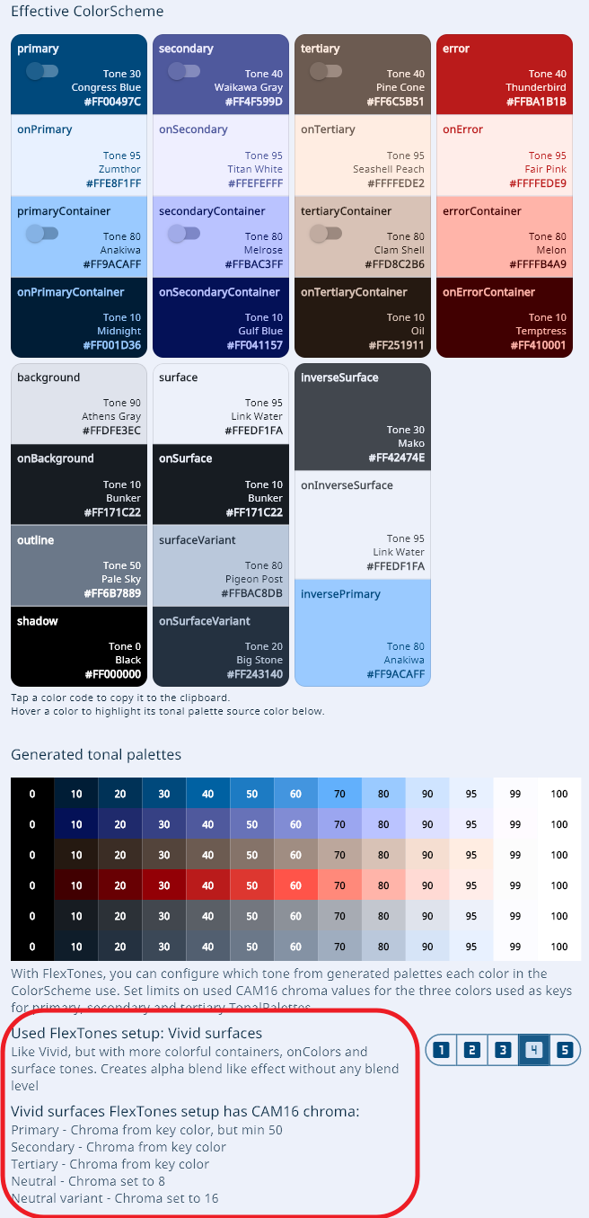
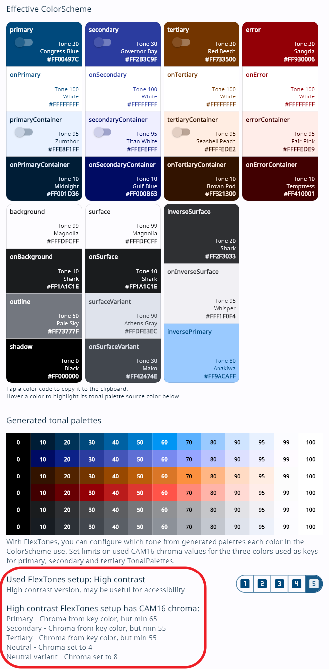
Maybe in some future version of the Themes Playground, custom interactive configuration of FlexTones will be added. For now, let us compare some of the built-in ones we can swap between in the current version. When you select a pre-made FlexTones configuration, the Theme Playground app shows a brief summary of its configuration, here are some examples:
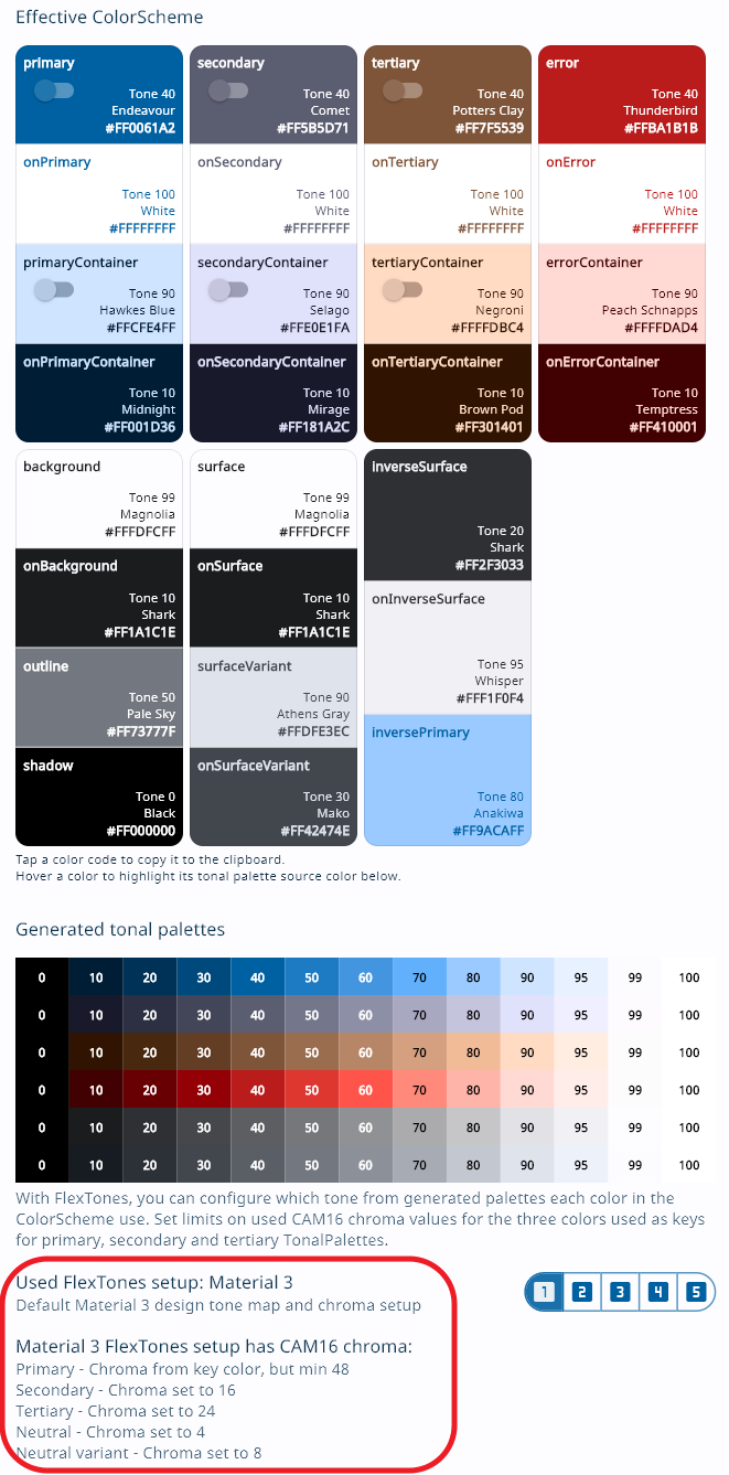
The "Vivid" colors may actually not always be more "vivid" than the Material-3 FlexTones configuration. It depends on the used seed key colors. For the secondary and tertiary tonal palettes, the actual chroma values of the used input key colors are used. This means you will get a generated ColorScheme that looks a bit more like the input colors you used.
Surface Blends
With surface blends, FlexColorScheme refers to using alpha blends to mix in a hint of a color, typically primary color, into different Material surface colors.
The Material-2 guide also talks about using alpha blends to create branded surface colors, especially in dark mode. In this tweet I show an example of how to create such color tinted background and surface colors, using the Color.alphaBlend function.
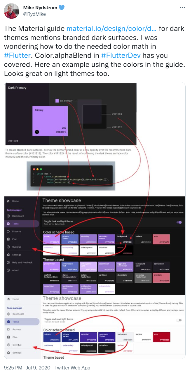
The above is exactly what FlexColorScheme does when you configure it to use surface blends. It also adds different blend modes and variable alpha blend levels, that is then varied per surface type. Or with a bit more detail, the different surface blend-modes vary the defined alpha blend-level value using different fractional factors for different Flutter surface types.
It mainly affects the two main ColorScheme surface colors surface and background, and their derivatives in the ColorScheme. However, FlexColorScheme also creates surface blends for the Scaffold background color, and in some modes even for the dialog background color, treating them as their own themed surface colors.
In addition to being able to blend in primary color into surfaces, starting with version 5, the color of a container can be blended into its own contrasting "onColor" using a blend-level as well. This gives the onColor itself a hint of the color it is on, instead of being plain white or black/dark-gray. For onPrimary, onSecondary, onTertiary and onError, it can be turned OFF completely, while still being used by all the other onColors.
This was added because Material-3 design keeps the onColors for the main colors white in light theme mode, but in dark theme mode that is not the case. With this setting, you can decide if you follow this principle or not, when not using Material-3 seed-generated ColorSchemes. When using the seed generated ColorScheme, this depends on the tone mapping in used FlexTones.
Seed generated ColorSchemes can also use surface blends. Since Material-3 style generated color schemes already include a hint of primary color in all neutral tones, it means that they start with some primary color baked in. When you add surface blends to them, you further strengthen the Material-3 blend effect. Since they don't start at white and almost black, like pure Material-2 surfaces, it means they get much stronger primary color surface blends at same blend-level, compared to a none seed generated ColorsScheme. So be more gentle with the blend level, it is easy to overdo it.
If you want a pure Material-3 guide design intent, keep blend level at zero with seed generated ColorSchemes. A bit more is pretty nice too though.
Seed color generated color schemes do not use onColor blending. This is because such themes already cover this design aspect by using tones from the Tonal Palettes that effectively accomplishes the same thing, and often with a better, or let's call it, with a more balanced looking result.
However, when you "keep" e.g. primary color in a seed generated ColorScheme, its onPrimary color can then use onColor blending. Therefore, this setting is not disabled when using Seeded ColorScheme. However, using it will only impact contrasting "onColors" belonging to the main or container color, that are locked to their original input color.
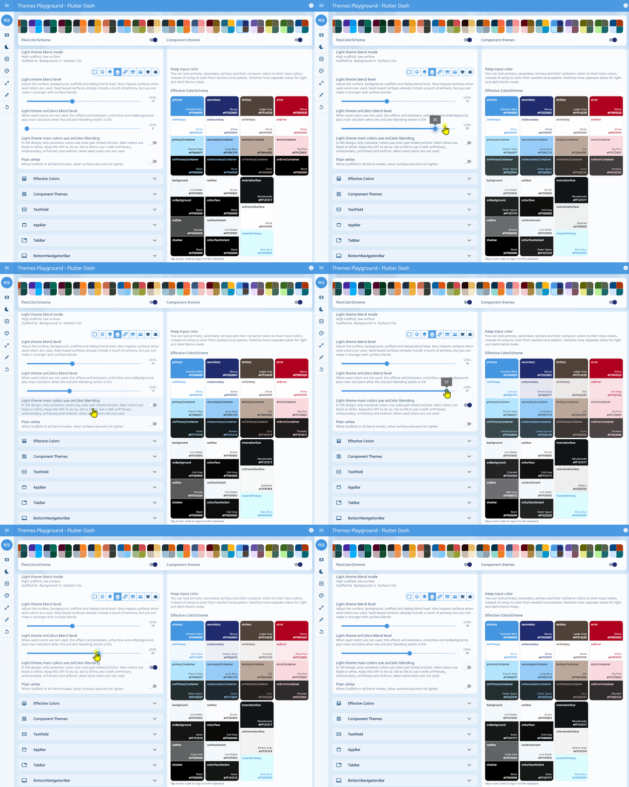
The above may sound complicated, but using it is not. You can just fiddle with settings until you find something you like. The screen recording below shows the surface blend-modes at the same mid-level, and then one of the surface modes from no blend, to maximum blend-level.
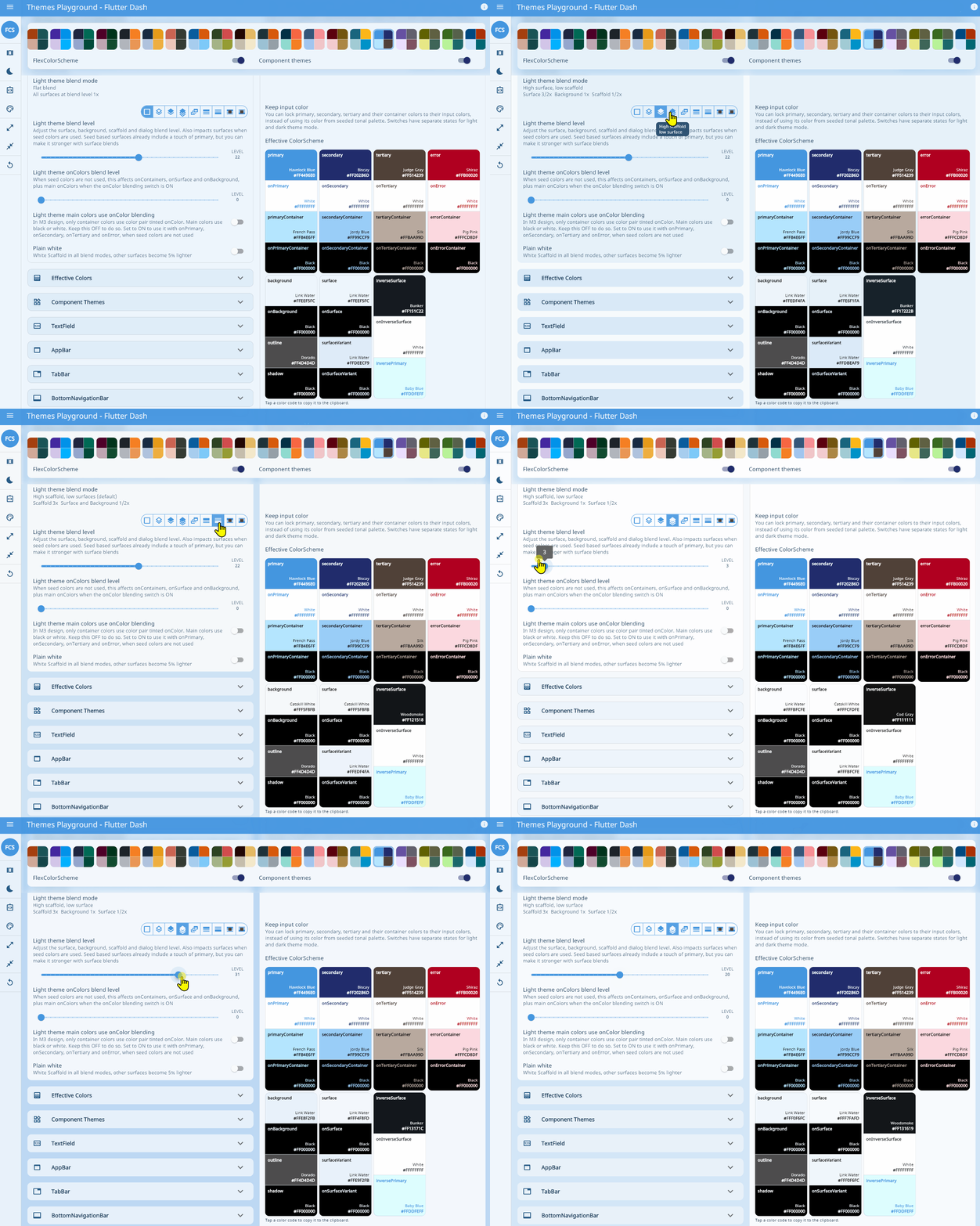
The second screen recording above shows the onColor blending options and levels. The onColor impacts the color you should use for text and icons on container surfaces when you use them on their none "on" colored container. The impact of this is not clearly seen above. Generally in an application, they still create a remarkable subtle toned difference. Most notice it, but might not be able to immediately explain what causes the difference in how the design is perceived.
This is especially true for the Material-3 generated ColorSchemes, that use the matching lighter/darker tones for their onColors, which are often brighter and more impactful than the simpler alpha-blended version.
In both cases above, pay attention to effective surface, container colors and their onColors, and how they change. Also look at the app to see how it visually changes as blends are varied.
Custom Colors
You can copy any pre-made color scheme to the last scheme in the Themes Playground, and use its colors as a base for a completely custom colored theme. You can select and edit colors with the FlexColorPicker. The color picker also allows you to enter or paste in color values to it to define the custom color for each input color in the customizable theme.
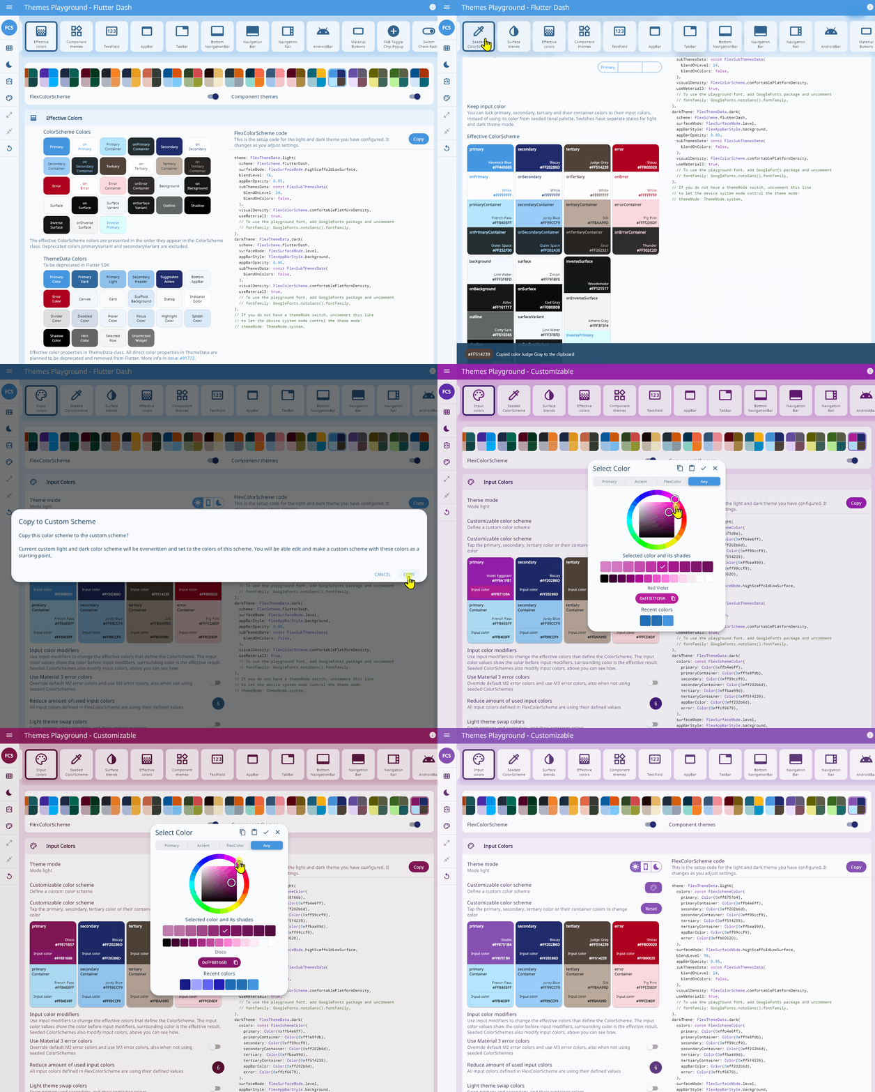
Pretty much any color in a box and color code you see in the Themes Playground can be tapped and its color value is then copied to the Clipboard in Dart format. This is handy if you want to snipe any color you see in the playground. This works with the individual generated Tonal Palette colors too.
Copy ColorScheme
Only want the raw ColorScheme of the active theme you are looking at? No problem, you can copy it too and get a ready-made standard Flutter ColorScheme class definition for it.
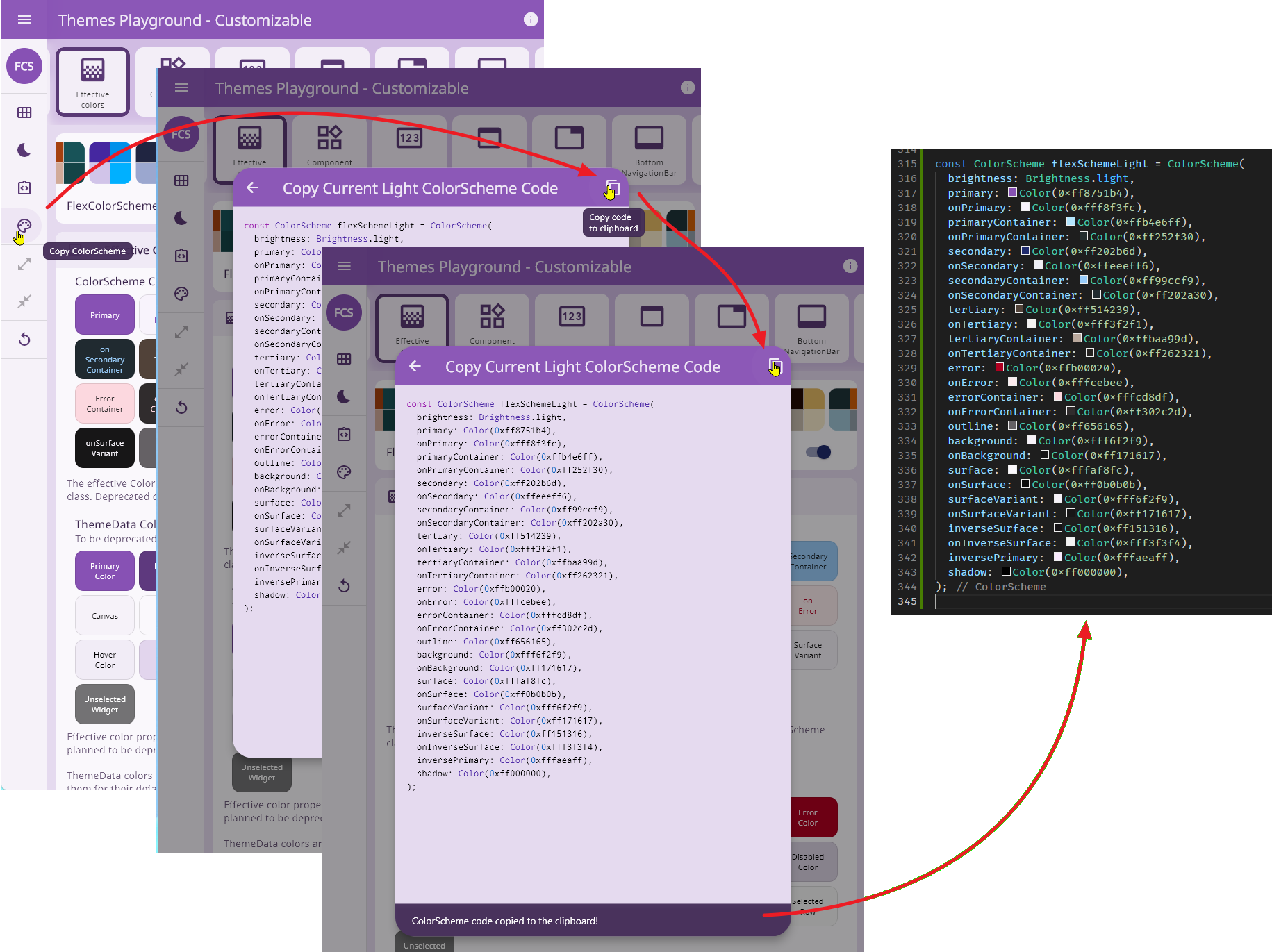
You can use this feature if you prefer to not use any of FlexColorScheme's theming features. Maybe you would like to build your custom theme from scratch, but still find creating ColorScheme objects with the Themes Playground helpful.
