4. All Themes
This example shows how you can use all the built-in color schemes, add three custom color schemes to them. How to select which one of these schemes is used to define the application's active theme.
The example also uses primary color blending on background and surface colors. A subpage is available that shows the same theme applied when opening another page, that in Flutter just inherits the same theme.
We can activate an option that uses the selected scheme's colors as input to generate a ColorScheme computed by the Material-3 ColorScheme generation tools. In example 3, we mentioned it being possible to keep primary, secondary and tertiary colors as defined by their inputs, while other colors are generated. In this example, we do can interactively toggle these settings and observe the differences.
As before, we can also turn the opinionated component widget themes ON or OFF. When it is ON, we can now also adjust the border radius on all component themes with one single setting.
Only code highlights are shown below. The complete code of this example can be found here.
ThemeServiceHive
The main start function of the app is very similar to example 3. However, here we use the popular package Hive to persist settings and persist the theme settings with ThemeServiceHive instead of using the ThemeServicePrefs service.
We again use the ThemeController, which glues our theme settings to Flutter Widgets. The controller uses an abstract ThemeService interface to get and save the settings. There are 3 concrete implementations available that we can use in these examples.
- ThemeService, abstract interface base class.
- ThemeServiceMem, keep settings in volatile memory.
- ThemeServicePrefs, persist settings locally using SharedPreferences.
- ThemeServiceHive, persist settings locally using Hive.
In this example we use the ThemeServiceHive option. The examples are all built using the same "example" app. If we use SharedPreferences in more than one of them, they would all use the same storage container and share the settings when you build them locally. By using Hive for most examples, we can change the storage container's name, for each example. You can swap in the SharedPreferences based one here as well to try it.
The Hive package is faster and does the same thing as SharedPreferences. It also has other features you might find useful, even for simple local key-value pair storage. We use both SharedPreferences and Hive in these examples for demonstration and educational purposes. For the past year Hive has not had any maintenance updates, but it is still a very popular package and still works well, at least in example 4 and even example 5, the Themes Playground app.
// The ThemeServiceHive constructor requires a box name, the others do not.
// The box name is just a file name for the file that stores the settings.
final ThemeService themeService = ThemeServiceHive('flex_color_scheme_v5_box_4');
// Initialize the theme service.
await themeService.init();
// Create a ThemeController that uses the ThemeService.
final ThemeController themeController = ThemeController(themeService);
// Load preferred theme settings, while the app is loading, before MaterialApp
// is created, this prevents a theme change when the app is first displayed.
await themeController.loadAll();
// Run the app and pass in the ThemeController. The app listens to the
// ThemeController for changes.
runApp(DemoApp(themeController: themeController));
Custom Colors
Instead of having our final and const color scheme definition values in the main file, we moved them into a static class called AppColor.
In it, we begin by defining the same colors that we used in examples 2 and 3, to be our first custom color. In this case we also assign a custom color to the optional appBarColor.
class AppColor {
  // This class is not meant to be instantiated or extended; this constructor
  // prevents instantiation and extension.
  AppColor._();

  // Create a custom flex scheme color for a light theme.
  static const FlexSchemeColor _myScheme1Light = FlexSchemeColor(
    primary: Color(0xFF00296B),
    primaryContainer: Color(0xFFA0C2ED),
    secondary: Color(0xFFD26900),
    secondaryContainer: Color(0xFFFFD270),
    tertiary: Color(0xFF5C5C95),
    tertiaryContainer: Color(0xFFC8DBF8),
    // The built in schemes use their tertiary color as their default
    // custom app bar color, but it can be any color. We use a custom color
    // here. We will see this in example 5 when using the theme and selecting
    // the custom app bar style. We use a light blue that matches branded
    // surface colors, but is a bit stronger than most surface branding.
    appBarColor: Color(0xFFC8DCF8),
  );
// Create a corresponding custom flex scheme color for a dark theme.
  static const FlexSchemeColor _myScheme1Dark = FlexSchemeColor(
    primary: Color(0xFFB1CFF5),
    primaryContainer: Color(0xFF3873BA),
    secondary: Color(0xFFFFD270),
    secondaryContainer: Color(0xFFD26900),
    tertiary: Color(0xFFC9CBFC),
    tertiaryContainer: Color(0xFF535393),
    // A custom very dark blue, to match the dark theme mode
    appBarColor: Color(0xFF00102B),
  );
We can build a scheme taking the long-way, by specifying all the required scheme colors, like above, or we can also build schemes from a single primary color. With the FlexSchemeColor.from factory. When doing so, the only required color is the primary color. The other missing colors will be computed. We can optionally also provide the primaryContainer, secondary and secondaryContainer colors with this factory, but any color that is not provided will always be computed to get all the required colors in a FlexSchemeColor.
In this example, we create our second scheme from just a primary color for the light and dark schemes. The custom appBarColor does in this case also receive the same color value as the one that is computed for secondaryContainer color. This is its default with the FlexSchemeColor.from factory if the color is not specified.
  // Vivid green colors.
  static final FlexSchemeColor _myScheme2Light = FlexSchemeColor.from(
    primary: const Color(0xFF065808),
    brightness: Brightness.light,
  );
  static final FlexSchemeColor _myScheme2Dark = FlexSchemeColor.from(
    primary: const Color(0xFF629F80),
    brightness: Brightness.dark,
The brightness parameter in the FlexSchemeColor.from factory above is new in version 5.0.0. If brightness is specified, the factory computes missing colors that are well suited for a Material-3 based ColorScheme, for the given brightness. If the brightness is not specified, then the algorithm is the same as before version 5, but with two more colors. These produced colors fit well the M2 specification. They also work with M3. They just don't follow the Material-3 guide with respect to the color shades of the main color and its container pair color. When using the FlexSchemeColor.from with Material-3 ColorScheme, prefer specifying the brightness value to get results following the Material-3 design intent.
For our third custom color scheme we define the primary and secondary colors, but no container colors, we will not make any dark scheme definitions either. All these missing colors will be computed. The missing color definitions will get computed by the factory FlexSchemeColor.from when it creates the FlexSchemeColor object. To make our dark colors for this light scheme, we use the method toDark further below with the _myScheme3Light instance.
  // Blue and red colors, for a classic blue and red theme.
 final FlexSchemeColor myScheme3Light = FlexSchemeColor.from(
  primary: const Color(0xFF04368E),
  secondary: const Color(0xFFA00505),
 );
Using the FlexSchemeColor.from is great for filling out missing colors when quickly trying different colors for custom themes. However, when you figure out the actual final colors you want, it might be a good idea to use the const constructor. As in the above case with the custom _myScheme1Light and dark, since it is const, and you can then make your entire list of color schemes a const too.
List of Schemes
Next we create a list that we call AppData.schemes, with all the color schemes we will use. Starting with our three custom color schemes. When we make custom schemes, those are probably the ones we want to use primarily, so we put them first in our preferred order. After our custom schemes, we add all the pre-defined built-in ones, offering them as options that users can switch to and use if they like.
In this example, we keep the list of all our schemes in a convenient FlexSchemeData object. A FlexSchemeData object stores name and description, plus its matching FlexSchemeColor for light and dark mode color schemes.
  static final List<FlexSchemeData> customSchemes = <FlexSchemeData>[
    // We add our custom light and dark FlexSchemeColor schemes we defined
    // to a list of FlexSchemeData, where we can bundle each light and dark
    // theme that goes together and give it a name and description too.
    const FlexSchemeData(
      name: 'Custom Midnight',
      description: 'Midnight blue theme, created by using custom color values '
          'for all colors in the scheme',
      // FlexSchemeData holds separate defined color schemes for light and
      // matching dark theme colors. Dark theme colors typically need to be less
      // saturated versions of their than light counter parts. Using the same
      // colors in light and dark theme modes does not work so well.
      light: _myScheme1Light,
      dark: _myScheme1Dark,
    ),
    // Do the same for our second custom scheme.
    FlexSchemeData(
      name: 'Custom Greens',
      description: 'Vivid green theme, created from one primary color in light '
          'mode and another primary for dark mode',
      light: _myScheme2Light,
      dark: _myScheme2Dark,
    ),
    // We also do the same for our 3rd custom scheme, BUT we create its matching
    // dark colors, from the light FlexSchemeColor with the toDark method.
    FlexSchemeData(
      name: 'Custom Red & Blue',
      description: 'Classic red and blue, created from only light theme mode '
          'primary and secondary colors',
      light: _myScheme3Light,
      // We create the dark desaturated colors from the light scheme.
      // The `swapColors` parameter is `true` here. It is new in version 5. It
      // swaps main and container colors values for the primary its container,
      // likewise for secondary and tertiary and their containers.
      //
      // This is done because in Material-3 light mode, the main color should
      // be darker or more saturated than the container, but in dark mode it
      // should be the other way around. By setting the flag to true, this is
      // done before the light theme mode colors are reused as dark theme and
      // desaturated using `whiteBlend` level value.
      dark: _myScheme3Light.defaultError.toDark(30, true),
    ),
    // Use all the built-in FlexColor schemes. This list is a const.
    ...FlexColor.schemesList,
  ];
This list of FlexSchemeData is very practical to use as input to our FlexThemeData when we want to switch theme colors. You can also make your own wrappers for the list of input colors. However, both the FlexSchemeData and the needed FlexSchemeColor classes are immutable classes that come with equality, copyWith and debugFillProperties and via that print too. You may find them convenient to use.
Theme Setup
The setup of the MaterialApp is as simple as in the previous example and almost identical, for demonstration purposes we use other values for surfaceMode and its blendLevel.
We use highScaffoldLowSurfaces where the scaffold background gets a stronger blend than other surfaces. This type is commonly used on web/desktop when you often wrap content on the scaffold, in a Card some other container that has a lighter background.
For demonstration purposes we also define the choice of our visualDensity and fontFamily in our static AppData class. The values are, however, the same as in example 3. You can find the AppData class here. The same class is also used and shared with Example 5, so it contains many values not used in this example.
class DemoApp extends StatelessWidget {
  const DemoApp({Key? key, required this.themeController}) : super(key: key);
  final ThemeController themeController;

  @override
  Widget build(BuildContext context) {
    // Whenever the theme controller notifies the listenable in the
    // ListenableBuilder, the MaterialApp is rebuilt.
    return ListenableBuilder(
      listenable: themeController,
      builder: (BuildContext context, Widget? child) {
        return MaterialApp(
          debugShowCheckedModeBanner: false,
          scrollBehavior: const AppScrollBehavior(),
          title: 'All Themes',
          // Define the light theme for the app, using current scheme index.
          theme: FlexThemeData.light(
            useMaterial3: themeController.useMaterial3,
            // We use our list of color schemes, and a theme controller managed
            // index to change the index of used color scheme from the list.
            colors: AppColor.customSchemes[themeController.schemeIndex].light,
            surfaceMode: FlexSurfaceMode.highScaffoldLowSurfaces,
            // Our content is not all wrapped in cards in this demo, so
            // we keep the blend level fairly low for good contrast.
            blendLevel: 2,
            appBarElevation: 0.5,
            // Opt-in/out on using component sub-themes.
            subThemesData: themeController.useSubThemes
                ? FlexSubThemesData(
                    // ThemeController managed radius to use as widget radius.
                    defaultRadius: themeController.defaultRadius,
                  )
                : null,
            // Control how seed generation is done by using `FlexKeyColors`
            keyColors: FlexKeyColors(
              useKeyColors: themeController.useKeyColors,
              useSecondary: themeController.useSecondary,
              useTertiary: themeController.useTertiary,
              keepPrimary: themeController.keepPrimary,
              keepSecondary: themeController.keepSecondary,
              keepTertiary: themeController.keepTertiary,
            ),
            visualDensity: AppData.visualDensity,
            fontFamily: AppData.font,
            // We use the nicer Material-3 Typography in both M2 and M3 mode.
            typography: Typography.material2021(platform: defaultTargetPlatform),
          ),
          // We make an equivalent definition for the dark theme.
          darkTheme: FlexThemeData.dark(
            useMaterial3: themeController.useMaterial3,
            colors: AppColor.customSchemes[themeController.schemeIndex].dark,
            surfaceMode: FlexSurfaceMode.highScaffoldLowSurfaces,
            // We go with a slightly stronger blend in dark mode.
            blendLevel: 7,
            appBarElevation: 0.5,
            keyColors: FlexKeyColors(
              useKeyColors: themeController.useKeyColors,
              useSecondary: themeController.useSecondary,
              useTertiary: themeController.useTertiary,
              keepPrimary: themeController.keepDarkPrimary,
              keepSecondary: themeController.keepDarkSecondary,
              keepTertiary: themeController.keepDarkTertiary,
            ),
            subThemesData: themeController.useSubThemes
                ? FlexSubThemesData(
                    defaultRadius: themeController.defaultRadius,
                  )
                : null,
            visualDensity: AppData.visualDensity,
            fontFamily: AppData.font,
            typography: Typography.material2021(platform: defaultTargetPlatform),
          ),
          // Use the dark or light theme based on controller setting.
          themeMode: themeController.themeMode,
          // Here we only pass the theme controller to the HomePage, where
          // we can can change its values with UI controls.
          home: HomePage(controller: themeController),
        );
      },
    );
  }
}
Below, we go through the above theme setup in more detail.
Selecting Theme
To select which of the themes in our list that we use as our active theme, becomes as simple as setting the themeController.schemeIndex index value, to the color scheme we want to use.
We do this with a simple popup menu button on the HomePage. This is a standard Flutter SDK UI widget. You can find how it is set up for this use case here. It is used in a simple StatelessWidget called ThemePopupMenu with a current index value and call-back when a value is selected, that we use together with our ThemeController on the HomePage.
ThemePopupMenu(
  schemeIndex: controller.schemeIndex,
  onChanged: controller.setSchemeIndex,
),
In the application, you can use the pop-up menu available in the ListTile, to change the active theme. You can choose any of the built-in 52 color schemes, plus the three custom color schemes we added.
When you change the theme, you can see that the active theme's color changes are animated by interpolating from the active theme's colors, to the new theme's colors. This is a very nice standard feature when you modify the theme used by a Flutter Material application. As mentioned earlier in the second example and tutorial, the usage of the AnimatedBuilder has nothing to do with this.
Rather when we change the value of the schemeIndex index in our ThemeController, with the setter setSchemeIndex, it calls notifyListeners(). The AnimatedBuilder listens to this notification, and rebuilds the entire MaterialApp with the new updated values that our ThemeController instance holds. The theme change animation itself happens because the MaterialApp lerp animates between previous and new ThemeData values when they change.
Component Themes
Exactly as in examples 2 and 3 the themeController is used to decide if we opt in or out of using the component sub-theming via useSubThemes. Which is toggled using a simple ON/OFF switch on the HomePage, that allows us to toggle useSubThemes controller value between true and false, thus turning ON or OFF the usage of FlexColorScheme's sub theming feature.
When the opt-in flag is true, we pass in a FlexSubThemesData() constructor, otherwise we pass in null to not use the sub themes at all.
  // Opt in/out on using FlexColorScheme sub-themes.
  subThemesData: themeController.useSubThemes
      ? FlexSubThemesData(
          defaultRadius: themeController.defaultRadius,
        )
      : null,
In this case when we do use the sub themes, we also set the default border radius, of component widget themes that have a corner border radius, to the double value defaultRadius controlled by our ThemeController.
If the defaultRadius is null, then the default radius of the opinionated component sub-themes will be used. This behavior defaults per widget to the radius specified by the Material-3 guide. If you want the Material-2 design back, you can assign value 4.
If we give the defaultRadius a simple double value, then all Flutter built-in UI widgets supporting border radius, will use the given radius as their themed border radius.
There are also individual widget border radius settings in FlexSubThemesData, where you can override and specify the border radius per widget. This is done with a simple double value, instead of using a sub-theme with a ShapeBorder. FlexColorScheme then handles the ShapeBorder setup based on the passed in FlexSubThemesData properties.
Result
When we build this example, we get an application where we can switch between 43 different themes. Their light and dark modes and change border radius on component themes and use very advanced color generation based ColorSchemes as an option to the actual defined ones, with the possibility to keep main colors as they were defined, even when otherwise suing generated colors.
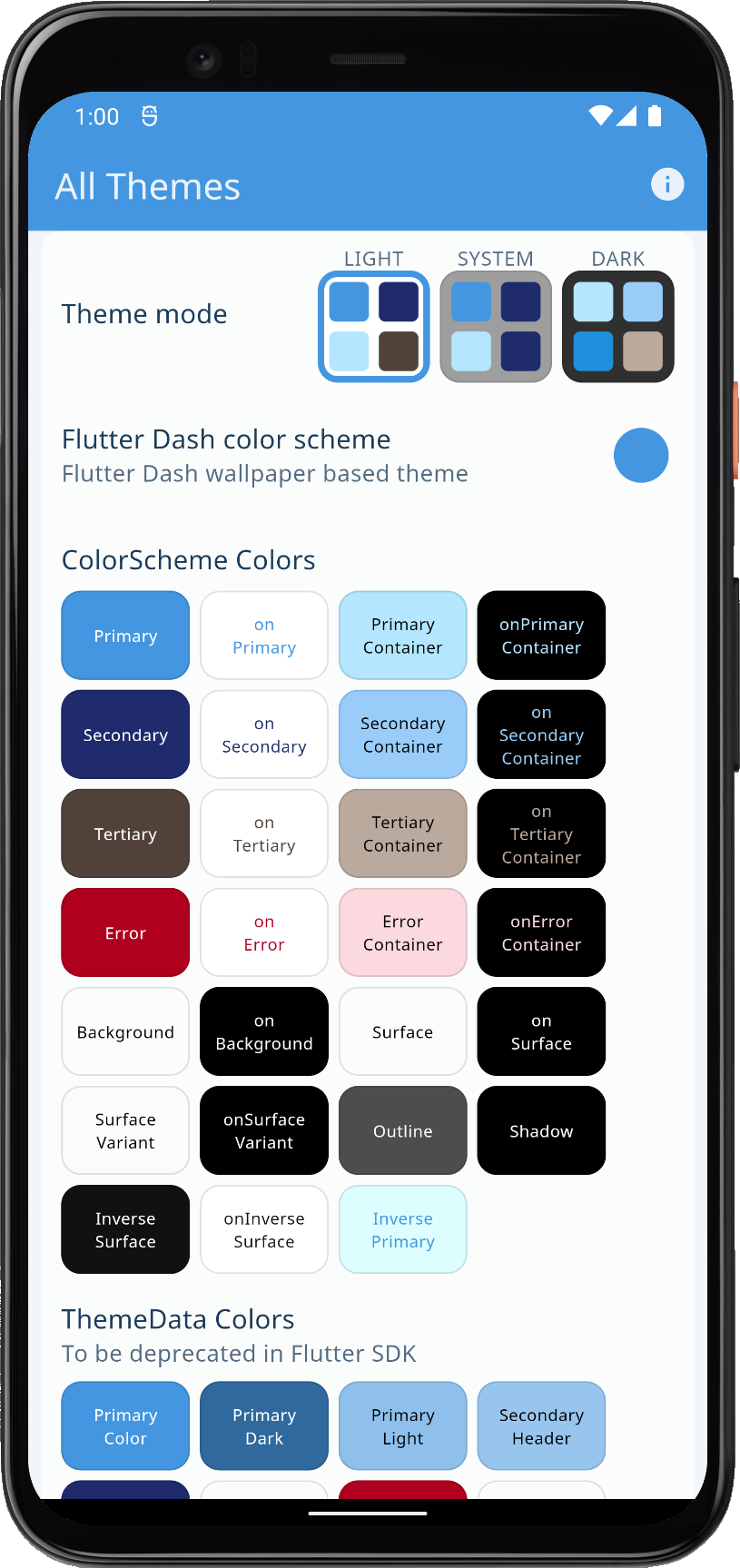 | 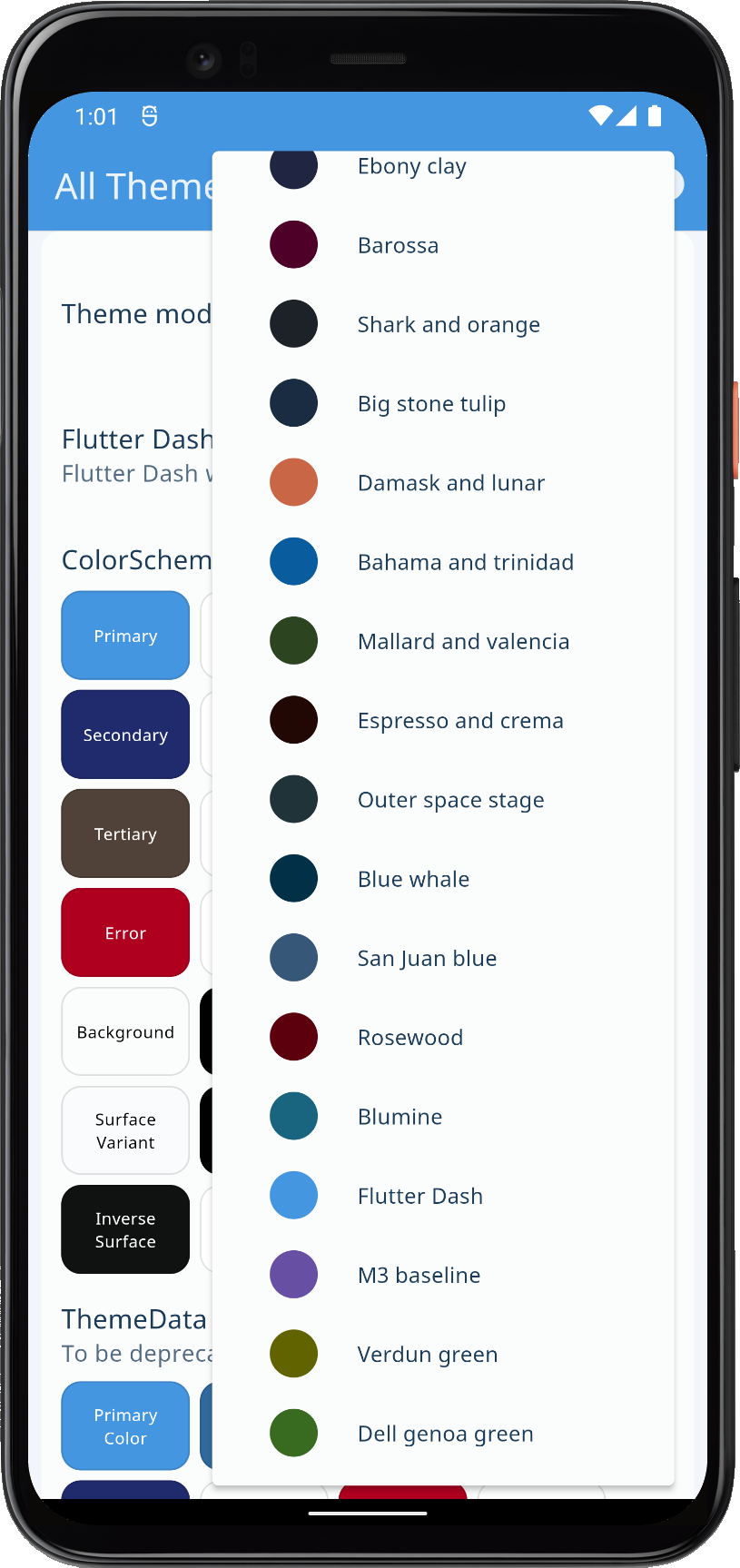 | 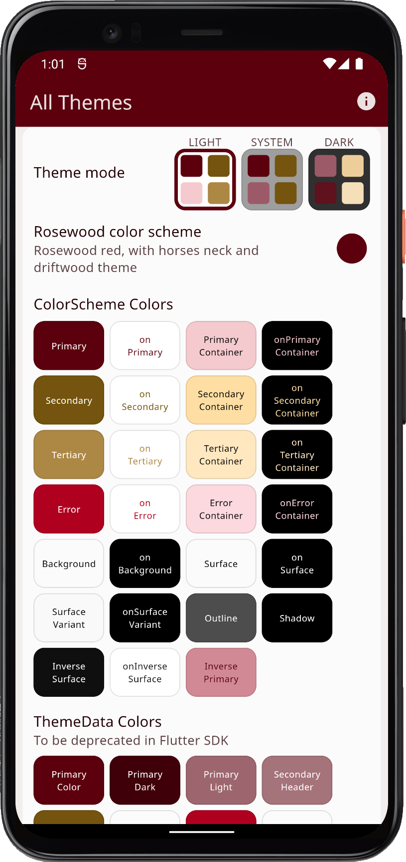 | 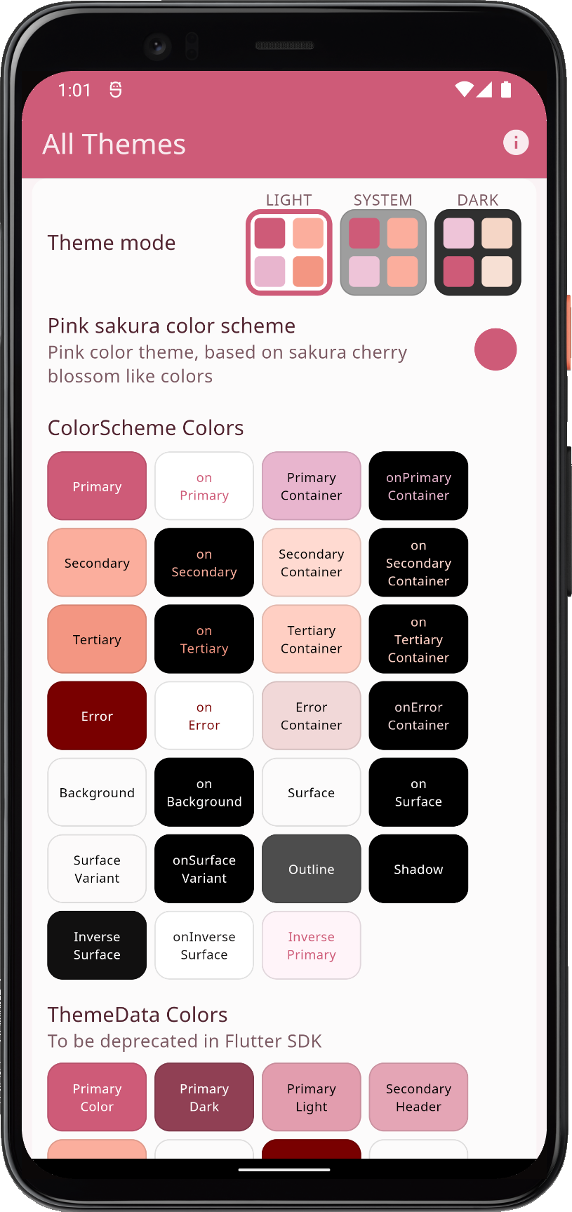 | |||
| Using three custom schemes, plus all the built-in ones as application theme options | ||||||
Scroll down to see the theme showcase further below. It presents the theme with common Material UI widgets. You can try this example as a Flutter web app here.
Seeded ColorScheme
The setup with using FlexKeyColors() to keyColors is identical to the one used in example 3, please refer to it for the basics.
In this example we also add 3 boolean values that allow us to define that we want to keep the primary, secondary and/or tertiary colors, as specified by our defined scheme colors, in the resulting ColorScheme.
When we do so, all the other colors will still be computed by the Material-3 based color generation algorithm. This is a useful feature because for the selected important main colors we may want to keep our custom, typically brand colors, but are OK with using computed and well-balanced tones for all other colors in the Material-3 based ColorScheme.
This example uses separate controller values for the dark and light theme mode to select which colors we keep. Often we might have a fixed given brand color for light mode, as paper is white. However, many customers may lack a defined brand color suitable for dark mode, then consider letting the color generation algorithm make one for you, using the light mode brand color as the seed key for dark mode.
In this example, for the light theme, we use these "keep" color controller values:
  keyColors: FlexKeyColors(
    useKeyColors: themeController.useKeyColors,
    useSecondary: themeController.useSecondary,
    useTertiary: themeController.useTertiary,
    // Light mode "keep" color toggle values.
    keepPrimary: themeController.keepPrimary,
    keepSecondary: themeController.keepSecondary,
    keepTertiary: themeController.keepTertiary,
  ),
And similar separate controller boolean values for keeping the input colors in dark mode:
  keyColors: FlexKeyColors(
    useKeyColors: themeController.useKeyColors,
    useSecondary: themeController.useSecondary,
    useTertiary: themeController.useTertiary,
    // Dark mode "keep" color toggle values.
    keepPrimary: themeController.keepDarkPrimary,
    keepSecondary: themeController.keepDarkSecondary,
    keepTertiary: themeController.keepDarkTertiary,
  ),
A slight custom StatelessWidget wrapper of the Flutter SwitchListTile.adaptive Widget is used to give us the desired themed platform adaptive look on the switch. The toggle is just the bool controller value, with a setter. All the "keep" toggles also contain the additional logic that if we do not use key colors, they get disabled.
  SwitchListTileAdaptive(
    title: const Text('Keep primary color'),
    value: controller.useKeyColors &&
        controller.keepPrimary,
    onChanged: controller.useKeyColors
        ? controller.setKeepPrimary
        : null,
  ),
You can find the code for the slightly modified wrapped version of SwitchListTile.adaptive here.
This setup is a bit complex in this example. The usage based on the theme controller is used in this example application only in order to be able to demonstrate the differences by using UI input controls that can be toggled to demonstrate the differences.
Normally for the FlexKeyColors properties you would just pass in true for the configuration you want. If you want to make a seeded ColorScheme that uses the hue from all the input colors, and you only want to keep the primary color as a given brand color, then you can use:
  keyColors: FlexKeyColors(
    useSecondary: true,
    useTertiary: true,
    keepPrimary: true,
  ),
Below we can compare the difference of produced ColorScheme when using input values as they are, or computed using all main colors as key colors, and then one by one keeping the input value as given. For this comparison, we used the "Blumine, eastern blue and saffron mango" theme.
The comparison shows the Blumine theme in light and dark mode, when using:
- Scheme colors as defined by its color values, used to make the
ColorScheme. - Seeded ColorScheme, with only primary as input, like
ColorScheme.fromSeed. - Seeded ColorScheme, with all main colors used as key color inputs.
- Seeded ColorScheme, all colors used as key color inputs, and locking primary, secondary and tertiary to their input value, while letting other colors use heir generated values.
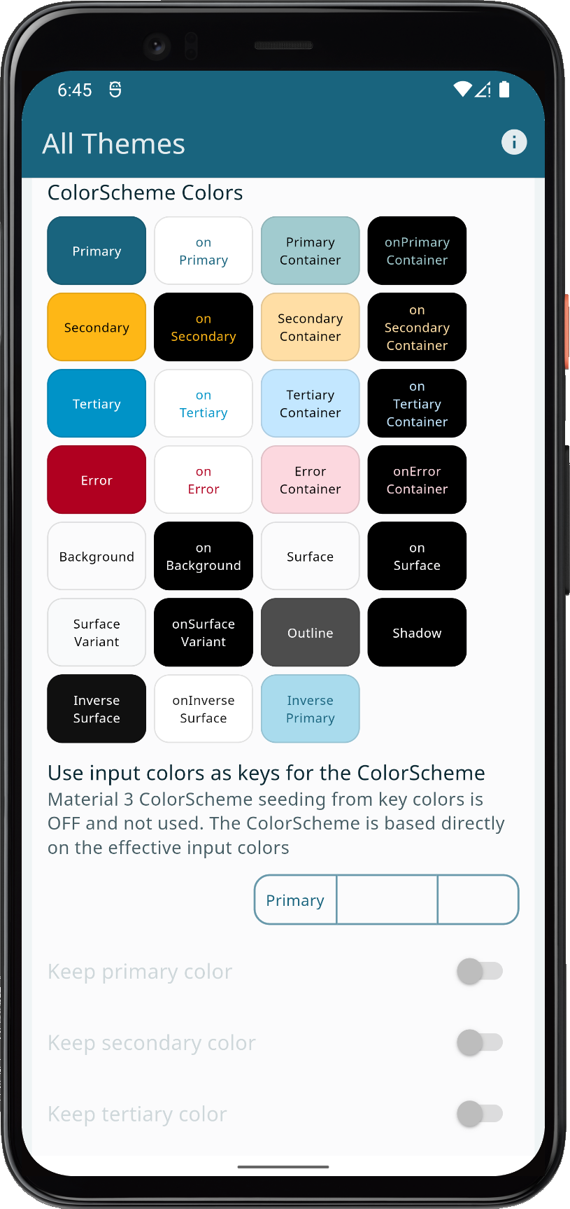 | 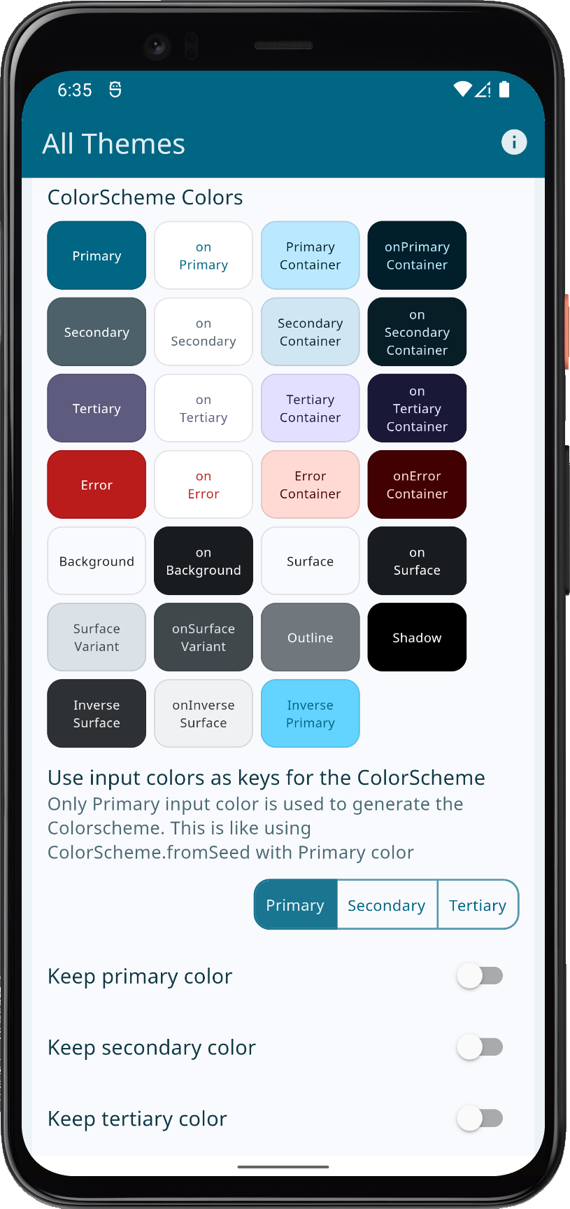 | 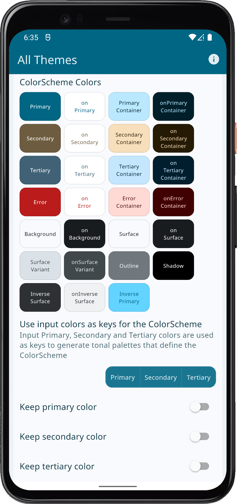 | 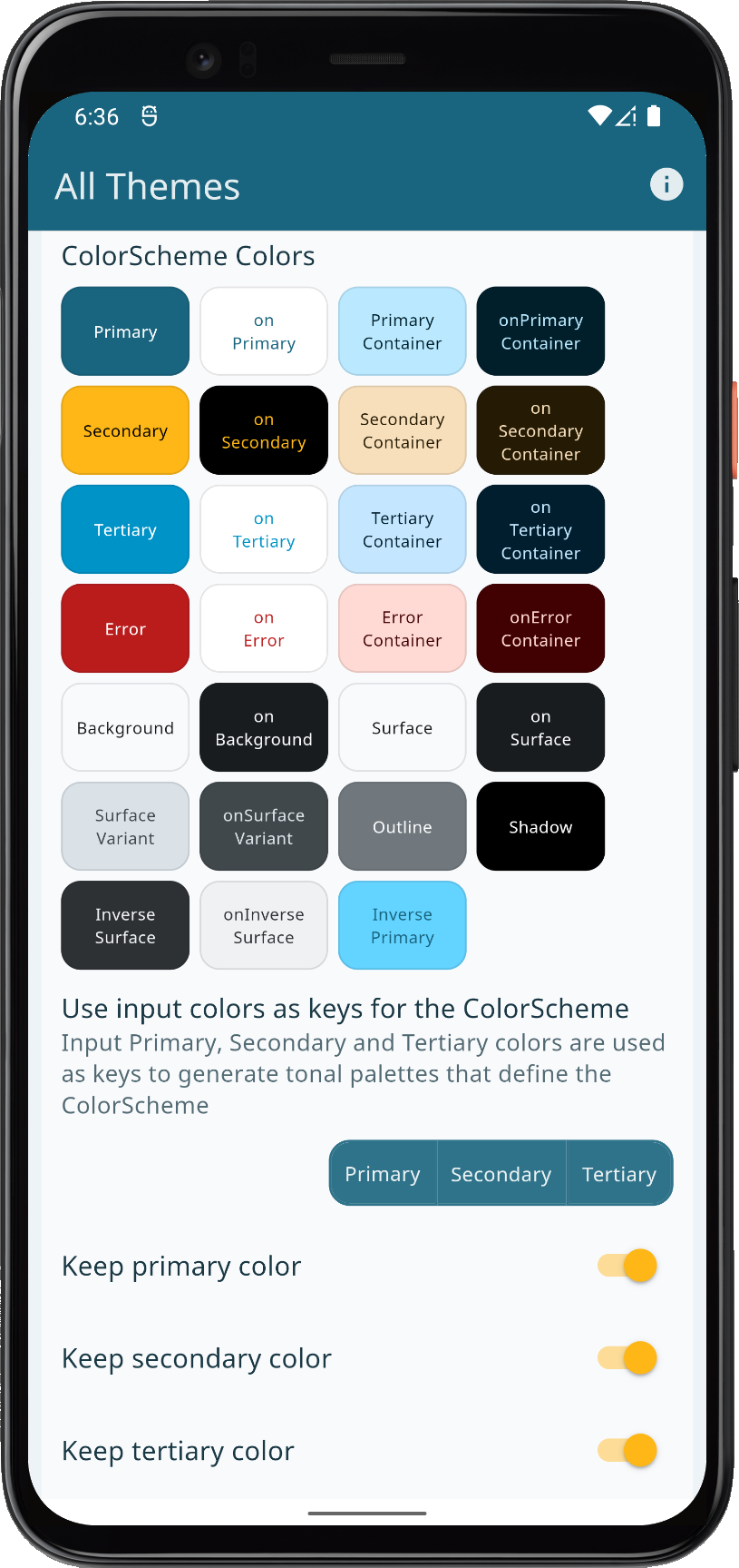 | |||
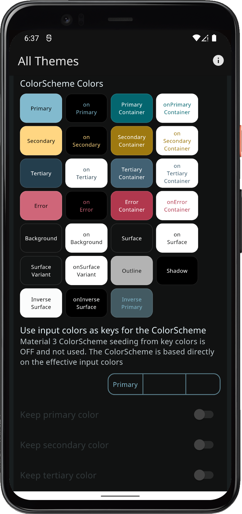 | 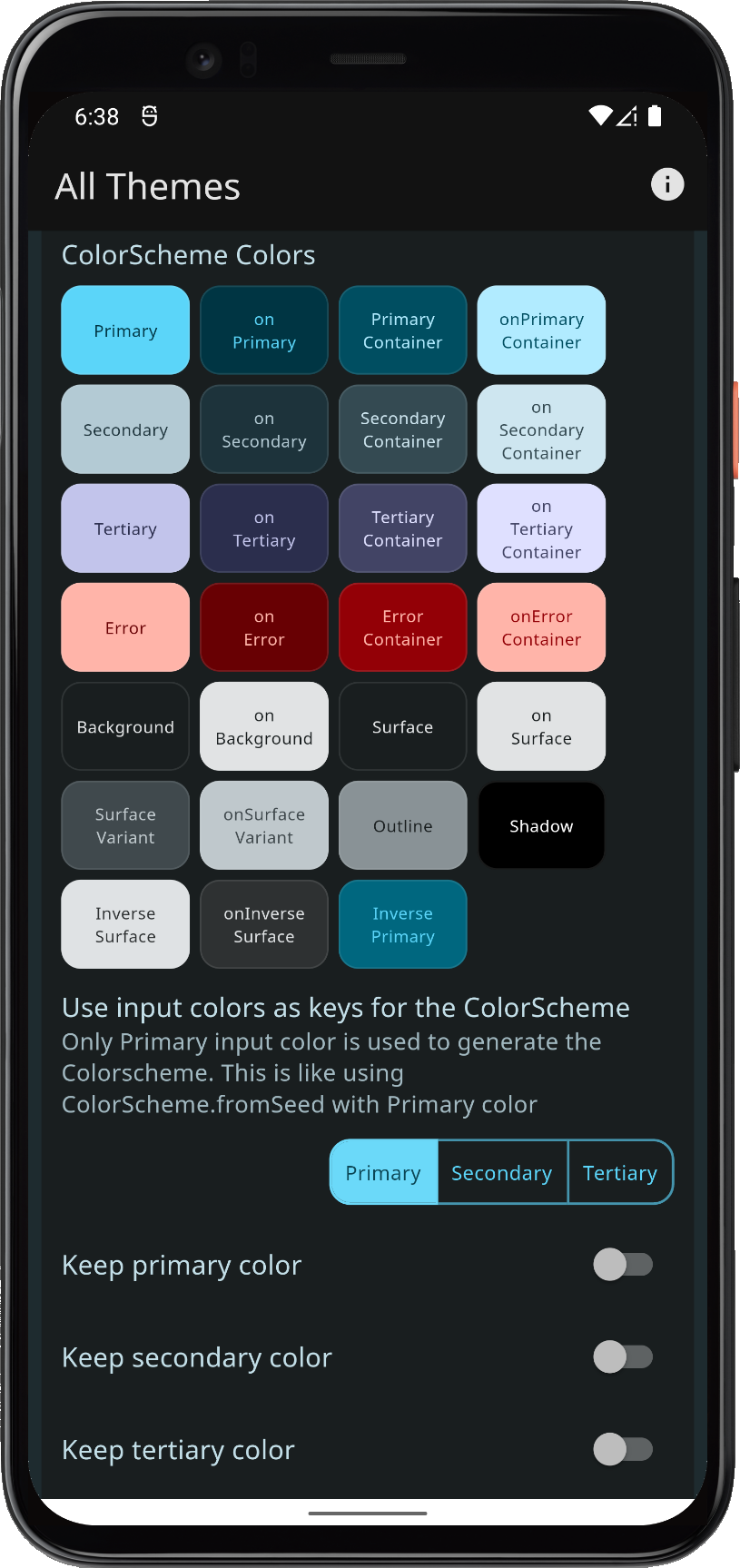 | 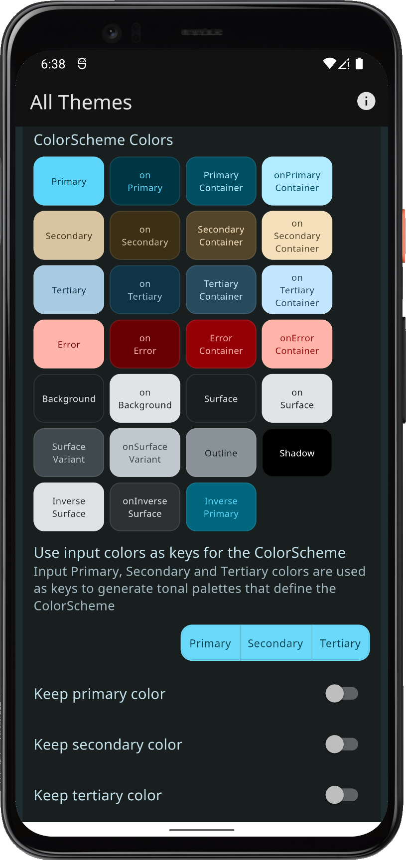 | 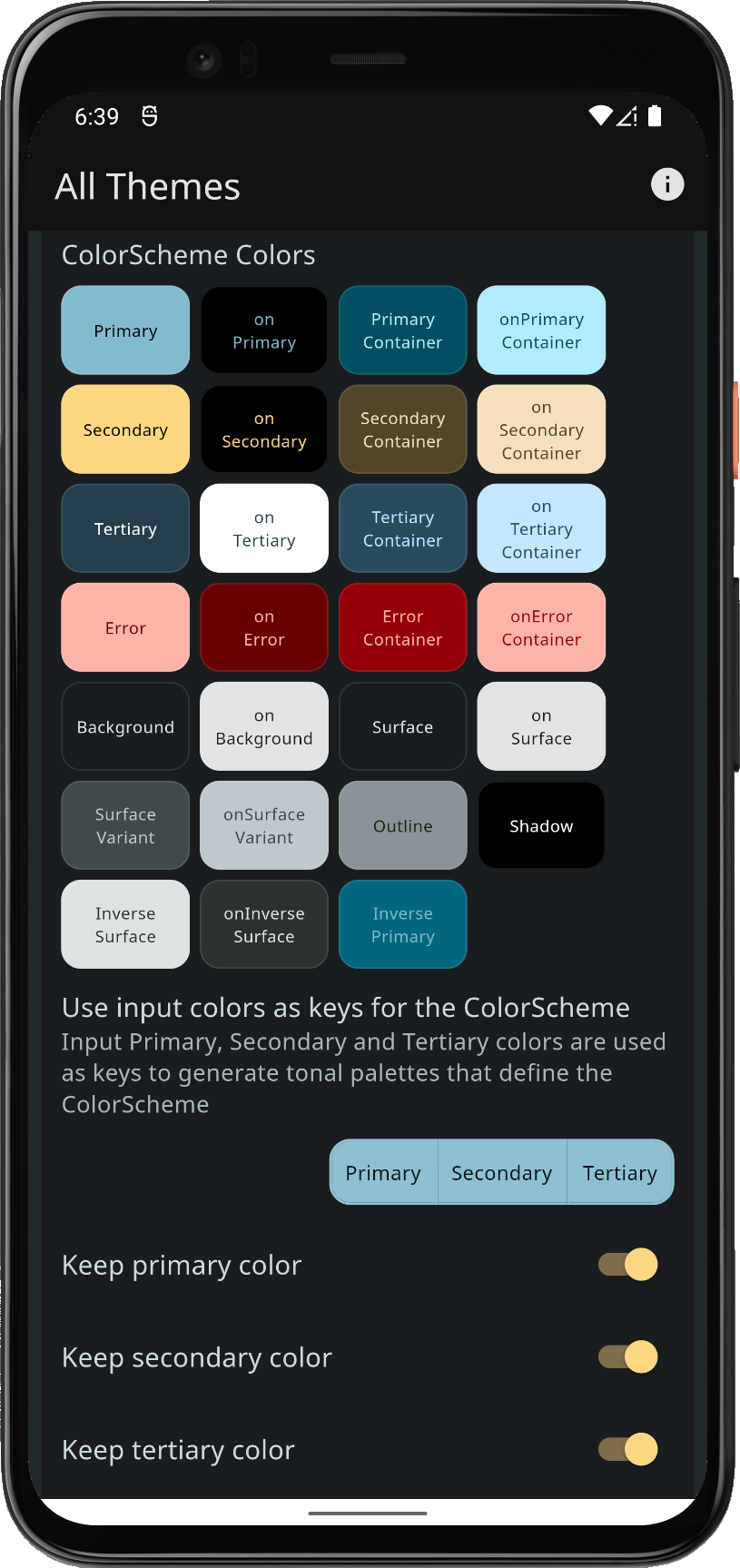 | |||
| Comparing resulting theme Colorscheme from same colors, with different FlexKeyColors settings | ||||||
You may find that the Chroma limits imposed by using the same ColorScheme generation algorithm values, that the Flutter Material-3 ColorScheme.fromSeed uses, is not enough to bring in required amount of the "color" in your input colors to the seed generated values for your secondary and tertiary colors in the generated ColorScheme. In that case you can use tones to configure a custom FlexTones to customize how the seed generation treats chroma in the input colors, and even how it maps colors from the generated tonal palettes to the resulting generated ColorScheme.
You can make complete custom configurations or use one of the built-in configurations. Below we use FlexTones.vivid tones constructor, a configuration that lets secondary and tertiary palette generation use the chroma as given by their input colors, the generated tonal palettes will then become closer in style to the actual source color.
  keyColors: FlexKeyColors(
    useSecondary: true,
    useTertiary: true,
    keepPrimary: true,
  ),
  // Tones setup for light theme to keep chroma as given in input key colors.
  tones: FlexTones.vivid(Brightness.light),
You can read more about FlexTones and its usage in the package API reference here. Its concept is also explained and visualized in Themes Playground guide.
In example 5, the Themes Playground you can select between all the different built-in FlexTones options, and also see what the actual Tonal Palettes look when you use generated ColorSchemes and how each tonal palette color maps to every ColorScheme color. It is a handy tool for exploring how tonal palettes and their mapping to a ColorScheme work.
